Matt Sussman

Visual reaction

0

arts@sfbg.com

FALL ARTS From retrospectives and installations tied to big names, to smaller but no less arresting gallery exhibitions, this fall’s visual art offerings will have a lot to say about political bodies, politicized bodies, and the body politic. It’s heartening that the “blockbuster” shows listed here by and large focus on artists whose work doesn’t shy away from politics or political activism. After a summer in which there was a palpable uptick in public conversations about the US’s role in humanitarian injustices — both home and abroad — I hope the following exhibitions encourage people to keep talking.


“Keith Haring: The Political Line”

de Young Museum, Nov. 8, 2014–Feb. 16, 2015

The posthumous ubiquity of Keith Haring’s art (on coffee mugs, T-shirts, postcards) has overshadowed the fact that he made work that was as committedly political as it was populist. His stances on antinuclear proliferation, apartheid, and the survival of sexual communities in the face of the AIDS epidemic were as clear as his trademark figures. This first major West Coast Haring show in over two decades is more importantly the first to explicitly focus on the political dimension of his work. https://deyoung.famsf.org


“@Large: Ai Weiwei on Alcatraz Island”

Sept. 27, 2014-April 26, 2015

The Chinese dissident artist’s installation on Alcatraz via the FOR-SITE Foundation has been greeted with equal parts hype and skepticism. Working remotely from his studio with a team that includes collaborators from Amnesty International and Human Rights Watch, Ai has created new sculpture, sound, and mixed media works for four locations on the former federal penitentiary grounds (three of which are usually off-limits to the public). How these pieces will put the artist’s own experiences of detainment and censorship in conversation with the site’s history of discipline and insurrection remains to be seen. Here’s to hoping for as much heat as there is light. www.for-site.org/project/ai-weiwei-alcatraz


“American Wonder: Folk Art from the Collection”

Berkeley Art Museum and Pacific Film Archive, Oct. 1-Dec. 21

John Zurier/MATRIX 255

Sept. 12-Dec. 21

On paper, “early American folk art” as the subject for an exhibition might sound dry as toast. But a lot happened between the signing of the Declaration of Independence in 1776 to the onset of the Civil War in 1861, the period during which the portraits, landscapes, commemorative mourning pictures, weather vanes, and decorative sculptures assembled here (and all from the BAM/PFA collection) were made. These artifacts of national self-fashioning reflect that history but also the quotidian aspects of daily life which often get left out of its telling. Also on view will be local Zurier’s first solo show at the museum, which features luminous, abstract paintings and watercolors inspired by his time in Iceland. www.bampfa.berkeley.edu


“Nicolas Lobo: D.O.W.”

Gallery Wendi Norris, Sept. 4-Nov. 1

Transforming chemical elements into contemplative sculptural pieces is the MO of interdisciplinary artist Lobo for his first San Francisco solo show. Previously working with sound in varying capacities, he has now turned to food science, isolating the chemical substrates of consumer goods such as doughnut frosting and cough syrup, and incorporating them into napalm and Play-Doh structures that resemble day-glo colored Song dynasty scholar stones. Toxicity never looked so enticing. www.gallerywendinorris.com


Kota Ezawa

Haines Gallery, Nov. 6-Dec. 20

Throughout his career, Kota Ezawa has rendered iconic images as disparate as Patty Hearst and the SLA robbing the Hibernia Bank and Nan Goldin photographs in a clean, simple style reminiscent of cartoons. The result is at once highly personal and aesthetically flattening, locating Cartier-Bresson’s “decisive moment” outside of the event photographed and in the photograph’s broader circulation across time. This collection of new work should provide another chapter in his ever-evolving history of the medium. www.hainesgallery.com

“Songs and Sorrows: Días de los Muertos 20th Anniversary”  

Oakland Museum of California, Oct. 8, 2014-Jan. 4, 2015

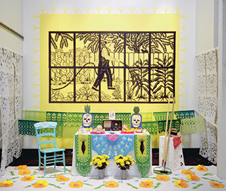
While the popularity of the Mission’s annual Días de los Muertos celebration grows in tandem with the dislocation of the community that originated it, Oakland Museum of California’s 20th anniversary celebration grounds the holiday in some much-needed historical perspective, while showcasing Latino and Latina artists who continue to innovate on the traditions and aesthetics the celebration has inspired. www.museumca.org  

“Something Completely Different”  

City Limits, Aug. 30-Sept. 13

You have to act fast on this one. If you want to see something completely new, head to this group show at one of Oakland’s strongest exhibition spaces. For this salon-style collection, each of the 60 participating artists was asked to go outside his or her comfort zone to create a piece that was truly new. The opening reception Sept. 5 doubles as a gallery fundraiser, so now is you chance to pick up something by one of the Bay Area’s best and brightest. http://citylimitsgallery.com *

This old house

1

HAIRY EYEBALL Aside from its prime Cow Hollow location, the modest single floor, above-garage residence at 3020 Laguna Street is a largely unremarkable piece of real estate. Over its 150-year existence it has served as a home to people now forgotten, any relations of its last known occupants having cut all ties to this particular place. What’s left is the building itself, which, judging from its dingy stucco exterior and the tidy beaver dam of exposed lath covering what had been a bay window, looks as if it has an imminent appointment with the wrecking ball.

The house is indeed slated for demolition due to structural instability. But the lath-work exterior is in fact one of nine installations built in, on, and outside the house for Highlight Gallery’s inaugural site-specific project “3020 Laguna Street in Exitum.”

3020 Laguna in 2009:

Real estate developer and Highlight Gallery founder-director Amir Mortazavi, along with co-curator David Kasprzak gave each participating artist the stipulation that, aside from fasteners, they could only use materials sourced from the house itself. The resulting pieces turn the space inside out, making visible the domicile’s history as well as its bones, while also bringing in new bodies to reside — however temporarily — within its walls. In short, 3020 Laguna Street in Exitum returns something of the “home” to this house in its final days.

Starting from the outside, Randy Colosky’s “Quantum Entanglement of the Carpenters Union Local,” a clean line cut into the building’s stucco exterior with two rotary saw blades protruding from either end, is a visual chicken-egg puzzle. The blades appear as if they were cutting their way out or had been simply left there mid-job.

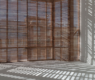
Upon entering a narrow hallway, one is immediately drawn into the front room on the right where Chris Fraser’s “Outline” — the aforementioned beaver dam — can be properly experienced. Fraser stripped the exterior wall to its studs and lath, producing a Venetian blind-style grating that turns the brightly whitewashed walls into a canvas for shadow and sunlight to play off.

When I visited the site late on a sunny afternoon, visitors understandably congregated near “Outline.” It is a serene, almost patio-like space in which the outside world, still so near, is transformed into flickering bands of movement. Afternoon shadows create moiré patterns of interference on the walls.

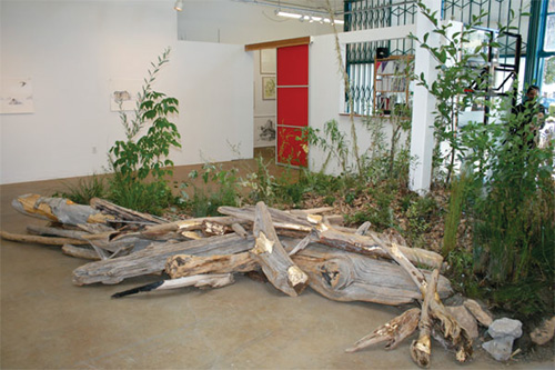
The other focal point was Andy Vogt’s “Drawn Out,” perhaps the most technically involved and architecturally ambitious installation aside from Fraser’s. Vogt cut a diagonal path into the floorboards between the kitchen entrance and what had been a window, excavating it as a single piece. He then decreased the height of the floor joists below the cut and put the floor back in place, creating a ramp to nowhere that draws the eye from the kitchen down to the where the wall had been to a patch of scrubby bamboo that has taken root in the crevice between the house and the neighbors’.

Not all the interventions are as heavy on reconstruction as Fraser’s and Vogt’s. For “Nothing to No Thing” Jesse Schlesinger camped out in what was the bedroom for 28 days, from new moon to new moon, using elements from the room—mainly a baseboard and door trim — to create a bed frame and stools, and invited visitors to join him for tea and coffee. Aside from the furniture itself, the only traces of these visits are the used tea leaves and coffee filters, a guest log, and, in a decidedly homey touch, the height of each guest recorded on the doorframe.

Christine M. Peterson’s “Shift (Plane),” which transforms a large storage area off of the kitchen by detaching and radially shifting the facade of closet doors that covered one wall, and Yulia Pinkusevich’s “Data Mass Projection,” a basement installation created out of telephone and data wires found throughout the house that have been stripped and hung to resemble a light spectrometer, are formally pleasing yet don’t quite reveal the space anew.

If this project can said to be haunted, it is by the ghost of Gordon Matta-Clark, the 1970s New York-based artist and architect best known for those works in which he dissected existing buildings, often slicing into and opening them up, or engaged with marginal and neglected urban spaces he termed “nonsites.”

I’m not sure if 3020 Laguna, or if any piece of marketable property in our 7×7 real estate bubble, would qualify as the latter. Matta-Clark was working at a time when New York City developers were throwing money into large corporate construction projects that sought to bulldoze and build over much of the Big Apple’s infrastructural rot and many Americans were fleeing to the suburbs. His pieces at both urban and suburban sites were informed by — and drew attention to — this shifting architectural landscape. Despite the elegiac overtures of some the pieces, the stakes at 3020 in Exitum feel smaller even if the project is engaging as a series of formal experiments in spatial perception.

3020 LAGUNA STREET IN EXITUM

3020 Laguna, SF

Sat/18 and Sat/25, 2 p.m.-7 p.m.

(415) 529-1221

www.highlightgallery.com/project


No country

0

arts@sfbg.com

FILM “The male stereotype makes masculinity not just a fact of biology but something that must be proved and re-proved, a continual quest for an ever-receding Holy Grail,” wrote Marc Feigen Fasteau in The Male Machine, a 1975 Gloria Steinem-approved polemic (she wrote the introduction) that attempted to catalyze American men into joining their sisters in the women’s movement in reexamining and casting off traditional gender roles.

Masculinity of the variety rhapsodized by Ernest Hemingway and scrutinized by Fasteau is now something talked about in scare quotes (see Old Spice’s man on a horse) or presented as a relic of an earlier time à la Don Draper, even if magazines such as GQ routinely make it into a fetish object. Even a cursory scan of contemporary pop culture, from Drake’s broody makeover of hip-hop swagger to Will Arnett’s stay-at-home dad in Up All Night, shows that men today seemingly have more options, and consequently different sets of expectations, when it comes to being a man.

And yet, the ties that bind to that “ever-receding Holy Grail” still grip some men, causing fresh wounds and opening up old scars. It’s a struggle that runs through many of the remaining programs in Yerba Buena Center for the Arts’ ongoing series “Bros Before Hos: Masculinity and its Discontents,” a collection of leftfield representations of masculinity, often under duress.

The hitchhiking bisexual hustler at the center of Meat Rack (1968), a gritty piece of Gay Lib-era San Francisco film history, protests the loudest. Director Michael Thomas, who appears in person at the screening, has his boy-toy clanking his can against the prison bars of pop Freudian psychology as he works out his Mommy issues, turning tricks in Market Street cinemas (appropriate, given that Thomas owned the infamous Strand Theater and later founded its namesake, indie film distributor Strand Releasing). Although the film’s sexual politics are at times as confused as its protagonist’s, Meat Rack depicts with lysergic abandon the panic that can happen when the injunction to be a man is simply too much to bear.

That pressure is also touched on again and again by the various Finnish men Joonas Berghäll and Mika Hotakainen interviewed for their tender documentary Steam of Life (2011). Within the steam-filled confession booth of a sauna, men talk candidly and emotively about their lives, loves, and losses, their famous Scandinavian reserve seemingly melting away into streams of tears with each new puff of steam. “What are the options for boys?” a solider asks a bench-mate, reflecting on his inability to mourn. “Silence and drinking”

Steam of Life wears its nationalism, as well as its heart, on its sleeve, intercutting gorgeous long shots of the Finnish countryside between its in-the-buff interviews, and ending with a dedication, not merely to its subjects, but to, “all Finnish men.”

But the ballad of aging strongman Stanley Pleskun, a.k.a. Stanless Steel, as documented in Zachary Levy’s Strongman (2009), can be called uniquely American. Pleskun’ abilities are the stuff of classic tall tales — he can lift 10,000-pound trucks with his legs and hold aloft three adults with just one finger — even if his chaotic home life and uphill battle to keep his career going, sympathetically captured by Levy, is straight Arthur Miller. For all his might, Pleskun is at times painfully oblivious to his emotional shortcomings, making his quest for the ever-receding Holy Grail of fame and glory one of the rougher paths that “Bros Before Hos” traces. 

“BROS BEFORE HOS: MASCULINITY AND ITS DISCONTENTS”

Through Feb. 26

Yerba Buena Center for the Arts

701 Mission, SF

(415) 978-2787

www.ybca.org

No country

0

FILM “The male stereotype makes masculinity not just a fact of biology but something that must be proved and re-proved, a continual quest for an ever-receding Holy Grail,” wrote Marc Feigen Fasteau in The Male Machine, a 1975 Gloria Steinem-approved polemic (she wrote the introduction) that attempted to catalyze American men into joining their sisters in the women’s movement in reexamining and casting off traditional gender roles.

Masculinity of the variety rhapsodized by Ernest Hemingway and scrutinized by Fasteau is now something talked about in scare quotes (see Old Spice’s man on a horse) or presented as a relic of an earlier time à la Don Draper, even if magazines such as GQ routinely make it into a fetish object. Even a cursory scan of contemporary pop culture, from Drake’s broody makeover of hip-hop swagger to Will Arnett’s stay-at-home dad in Up All Night, shows that men today seemingly have more options, and consequently different sets of expectations, when it comes to being a man.

And yet, the ties that bind to that “ever-receding Holy Grail” still grip some men, causing fresh wounds and opening up old scars. It’s a struggle that runs through many of the remaining programs in Yerba Buena Center for the Arts’ ongoing series “Bros Before Hos: Masculinity and its Discontents,” a collection of leftfield representations of masculinity, often under duress.

The hitchhiking bisexual hustler at the center of Meat Rack (1968), a gritty piece of Gay Lib-era San Francisco film history, protests the loudest. Director Michael Thomas, who appears in person at the screening, has his boy-toy clanking his can against the prison bars of pop Freudian psychology as he works out his Mommy issues, turning tricks in Market Street cinemas (appropriate, given that Thomas owned the infamous Strand Theater and later founded its namesake, indie film distributor Strand Releasing). Although the film’s sexual politics are at times as confused as its protagonist’s, Meat Rack depicts with lysergic abandon the panic that can happen when the injunction to be a man is simply too much to bear.

That pressure is also touched on again and again by the various Finnish men Joonas Berghäll and Mika Hotakainen interviewed for their tender documentary Steam of Life (2011). Within the steam-filled confession booth of a sauna, men talk candidly and emotively about their lives, loves, and losses, their famous Scandinavian reserve seemingly melting away into streams of tears with each new puff of steam. “What are the options for boys?” a solider asks a bench-mate, reflecting on his inability to mourn. “Silence and drinking”

Steam of Life wears its nationalism, as well as its heart, on its sleeve, intercutting gorgeous long shots of the Finnish countryside between its in-the-buff interviews, and ending with a dedication, not merely to its subjects, but to, “all Finnish men.”

But the ballad of aging strongman Stanley Pleskun, a.k.a. Stanless Steel, as documented in Zachary Levy’s Strongman (2009), can be called uniquely American. Pleskun’ abilities are the stuff of classic tall tales — he can lift 10,000-pound trucks with his legs and hold aloft three adults with just one finger — even if his chaotic home life and uphill battle to keep his career going, sympathetically captured by Levy, is straight Arthur Miller. For all his might, Pleskun is at times painfully oblivious to his emotional shortcomings, making his quest for the ever-receding Holy Grail of fame and glory one of the rougher paths that “Bros Before Hos” traces. 

“BROS BEFORE HOS: MASCULINITY AND ITS DISCONTENTS”

Through Feb. 26

Yerba Buena Center for the Arts

701 Mission, SF

(415) 978-2787

www.ybca.org

Hello, Carol!

1

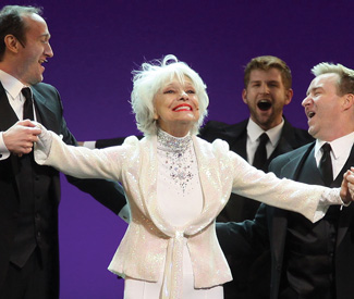
FILM It is close to impossible not to love Carol Channing; those who would protest otherwise are simply heartless. The only adequate response to her is unconditional surrender, as if standing before an oncoming cyclone filled with puppies.

With her saucer eyes topped with false lashes that could give Bette Davis’ a run for her money and a mouth that seems as if it could swallow the world, Channing is a living incarnation of a Muppet (to watch her duet with Miss Piggy just seems natural, somehow). And yet, despite her cartoonish physicality and exaggerated appearance, there is nothing false or put-on about Channing.

When I hear that voice — dripping with whiskey, smoke, and honey, begging to be imitated — the effect is instant happiness. Everything just feels right. As Roland Barthes writes in his essay “The Grain of the Voice,” I then must face the task of articulating “the impossible account of an individual thrill I constantly experience in listening to singing.”

Dori Bernstein’s sweet if worshipful documentary Carol Channing: Larger Than Life necessarily fails at that task, even as it proves the now 91-year-old Broadway legend more than lives up to the second half of the film’s title.

Now slightly stooped, her hair in a choppy gray bob, which she occasionally pulls into a Peggy Moffitt-esque topknot, and her lips a smear of Malibu pink, Channing is still ever the professional, hilariously impersonating a Russian theater troupe one moment and chatting with young dancers in Times Square the next.

The life Channing recounts is an abbreviated and selective version of the one detailed in her 2002 memoir Just Lucky I Guess: her childhood in San Francisco spent being the class clown and worshiping Ethel Waters; her first big Broadway break playing Lorelei Lee in Gentlemen Prefer Blondes; and her career-cementing role as Dolly Levi in Hello, Dolly! And many of the memoir’s same supporting characters, such as frequent TV variety show co-star Loni Anderson and Dolly composer Jerry Herman, also make appearances here.

What Bernstein’s documentary offers is the rare chance to witness the palpable impact Channing has made on others. In personal interactions, she gives her attention equally and wholly to anyone who seeks it (including the camera). Those who have worked with her — particularly the many gay chorus members interviewed here — speak of her as a mother rather than a diva.

The film’s most touching footage is of Channing with her late husband Harry Kullijian, who passed away last year. The two were childhood sweethearts who some 70 years later tied the knot (in Channing’s fourth go at marriage), and seeing them joke together and read aloud poetry passages they shared as love-struck teens is the very definition of adorable.

Curiously, Kullijian’s passing is not mentioned in the film, even as a postscript. You get the sense more generally that Bernstein tried to stay clear of reopening any old wounds with her subject. The awful tempestuousness of Channing’s second marriage to her publicist and manager Charles Lowe is referenced by others but not Channing, who speaks only in passing of the toll life on the road took on her relationship with her son from her first marriage.

Additionally, despite her fame, Channing has always had to share the larger cultural spotlight with Marilyn Monroe and Barbra Streisand, powerhouses in their own right who became associated with the roles she originally made famous on stage (Channing would have her Hollywood comeuppance in 1967 when she was nominated for a Best Supporting Actress Oscar for 1967’s Thoroughly Modern Millie). Larger Than Life attempts to provide a corrective to this, but its motivations for doing so are as transparent as they are understandable. This film is a mash note to Channing as much as it is a gift to her fans, who, rest assured, didn’t need any more reason to love her. *


CAROL CHANNING: LARGER THAN LIFE opens Fri/3 in Bay Area theaters.

Female trouble

0

arts@sfbg.com

FILM Rooney Mara’s chalk-complected cyberpunk Lisbeth Salander is one of the more fearsome and curious creatures to stalk across movie screens in recent memory, her freak genius and impassive veneer concealing deep reservoirs of pain and rage — and also desire. Cold and distant to the extreme, Salander makes for an odd duck of a femme fatale to disgraced journalist Mikael Blomkvist’s accidental gumshoe.

And yet, as many a reviewer has commented of David Fincher’s The Girl With the Dragon Tattoo (2011), the camera spends plenty of time surveying Mara’s naked body as she takes down Sweden’s patriarchal-industrial complex one misogynist at a time. Salander might be more leather than lace, but like many femme fatales before her she flickers (albeit far more unsteadily than her forbearers) between being an object to be desired and a force to be reckoned with.

If it is perhaps something of a stretch to claim that the dame-heavy titles at this year’s Noir City offer a tour of the more distant branches of Salander’s genealogy, at the very least, the gallery of black widows and Jezebels-in-disguise Eddie Muller has assembled for the festival’s tenth go-round offer a pointed lesson in how hard it has been for Hollywood, tattoos and mad hacking skills aside, to shake its old regimes of visual pleasure.

Something of Salander’s icy remove is detectable in mid-1960s Angie Dickinson, who will be feted and interviewed in person at a double bill of two of her best: The Killers (1964) and Point Blank (1967). Whereas Ava Gardner simmered her way through Robert Siodmak’s 1948 adaptation of Ernest Hemingway’s short story, the temperature of Dickinson’s Killers mob girl is harder to take in Don Siegel’s remarkably brutal remake: a Monroe in harsher lines with nothing of the little girl lost about her. So too in Point Blank —which re-teams Dickinson with her Killers costar Lee Marvin — does she put up a good fight, even as she brandishes her sexuality like a semi-automatic.

You can add Bedelia — writer Vera Caspary’s lesser-known 1945 follow-up to her convoluted 1943 novel Laura — to the canonical list of first-name-basis sirens (also in Noir City X: 1946’s Gilda and the 1944 film version of Laura). Bedelia‘s titular heroine was touted on an early cover of the 1945 book that inspired the 1946 film (for which Caspary also wrote the screenplay) as “the wickedest woman who ever loved,” a title more than lived up to by Margaret Lockwood’s performance as the small-town temptress.

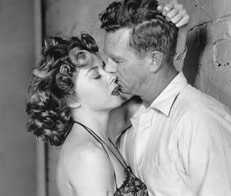
That description also fits one of noir’s finest leading ladies, Gloria Grahame, who — as always when cast as the bad girl — makes damaged goods look damn fine. In Naked Alibi (1954), she plays a border town torch singer caught in an abusive relationship with a fugitive on the run. Beverly Michaels, on the other hand, is simply damaged (but no less a joy to watch) as the bullet bra-brandishing beauty trying to off her husband for money in Hugo Haas’ sleazoid rarity Pickup (1951).

In keeping with the Pacific Film Archive’s unofficial late-January tradition of running complimentary programming during Noir City, a retrospective of the films of French suspense auteur Henri-Georges Clouzot offers a more nuanced gloss on noir’s troubled women. Simone Signoret and Clouzot’s own wife, Véra, deliver a master class in how to simultaneously do and be undone by a dirty deed in Diabolique (1955). Perhaps more apropos to the dragon-tattooed girl is Clouzot’s final feature Woman in Chains (1968), which, much like Michael Powell’s tour de force Peeping Tom (1960), lays bare the operations of cinema’s gendered voyeurism by having the kinky Josée (Elisabeth Wiener) turning the gaze back on both her artist boyfriend and the amateur pornographer who covets her — a reversal that Clouzot formally mirrors in the film’s electric finale. Though she might not show it, I think Lisbeth Salander would be pleased.

NOIR CITY X

Jan. 20-29, $10-$15

Castro Theatre

429 Castro, SF

www.noircity.com

“HENRI-GEORGES CLOUZOT: THE CINEMA OF DISENCHANTMENT”

Through Feb. 4, $5.50-$9.50

Pacific Film Archive

2575 Bancroft, Berk.

bampfa.berkeley.edu

What recession?

0

Also in this issue: Guardian culture editor Caitlin Donohue on Art Basel Miami 2011’s street art scene

VISUAL ART Now in its 10th year, Art Basel Miami Beach (ABMB)— the art world’s annual “spring beak” during which power brokers, status-seekers, and a curious public descend on Miami Beach over the first weekend in December — makes for an easy target, engorging South Beach’s already cartoonish version of “living large” by bringing its own cold strains of entitlement, status, and exclusivity.

Perhaps this is what advertising mogul and mega-collector Charles Saatchi decried (somewhat sanctimoniously) as “the hideousness of the art world” in an op-ed piece for the UK Guardian, conveniently published during the fair’s run. Those who liked to show off certainly did: luxury SUVs continually clogged the viaducts across Biscayne Bay; I counted more blue-chip handbags and heels than in the September issue of Vogue; and there was always buzz of a party or dinner you weren’t on the list for. (Party-crashing is ABMB’s unofficial blood sport).

“I just stopped Tweeting,” remarked a social media manager for a San Francisco museum, as we shared a bleary-eyed ride to the airport on Monday night. “I mean, how many jokes can you make about the money?”

My van-mate’s fatigue was understandable. The fair itself is exhausting, having grown to include some 260 international exhibitors that transform the Miami Beach Convention Center into a warren of aisles and booths, as well as programs of outdoor sculpture, video, and a series of panel discussions and Q&As. And this isn’t even including the aforementioned endless circuit of afterhours soirées.

But his bafflement also pointed towards the way business is done at Art Basel, bringing to mind Marx’s characterization of capital as a kind of magic act. Most of the transactions happened offstage, with a majority of pieces selling before the fair had even opened. As a curator friend jokingly asked, echoing sentiments she has been hearing all weekend from gallery associates: “Where’s the recession?”

There certainly wasn’t much in the way of finger-pointing on the convention center floor. Threats of an Occupy-style protest remained just that. Danish collective Superflex’s giant flags emblazoned with logos of bankrupt banks (at Peter Blum Gallery) attempted to reveal the elephant in the room. They might have been overpowered, however, by the flash of Barbara Kruger’s riotous wall texts at Mary Boone, which proclaimed “Money makes money” and “Plenty should be enough.” The ripest visual metaphor for wasteful abundance was certainly Paulo Nazareth’s “Banana Market/Art Market,” a green Volkswagen van filled with real bananas that spilled out onto the convention floor.

Even though the writing was on the wall, visitors seemed more keen on getting their pictures taken with some of the single-artist installations that were part of the”Ark Kabinett” program. Ai Weiwei’s barren tree made from pieces of dead tree trunks collected in Southern China had almost as long of a queue as Elmgreen and Dragset’s marble sculpture of a neoclassical male nude hooked up to an IV, the centerpiece of Amigos, the un-ambiguously gay duo’s deconstructed bathhouse that took over Galeria Helga de Alvear’s booths.

There were a few welcome surprises: new LA-based artist Melodie Mousset’s mixed-media piece “On Stoning and Unstoning” (at Vielmetter) offered a politically astute and formally bold tonic to the generally conservative, painting-heavy selection, as did older sexually and politically frank pieces by second-wave feminist artists such as Martha Rosler and Joan Semmel.

However, the most exciting art could be found outside the convention center, mainly in the rapidly-gentrifying Wynwood neighborhood which now boasts more than 40 galleries (nearly quadruple the number from eight years ago). Many of Miami’s biggest collectors have followed suit, setting up warehouses in the adjacent Design District where their collections are on view to the public.

“Frames and Documents,” the Ella Fontanalas-Cisneros Collection’s sensitively curated selection of Conceptualist art from the 1960s to the late ’80s— which juxtaposed the work of Central and South American artists with that of their American and European contemporaries — was brimful with lush aesthetic rewards delivered with the barest of means.

I renewed too many loves that afternoon (and found some new ones, as well) to list in full, but another institutional stand-out was the Miami Art Museum’s “American People, Black Light,” a retrospective of Faith Ringgold’s early paintings from the ’60s that capture with unflinching clarity the anguish, ambivalence and rage of the Civil Rights era. Given Ringgold’s profile, it’s shocking that they’ve never been the subject of their own exhibition until now.

Much has been made of the “trickle down” effect ABMB has had on the cultural revitalization of Miami. (Wynwood is the most frequently cited example). The most hopeful and lasting sign I saw of any such change was a few blocks down from the Cisneros collection, at the small gallery Wet Heat Project. For the group show “A Piece of Me” pairs of art students from local high schools had been matched with four mid-career alumni from Miami’s New World School of the Arts. Each student team then conceived, developed, and produced a video installation in response to a piece by their alumni mentor, with both the final video pieces and those works that inspired them on display in the gallery.

What could’ve been a gimmicky set-up resulted in some truly inventive, thoughtful, and original work on the part of the students. Moreover, “A Piece of Me” offers one portable model for bridging the community at large and the art community. As Max Gonzalez, one of the participating students who was on hand, said of his installation, “It was go big or go home for us.”

Next to that vote of confidence, the Miami Beach Convention Center floor — littered with big names and bigger baubles destined for law firm lobbies and penthouse living rooms — seemed that many more miles away.

Matt Sussman writes the Guardian’s biweekly Hairy Eyeball column.

On nostalgia

0

arts@sfbg.com

YEAR IN FILM I haven’t laughed so hard or so deeply in a movie theater as I did watching The Muppets after a languorous Thanksgiving dinner. Perhaps it was as much due to the tryptophan, sugar, and booze coursing through my system as to the welcomely familiar zaniness transpiring onscreen, but more and more my chuckling was subtended by the throaty chokes that presage a good, deep cry. And when I caught the pointedly placed photo of Jim Henson in the background of an interior shot, it finally hit me: that warm lump in my chest was nostalgia.

For a movie as universally praised as The Muppets has been (and let it be said, its 97 percent approval rating on Rotten Tomatoes is totally deserved), most of the nitpicking I’ve noticed has centered around whether the film pours on the sentiment too thickly, spoiling the fun with too much maudlin self-awareness about the Muppets’ past. “Nostalgia and reverence are anti-Muppet,” wrote one reviewer. But I don’t know if Jason Segal — who, aside from co-writing and starring in the film, was also the project’s greatest proselytizer — could have made The Muppets any other way.

For starters, the Muppets, for all their “let’s put on a show” tenacity and plain old absurdity, are like many professional entertainers, a vulnerable bunch. Think of Gonzo or Fozzie’s frequent moments of self-doubt, or Kermit’s periodic disillusionment with his role as ringmaster. The crestfallen wistfulness he displays at the start of The Muppets isn’t too far removed from the mid-career crisis he underwent in The Muppets Take Manhattan (1984). After all, it’s not easy being green.

The Muppets is also startlingly self-reflexive about the disjuncture between the Muppets’ status as Disney-owned intellectual property (acquired from Henson’s family in 2004) and their legacy as beloved cultural icons. The movie’s climax dramatizes this situation, effectively condensing the entire operation of emotional rescue that the film is premised on: having failed to raise enough money through their spirited telethon to buy back the rights to their name, Kermit and company nevertheless exit the old Muppet theater to an adoring public who, like much of the audience watching the film, never forgot them in the first place.

The drama at heart of the Muppets, what gives their wacky antics such emotional heft, and what necessarily makes The Muppets a reconnaissance mission and not just another franchise reboot, is this: becoming aware of one’s vulnerability is a huge and unavoidable part of growing up. Life can’t always be fun or fair. Eventually, we put away our stuffed animals and frayed blankets and take bigger risks, only to return to those objects as adults when we want to retreat from putting ourselves on the line again and again. But we can’t go back; not really. We can only move forward. The show must go on.

Pre-Occupied

0

arts@sfbg.com

YEAR IN VISUAL ART “Occupy the Empty,” Amanda Curerri’s 2010 solo show at Ping Pong Gallery (now Romer Young Gallery), seems about as appropriate a tag line as any for this past year. It’s not just Curerri’s prescient title that resonated with the occupations at Zucotti Park, Frank Ogawa Plaza, and the Mario Savio steps at U.C. Berkeley’s Sproul Hall, as well as the populist expressions of protest seen throughout the Arab Spring that many involved with the Occupy movement looked to, not always unproblematically, as sympathetic precedents.

“Occupy the Empty” took seriously the question of how art and aesthetics can create a more democratic society, testing the tensions inherent within the question’s very terms by asking viewers who entered Curerri’s deconstructed courtroom to become witnesses. The efficacy of the entire enterprise was predicated on individuals taking the stand, but also placing their testimony against and alongside those who had spoken before about a form of speech no less personal and performative: last words.

Similarly, the tension of the individual voice in relation to the collective it contributed to has been the engine motor of the Occupy movement. At the encampments no one could speak for anyone else and yet everyone was, at the very least, in agreement on the necessity of being present, a message often relayed (without an apparent sense of irony) back to the assembled, via a re-presentational strategy known as “the human microphone.”

One could also point to the whimsical criers and peddlers of Allison Smith’s “Market Day,” a public performance event held on and around Market Street in June as part of her Southern Exposure exhibit “The Cries of San Francisco,” or Stephanie Syjuco’s “Shadow Shop,” a mom-and-pop-style art market that resided for five months at SFMOMA, as other examples of participatory artistic practice that aimed to insert alternative forms of democratic exchange into public life, in some ways anticipating much of the discussions around aesthetics and politics that Occupy generated.

Whether this exploratory, incessantly present dynamic will — or can — continue to “trickle up” further through the art world remains to be seen. Major museums largely played it safe this year going with tried and true blockbusters (locally, Picasso and Impressionism) or spectacular spectaculars that had critics alternately swooning or pointing at the naked emperor’s relentless march, as in the recent retrospectives of Mauricio Catalan and Carsten Höller in New York.

Certainly, the likes of Charles Saatchi grumpily lecturing about cultural capital and the “vulgarity” of new super-elite art collectors in the pages of the UK Guardian doesn’t make the one percent look necessarily any more “in touch.” (Not that any of the moneyed gawkers I encountered at Art Basel Miami would care.) On the other hand, Alice Walton’s recently opened Crystal Bridges Museum of American Art in Arkansas, funded with Wal-Mart cash, can be seen as presenting both a possible new model and a grim augury about how art’s public future will rely even more transparently but no less troublingly on private beneficence. Why must we travel to a major urban center to see outstanding art? Then again, why donate to a museum when you can build you own?

ADDENDA

Although I don’t do regrets, I believe that putting out something “for the record” should still count as as a positive — despite constant abuse of the phrase by those publicly scandalized for their private moral failings. So, following in the tradition of last year’s “year in art” column, here is an incomplete rundown of art, exhibits, and, institutions that didn’t entirely make it in for myriad reasons, none of which had to do with the work itself.


KATHYRN VANDYKE “PAINT” AT STEPHEN WIRTZ GALLERY, MAR. 16-APRIL 23

Who said non-representational collage was done for? VanDyke’s colorful, mixed media mash-ups of paint and paper flaunted the grain of their materials and the elegance of their compositional logics with the disciplined flourish of a master flamenco dancer.


SFMOMA PUBLIC PROGRAMMING

Whereas SFMOMA’s track record in regard to exhibitions has been mixed this year (cheers to the recent Richard Serra and Francesa Woodman retrospectives; good riddance to the slog that was “Exposed”), its public programming has brought an invigorating mix of poets, musicians, performers, and audiences to the institution, making that word seem an awfully staid descriptor for a venue that has consistently hosted such unexpectedly engaging and fun events.


“BALENCIAGA AND SPAIN” AT THE DE YOUNG MUSEUM OF FINE ART, MAR. 26-JULY 4

The sculptural, late 1960s pieces in this quiet stunner of a show highlighted the influence of Spain’s many forms of national costume upon its most gifted native sons, couturier Cristobal Balenciaga — and should shush the grousing of anyone upset over the rise of fashion and textile exhibits at major art institutions. To appropriate a nugget of praise once paid to Yves Saint Laurent, we can debate whether or not fashion is art until the cows come home, but there is no doubt that Balenciaga was an artist. Bring on the Gaultier!


DAVID IRELAND AT GALLERY PAULE ANGLIM, NOV. 2-26

Ireland’s early ’70s canvases of cement, dirt, and rock are slices of time, fragments of place. They are numinous, fragile reminders of being, as well one piece of the legacy of this late, great Bay Area artist.


PACIFIC STANDARD TIME, VARIOUS VENUES, LOS ANGELES

If you haven’t already planned a weekend around the Getty’s massive, multi-institution survey of postwar California art (www.pacificstandardtime.org), you owe it to yourself to head south ASAP. Many of the participating exhibits close in late January, so get!

Dead horses and fool’s gold

1

arts@sfbg.com

HAIRY EYEBALL What more can art tell us about our culture’s conflicted relationship to celebrity, let alone its own conflicted relationship with celebrity? Not much, I suspect.

Kim Kardashian needs Barbara Kruger, who collaborated with the self-branding phenom on a now infamous cover portrait for W magazine’s 2010 art issue, like a fish needs a bicycle. And Warhol’s silk-screened Marilyns, or even Jeff Koons’ ceramic tribute to the King of Pop and his pet primate, seem positively quaint next to the hollow extravagance of Siren (2008), Marc Quinn’s life size statue of a yoga-posing Kate Moss cast in solid gold. I’m sure, though, that Kruger and Quinn appreciated the press their pieces netted them.

So, kudos to Bay Area artist Ray Beldner for attempting to scout some new routes through well-trod terrain. His two series of portraits at Catharine Clark Gallery are as much about the processes used to create them as they are the famous (and sometimes infamous) faces they depict. The results are decidedly mixed.

For the ghostly digital portraits in the first series, “101 Portraits,” Beldner overlaid the first 101 results that came up in a Google image search for a given subject, resulting in a hazy composite of that person’s publicly circulated image at a particular moment in time that reveals little of their actual likeness.

Some subjects are recognizable by a certain feature (Sarah Palin’s trademark up-do, Barack Obama’s prominent ears), whereas others (Michael Jackson, Britney Spears) are nearly unidentifiable, eraser-marks of their former selves.

The portraits invite allegorical speculation. Is the recognizability of Palin and Obama’s outlines a testament to the consistency of image in politics? Does the illegible smudginess of Jackson and Spears offer a formal comment on their respective falls from grace? But why over think things? Beldner’s composites are at their most intriguing when viewed as useless data sets; palimpsestic reminders that for all of the algorithms Google has churning out its top results, the internet is still something of an impenetrable jungle.

Gimmickry gets the better of Beldner’s other series, “Drawn by the hand of…,” hung in the gallery’s rear space. Wearing silicone gloves made from casts of other people’s hands, Beldner applied colored ink directly to paper. The resulting ventriloquized finger-paintings — whose sparse, monochromatic figurations recall Raymond Pettibon — are too stylistically uniform to say much about the potential affective affinities between the hand used and the person depicted.

Rather, the paintings come off as obvious and sometimes ghoulish sight gags: Jackson (again) was drawn using the hand of a young boy; for Jaycee Lee Dugard’s kidnapper Phillip Garrido, Beldner used the hand of a young girl. If the gesture seems familiar, it’s because it’s old news: another Young British Artist alum of Quinn’s, Marcus Harvey, caused much pearl-clutching with his 1995 portrait of British child murderer Myra Hindley, created by applying gray and black acrylic paint using a plaster cast of a child’s open palm.


ROCK TUMBLER


Leslie Shows’ large-scale mixed media portraits of the many faces of two pyrite chunks are the formidable and beguiling standouts of “Split Array,” her first solo exhibit at Haines Gallery. Despite Shows’ subject matter — fool’s gold — there is no joking around here. The pyrite portraits are the 2006 SECA Award recipient’s most technically finessed exploration of the parallels between geologic formation and the material process of painting to date.

Shows has worked layers of Plexiglas, colored ink, Mylar, crushed glass, metal dust, and mirrored shards onto thin, reflective aluminum panels (which she also engraves) to create trompe l’oeil effects that give her compositions dimensional heft despite their bas relief-like surfaces. When viewed head-on, a silvery pyramid-shaped outcrop seems to emerge from the upper left section of Face K (2011), pulling away from its striated Plexiglas backing. Similarly, Face P (2011) seems to extend infinitely back into the upper right hand corner of its aluminum “canvas” even as bloodied streaks (ink stains, perhaps?) in the lower half foreground the entire composition’s flatness.

However dazzling, the pyrite portraits are not merely the sum of such special effects. A deeper kind of alchemy is going on here beyond Shows’ transformation of industrial materials into representations of a mineral which is, by and large, useless to industry. I’m still trying to put my finger on it. Robert Smithson’s dictum “Nature is never finished” comes to mind as a signpost, although I’m guessing he would’ve had beef with the Faces series.

In Smithson’s gallery installations, the mirrors placed to infinitely reflect piles of shells or dirt were reminders of these natural components’ infinite variety and unknowable totality. Nature could be brought into the white cube but the white cube would never fully exhaust it. Show’s pyrite faces — with their man-made materials and Cubist collapsing of multiple perspectives — arrive at a similar conclusion, but through overt representation rather than presentation. To attempt the latter would risk evoking a naive transcendentalism which in this day and age could amount to a fool’s errand.

RAY BELDNER: PORTRAITS

Through Dec. 23

Catharine Clark Gallery

150 Minna, SF

(415) 399-1439

www.cclarkgallery.com

LESLIE SHOWS: SPLIT ARRAY

Through Dec. 24

Haines Gallery

49 Geary, Fifth Flr., SF

(415) 397-8114

www.hainesgallery.com

Bling and the kingdom

1

arts@sfbg.com

HAIRY EYEBALL “Why curate an exhibition focused on a single country in an age of disappearing boundaries?” is one of the questions posed by the curatorial text at the start of “The Matter Within: New Contemporary Art from India,” Yerba Buena Center for the Arts’ survey of recent photography, sculpture, and video from the subcontinent.

One obvious answer is, “Why not?” The recent historic record gives plenty of reason enough. Despite all those “disappearing boundaries” and the wider circulation of art and ideas and artists around the globe, there is the fact that, perhaps with the exception of Chinese art, comprehensive displays of contemporary art from non-Western countries are proportionally much rarer in major Western institutions, especially those in the US.

There is also the issue of timeliness. Although India’s transformation into a leading global economic player is not news, the impact that growth has had on the arts and the art market still is. An Artinfo.com headline asked only last week, “Is India Becoming the World’s Hub for Internet Art Commerce?” (with the related article on the blue chip, Internet-based art fair, India Art Collective, making a persuasive case for “yes”).

But the most compelling reasons for The Matter Within are offered by the art itself. Alternately playful and reflective, packing visual pop and demanding of deeper consideration, the exhibit’s pieces are as densely-packed with ideas, portraits, and questions about what and who comprises as complex an entity as “India,” and also what India’s future might look like when reflected in its past and present, as YBCA’s galleries are chock-a-block with things to look at.

This breadth is both “The Matter Within”‘s greatest curatorial strength and the source of some of its practical weak spots, particular in regards to how it is installed. There is simply more art here than YBCA can comfortably accommodate, as well as intriguing omissions (why no paintings?). Different series by the same artist are spread across the space’s two main galleries, something not explicitly stated in the wall didactics, which often address both bodies of work but are positioned alongside only one of them.

This is all the more frustrating since not everything in the show necessarily deserves inclusion. Sunil Gupta’s photo-story Sun City, which recasts the heterosexual relationship at the center of Chris Marker’s 1962 science fiction film La Jetee as a trans-national homosexual one played out against the backdrop of AIDS rather than nuclear annihilation, is a moving engagement with both the film it references and the shifting valences of minoritarian sexuality and desirability across borders.

His large-scale, multi-portrait narratives focusing on gender-ambiguous couples in the next room over, however, is less compelling and lacks the directness with which Tejal Shah documents the female masculinity of her transsexual and transgender subjects in the photo series and digital slide show, “I Am.” Shah’s portraits would’ve made for a smart counterpoint to Pushpamala N.’s “Native Types” series — in which the photographer appears as various Indian female archetypes culled from art history, pop culture, and religion— that instead are hung across from Nikhil Chopra’s equally costume and prop-heavy, yet less conceptually tight, photos and video in the show’s entry gallery.

Similarly, Rina Banerjee’s Frankensteinian sculptures of colonial-era antiquities and costly animal remnants, although rich with historical allusion, simply look busy compared to Siddartha Karawall’s giant send-up of a horse and rider statue Hangover Man, made from wax-covered T-shirts that had originally been donated to poor communities in India by an American charity but got re-routed to the open market. The rider in question is the former Maharaja after whom Karwall’s art school was named, who now appears as a Don Quixote-like wraith representative of the gulf between Western goodwill and the Indian “ground truth” of need and impoverishment it is supposedly addressing.

A different sort of disconnect haunts the Asian Art Museum’s “Maharaja: The Splendor of India’s Royal Courts,” the other major exhibit in town currently devoted to India. Maharaja means “great king” or “high king” in Sanskrit, a status expressed in the breathtaking level of sumptuousness and luxury of the material items through which Indian rulers displayed their power.

Light on historical context and heavy on the baubles, Maharaja offers up a seemingly endless parade of such items: extravagantly embroidered textiles, magnificent ceremonial accouterments, and enough serious bling to outshine the borrowed sparkles of any contemporary red carpet. The effect is strangely flattening. Monarchy is the golden goose that produces marvelous things rather than a larger institution, the spoils of which only tell one part of a more complex and usually bloody story.

Thus, what Maharaja leaves largely unaddressed are questions of power and history, as well as the politics of display. For example, what was the cost in human labor (and perhaps lives) to spin and weave the silk necessary to make the stunning 18th Century bridal gown in the second gallery? Or to mine the diamonds, rubies, and emeralds that emblazon so many of the items displayed?

The fact that the majority of the artifacts come from London’s Victoria and Albert Museum –an official co-presenter of the exhibit— speaks more to the legacy of British colonial rule than the brief gloss the Raj and its aftermath receive in the show’s third gallery, which crams in most of Maharaja’s history lessons. And judging from the case of various Cartier commissions from the 1920s and ’30s, and the gorgeous modern furniture commissioned by Yeshwant Rao Holkar II (a jazz age jetsetter and friend of Man Ray’s who is the exhibit’s breakout star), India’s deposed royals did pretty well for themselves, even as the times changed around them.

But then again, that the already powerful would continue being high rollers is not really news. As Mel Brooks pointed out long ago, it’s good to be the king.

THE MATTER WITHIN: NEW CONTEMPORARY OF INDIA

Through January 15

Yerba Buena Center for the Arts

701 Mission, SF.

(415) 978-2787

www.ybca.org

MAHARAJA: THE SPLENDOR OF INDIA’S ROYAL COURTS

Through April 8

Asian Art Museum

200 Larkin, SF.

(415) 581-3500

www.asianart.org


GOLDIES 2011: Tammy Rae Carland

1

GOLDIES The beds in the photographs are like any other unmade beds — messes of rumpled sheets and dented pillows occasionally punctuated by a stray article of clothing or a curious pet. Except that they are not like other beds: they are, as the title of Tammy Rae Carland’s 2002 series of depopulated portraits informs the viewer, “lesbian beds.”

The distinction is crucial, critical. A smart conceptual retort to the hoary stereotype of lesbian bed death, Carland’s photographs of one of the places where women share their lives (and their bodies) with other women also make clear the political stakes of representing even the most quotidian objects.

At the same time, there is nothing in or about the photographs that signifies “lesbian.” Indeed, it is very banality of the images’ content, the very familiarity of the scene that is repeatedly depicted in “Lesbian Beds,” that makes them so immediately relatable. And yet to uncouple these photographs from the title which brackets them would be to disregard the difference the entire series makes visible.

This sometimes uneasy mix of representational politics and sentimental attachment to objects is at the core of Carland’s work. She cites her longtime involvement in the queer and feminist punk scenes that sprung up in Pacific Northwest in the early ’90s — where she made zines, ran a gallery space, booked shows and, later, ran the successful and politically progressive indie label Mr. Lady Records with her partner — as a catalyst for her interest in, “marginal identities and marginal bodies.”

“[And] not just in regards to sites of oppression,” explains Carland — who has lived in Oakland for close to a decade and now chairs the California College of the Arts’ photography department — “but alternative sites where people function.” It is often the material possessions accumulated at those sites, rather than the people themselves, that catch Carland’s sympathetic eye and form the genesis for a new project. For her series “Outposts,” it was the (unpopulated) encampments within the “women born, women only” space of the Michigan Womyn’s Music Festival. In “My Inheritance,” Carland turned the camera on the inventory of her late mother’s apartment — the entirety of which could fit in a paper grocery bag.

Carland’s latest project, “I’m Dying Up Here,” which was recently featured as part of Yerba Buena Center for the Arts’s triennial Bay Area Now 6, takes a different tack, focusing on stand-up comedy and the figure of the self-deprecating comedian. Pieces include staged photographs of local female performers, their faces often obscured, caught mid-routine, as well as a bar stool and microphone — the tools of the trade — cast in white porcelain.

Like beds, the comedy club stage is also a site of vulnerability, albeit a public one. For female comedians, the price of admission is often predicated on making themselves the butt of their own jokes. The melancholy and tender pieces in “I’m Dying Up Here” convey that moment, pregnant with empowerment but also the threat of rejection. A joke, like an artwork, can always flop or the audience just might not get it. A bed is just a bed; but then it isn’t, if two women share it. Carland’s work routinely foregrounds this riskiness while extending a reassuring hand as if to say, “it’s ok if this fails, because we both still tried.”

GOLDIES 2011: Ana Teresa Fernandez

0

GOLDIES When I meet Ana Teresa Fernandez at her studio at the furthest edge of Hunters Point, she tells me she has just come from surfing. Water, it seems, is very much Fernandez’s element, frequently appearing in her dream-like video installations and her gorgeous, large-scale, photorealistic oil paintings as both setting and metaphor — and sometimes even as medium.

“My work is about an energy that is placed in an object that creates a kind of strangeness,” she explains. More often than not that object is a body of water: a swimming pool, a bathtub, the polluted shallows of the Pacific at the San Diego-Tijuana border (Fernandez was born in Tampico, Mexico), and the San Francisco Bay itself. The strangeness emerges out of the choreographies of resistance and restraint — ritually washing herself; performing household chores; walking, or more often than not, swimming in heels — that Fernandez executes at these symbolically-charged sites, documented in the larger-than-life scale of her videos and paintings.

For its many beautiful surfaces, Fernandez’s art doesn’t let you forget that the actions depicted are rarely neutral, even if the ways in which they’ve been gendered, raced, and classed have been naturalized. The glossy realism of Fernandez’s aesthetic also foregrounds the physicality and sensuality of what she’s doing or enduring. For example, in the video of her performance Ice Queen, Fernandez wears high heels made of ice while standing on an Oakland storm drain until her footwear has entirely melted back into the Bay some 45 minutes later. In one of the paintings from the “Pressing Matters” series, Fernandez is shown mopping the beach at US-Mexico border while in pumps that sink into the sand, an image that is the very definition of Sisyphean.

Fernandez wears that uniform of a black cocktail dress and matching heels in many of her performances. It simultaneously draws attention to her body through its very incongruity with her setting or actions while also rendering her archetypical feminine. When I ask her about this tension, Fernandez, who swam competitively for 14 years, informs me that to wear clothing while racing is called drag, leading to a half-joking assessment of her performance getup as “wearing the weight of femininity.”

But for Fernandez, who cites modern artist Marilyn Minter and Neoclassical painter Jean-Auguste-Dominique Ingres as inspirations in the same breath, the point is not accusatory per se, but to explore how that weight can or can’t be shifted through a willful blending of the metaphoric and the physical. Water can drag you down, but it also provides buoyancy. “There are these moments of seduction that occur because of the element itself, whether its the beauty of the sea or the allure and sensuality of dance. I throw a wrench into all that,” Fernandez explains. “Actually, I throw the whole toolbox.”

Uncomfortable truths

3

arts@sfbg.com

HAIRY EYEBALL Sometimes it seems like Americans would rather undergo a root canal than honestly talk about race in this country. Witness the rounds of recrimination and defensive posturing on all sides that followed the Washington Post’s recent front page story that the hunting camp Texas governor Rick Perry has long frequented was formerly known as “Niggerhead.”

Perry acknowledged that the camp’s original name was “offensive,” and in a move akin to the white paint that Perry’s own father brushed onto the rock on which it is carved, tellingly declared, “[it] has no place in the modern world.” This is a story a lot of people, not just Republican Texans, like to tell themselves about racism — it’s all in the past, or, if racism manifests itself presently, it is a crime committed by only the most egregious and malicious perpetrators. It’s this kind of magical thinking that makes a narrative like The Help, with its privileged-but-sympathetic heroine giving her cartoonishly racist sisters their comeuppance, a guaranteed best-seller and a box-office draw.

How refreshing then is SHIFT, a series of solo projects by Bay Area artists David Huffman, Elizabeth Axtman, and Travis Somerville newly commissioned by the San Francisco Arts Commission. Employing different mediums and narrative strategies—crowd-sourced community intervention (Axtman), historical reconstruction (Somerville), science fiction-tinged Afro Futurism (Huffman) — each artist works through the messy business of how race is lived in America today in ways that are deeply personal, and at times, politically oblique.

Huffman’s contribution, “Out of Bounds,” which takes over most of the SFAC’s Van Ness gallery space (401 Van Ness, SF), packs the most visual impact of SHIFT’s three propositions and also leaves the most dots to connect. At its center is a towering pyramid of 650 basketballs, held in place solely by gravity and a simple wood frame at the pile’s base. The smell of rubber hits your nostrils before you have a chance to take in the piece visually.

Huffman, whose background is in painting, has materialized this formation before in a 2006 series of mixed media canvases which depict similar heaps of balls next to barren trees, as if they were piles of raked autumn leaves. Its current sculptural incarnation is far more monumental, like some arrangement of mythological fruit. But unlike Jeff Koons’ 1985 hermetically-sealed, readymade “Three Ball 50/50 Tank (Two Dr. J. Silver Series, One Wilson Supershot),” Huffman’s pyramid is in fact temporary: the balls will be donated to local charities after the piece is deconstructed.

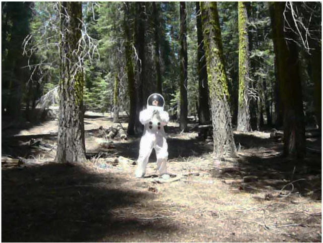
Spheres and pyramids abound throughout “Out of Bounds,” as Huffman — who is African American — uses basketball as a kind of metaphoric lingua franca across his videos (his first pieces in the medium) and abstract paintings of astronomic clusters of balls to convey other forms of travel, whether across racial or temporal lines. Not everything translates, but maybe that’s the point. The sight of a spacesuit-clad Huffman comically embracing his way through a grove of redwoods in the video “Traumanaut Tree Hugger” is both silly and discomfiting, a humorous send-up of the supposed color-blindness of progressive politics and an unintended portrait of total isolation from other humans.

Less ambiguous but certainly more ambitious is Axtman’s ongoing video project “The Love Renegade #308: I Love You Keith Bardwell (Phase 1),” on view at the Van Ness gallery and which the artist is also showing in a series of community screenings. “The Love Renegade” responds to a 2009 incident in which Bardwell, a former Louisiana Justice of the Peace, refused to marry a mixed race couple fearing the rejection they would face by society. In response, Axtman interviewed mixed race couples and the children of mixed race couples who talk about their lives and assure Bardwell that it’s gotten better for them, ending their testimonials with a pledge of unconditional love to Bardwell.

Somerville’s moveable mural “Places I Have Never Been,” on display at SFAC’s Grove Street (155 Grove, SF) window space, is perhaps SHIFT’s most conventional component in terms of its chosen medium. Focusing on six pivotal moments in Bay Area history that affected various minority populations, Somerville has rendered iconic imagery from each event onto the six sides of large cubes that stack on top of one another to create a 10×14 foot wall that when placed together forms a large-scale painting across all its faces. Some of the events, such as the internment of Japanese citizens during WWII or the White Night riots, are more familiar than others (the 1966 Hunters Point uprising that saw residents facing off against 1200 National Guard troops).

Even though I started out this review discussing current events, I’d feel like I was underselling SHIFT if I simply called it timely. The point is that Huffman, Axtman and Somerville have taken the time in the first place to think through one of the most fraught, at times ugly, and always ever-present categories that we must continue to live with. The pieces in SHIFT are discussion prompts not diagnoses. And although they’re articulated with varying degrees of direction and clarity, at least they’re encouraging the conversation about race America never seems to be having to be broached in a way that’s not about blame or personal wrongdoing but accountability to each other.

SHIFT

Through December 10, free

San Francisco Arts Commission Gallery

Various locations, SF

(415) 554-6080

www.sfartscommission.org


Channeling darkness

0

arts@sfbg.com

FILM One of the longest and most unsung stretches of film noir’s half life as an enduring aesthetic sensibility has played out on television. From such former Nick at Night staples as Dragnet and Alfred Hitchcock Presents, to The Twilight Zone, to the neo-noir of Twin Peaks, and more recently, AMC’s drama The Killing, TV has long been home to those lawbreakers, revenge-seekers, and poor souls tormented by unexplained phenomena and sinister plots who once populated the black and white cinematic pulp of the 1940s.

In fact, Hollywood’s fingerprints are all over “TV Noir,” a highly detailed survey of the various types of malfeasance and mystery one could find on television sets during the medium’s golden age. The series’ seven nights of double bills, which kick off at the Roxie Fri/30, are packed with small screen rarities that frequently feature big Hollywood names (or soon-to-be big names) behind or in front of the camera for episodes of now forgotten shows with catchy titles such as Suspense, Danger, Checkmate, and Tales of Tomorrow.

Series curator and Roxie resident noir expert Elliot Lavine has dug deep, unearthing such treasures as Blake Edwards’ unsold 1954 pilot for Mike Hammer, a series that was to be based on Mickey Spillane’s famous hard-boiled detective, which screens opening night. Things get more highbrow with Saturday night’s showcase of “Great Directors.” The aforementioned Hitch is present, directing and producing the tense Cornell Woolrich-inspired “Four O’Clock” from his program Suspicion, which stars E.G. Marshall as a clockmaker who becomes the unwilling victim of his plot to blow up the wife he thinks is cheating on him. I doubt you will squirm through a tenser five minutes than during the episode’s penultimate scene, which showcases Hitchcock’s uncanny ability to manipulate the viewer’s emotions through editing. Also of note is 1951 Danger episode “The System,” an early scorcher by a pre-Hollywood Sidney Lumet, who directs a terrific Eli Wallach.

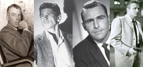
Of course, a survey of the darker side of the small screen would be incomplete without Rod Serling. Serling, who had catapulted his TV career with Kraft Television Theater’s live 1955 live broadcast of his screenplay Patterns, was in high demand and turning out top quality work pre-Twilight Zone, as evinced by the John Frankenheimer-directed 1958 episode of Playhouse 90, “A Town Has Turned to Dust,” which confronts racial prejudice in a poor, drought-ridden town in a way that Mad Men really has yet to do.

Like “A Town,” the other two Serling-scripted episodes in “TV Noir,” “Nightmare at Ground Zero” (a live drama from 1953) and “The Arena” (1956, from Studio One), hold up a cracked mirror to their times, reflecting growing anxieties over nuclear annihilation and the gradual erosion of the established political order.

These themes are given a less refined treatment in some of Lavine’s campier sci-fi selections showcased on Tuesday and Wednesday nights, in which extraterrestrial is more often than not an anagram for communist. Although, the 1958 pilot for Now is Tomorrow offers a more psychologically taut portrayal of the men entrusted to push “the button,” which is paired with the odd Edward R. Murrow-hosted docu-drama “The Night America Trembled” (1957, from Studio One) — a recreation of the night of Orson Welles’ infamous radio broadcast of War of the Worlds with a cameo by Welles himself. Five years later America would face down the threat of annihilation via broadcast during the Cuban Missile Crisis.

“TV Noir” also packs in a few outliers that aren’t to be missed. In the 1954 episode “Bond of Hate,” from British series The Vise, a bitter married couple realize their only recourse is to kill each other. Pamela Abbott’s performance as the harpy-like wife stands next to the late Ann Savage’s turn as the powder keg hitcher in Detour (1945) as an example of how to completely own nearly every second of screen time. Another must-see is the bizarre quiz show, The Plot Thickens (1963); it features an older, but still randy Groucho Marx as part of an “expert” panel that attempts to solve a short whodunit penned by Robert Bloch of Psycho fame. It even had its own mascot: a black cat named Lucifer, which guests were instructed to pass around for good luck. Also of note: television’s early years were also the golden age of sponsorship, and many of episodes in “TV Noir” include each show’s original commercials — including a very young Mike Wallace shilling for Revlon lipstick.


“TV NOIR”

Sept. 30-Oct. 6

Roxie Theater

3117 16th St., SF

(415) 863-1087

www.roxie.com

The sight of sound

0

arts@sfbg.com

HAIRY EYEBALL “Home taping is killing music”, declared the 1980s anti-copyright infringement campaign waged by British music industry trade group, the British Phonographic Industry. History has proven BPI’s concerns to have been mis-targeted, with cassettes becoming an increasingly irrelevant medium in the ensuing decades, even as the music industry still struggles to respond to ever-mercurial forms of bootlegging and pirating. The cassette tape, however, has—perhaps unsurprisingly— re-emerged in recent years as both an object of nostalgia and a more exclusive format for more out-there musicians to release their small, home-made batches of black metal, experimental electronica, or noise out into the world for listeners for whom Tumblr is not enough.

Composer and musician Christian Marclay’s visual art often engages with our complicated relationship to outmoded technologies of audio-visual reproduction, particularly vinyl records. The photograms in his current show at Fraenkel Gallery continues this line of inquiry, playfully condensing the cassette tape’s arc from boon to perceived threat to obsolescence to fetish object.

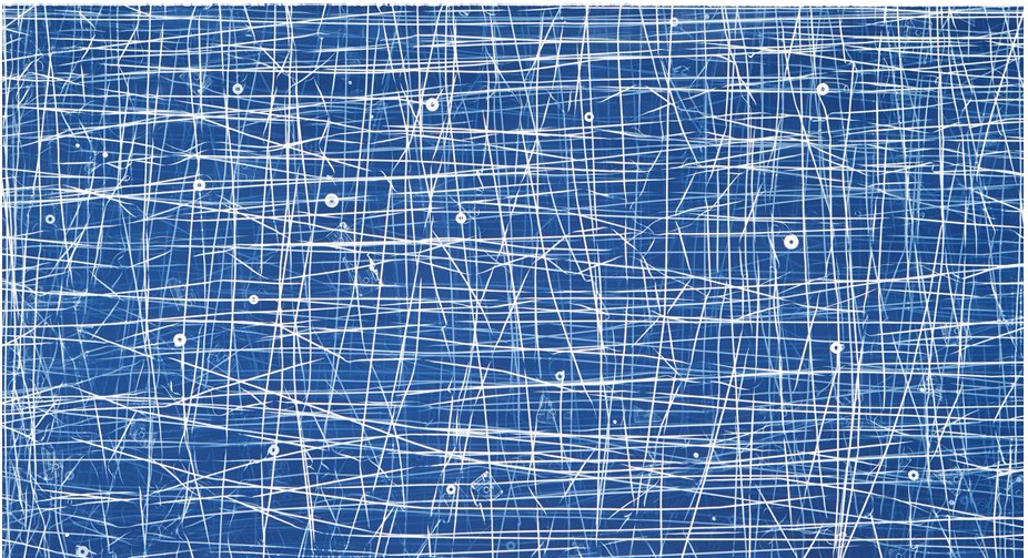
For the gorgeous 2009 photogram “Allover (Dixie Chicks, Nat King Cole and Others),” Marclay exposed photo-sensitized paper to light after he had strewn over it the magnetic innards of cassette tapes and fragments of the broken plastic shells that once contained them that had been coated in a photosensitive solution. The resulting sprawl of tangled white lines on blue brings to mind the splatter canvases of Jackson Pollock or the chalk squiggles of Cy Twombly (associations Marclay’s titular “allover” winks at). In other photograms, such as “Large Cassette Grid No. 9,” also from 2009, Marclay has arranged plastic cassette cases in block-like patterns that cover the entire paper, with each cases’ accumulated wear and tear providing subtle variations.

That cyan-like blue color is what gives Marclay’s chosen process, the cyanotype, its name. Discovered by English scientist Sir John Herschel in 1842, the cyanotype process was historically used to make blueprints. I’d like to imagine that this irony isn’t lost on Marclay. By using an outmoded photographic technology to make visual art out of an outmoded audio technology, Marclay underscores the eventual obsolescence of all reproductive technologies. His cyanotypes aren’t blueprints so much as headstone rubbings.

In “Looking for Love” (2008), a single channel video shown in the gallery’s backroom, Marclay’s stationary camera stays zoomed-in on a well-worn phonographic stylus, as his giant hands roughly skip the needle around record after record searching for any utterance of the word “love.” The film’s exaggerated scale combined with Marclay’s increasingly impatient and roughshod sample hunting can be read as a parody of the audiophile as techno-purist. But the film also speaks to our enduring investment in music—be it the Dixie Chicks, Nat King Cole, or any of the other inaudible “others” that went into the making of Marclay’s cyanotypes—even as our experience of listening to it becomes more and more immaterial.


HOMETOWN GIRL

Fran Herndon was not a name I was familiar with, so I’m glad to now be acquainted with this largely unsung player in San Francisco’s artistic firmament of the 1950s and 1960s (and all around bad-ass) thanks to the eye-opening selection of early oil paintings and mixed-media collages organized by Kevin Killian and Lee Plested currently on view at Altman Siegel.

An Oklahoma native, Herndon moved to San Francisco in 1957 with her husband, the California teacher and writer Jim Herndon, who she met while traveling in France. She quickly fell in with the likes of the Robin Blaser, Jess and his partner Robert Duncan, and Jack Spicer, with whom she formed an intense intellectual and aesthetic bond. Together, they founded the mimeographed poetry and art magazine J, and Herndon created lithographs for poet Spicer’s 1960 master-work The Heads of the Town Up to the Aether. All the while, Herndon continued to produce her own varied body of work that was as much a response to her newfound creative circle of friends and collaborators as it was to the times in which they were making art.

The series of sports themed collages she made in 1962 are especially representative of Herndon’s gift for exploding the hidden currents of emotion contained in her source material—in this case, images clipped from popular magazines such as Sports Illustrated and Life are transformed into near-mythological tableaux of victory and defeat in which race and the volatile racial climate of Civil Rights era-America are front and center (Herndon, who is of Native American heritage, has said “[America] is no place for a brown face”).

In “Collage for Willie Mays” the baseball legend is depicted hitting a homer out of a Grecian colonnade whereas in the decidedly darker and Romare Bearden-esque “King Football” an actual mask has fallen away from the titular ruler, revealing a skull-like visage wrapped in a cloak of newspaper clippings about the 49er’s then-scandalous decision to trade quarterback Y.A. Tittle for Lou Cordilione. The headlines about devastation and death speak to other off-field losses, though.

Other pieces resonate on a more emotional level. The gauche-smudged greyhounds in “Catch Me If You Can” bound past their bucolic counterparts like horses in a Chinese brush painting—all speed and wind—and are as much signs-of-the-times as the more politically overt anti-draft and anti-war collages Herndon made later in the decade.

Certainly, there was no time to wait. So much of Herndon’s art seems to come from an urge to document her “now” with whatever tools she had on hand, a present being lived and produced in the company of so many extraordinary others, from Spicer to Mays. Even her paintings seem to have been worked on only to the point at which their subjects just emerge distinct from their swirled backgrounds of color. Nearly fifty years later, Herndon’s urgency is still palpable.


CHRISTIAN MARCLAY: CYANOTYPES

Through Oct. 29

Fraenkel Gallery

49 Geary, Fourth Floor

(415) 981-2661

www.fraenkelgallery.com


FRAN HERNDON

Through Oct. 29

Altman Siegel Gallery

49 Geary, Fourth Floor

(415) 576-9300

www.altmansiegel.com

Caves of forgotten dreams

0

arts@sfbg.com

HAIRY EYEBALL If you follow Canyon Drive from Hollywood Boulevard all the way up into the hilly territory of Los Angeles’ Griffith Park, you’ll reach a cul-de-sac. Beyond that, accessible by foot, is a small stone bridge which leads to a dirt trail that eventually lets you out in what’s known as Bronson Valley. This is where you’ll find the Bronson Caves.

Even if you’ve never visited the caves in person, you’ve probably at least seen them: they’ve been used in countless motion pictures and television shows. One of the mouths served as the exterior shot for the Bat Cave in the original ’60s Batman TV series. Natalie Wood’s long lost Little Debbie is discovered in one of the caves in 1956 flick The Searchers. The caves also make cameos in plenty of schlocky, B-grade sci-fi and fantasy cheese of both classic (Invasion of the Body Snatchers, 1956) and more recent (The Scorpion King, 2002) vintage.

Given their status as one of the film industry’s leading landscape doubles, it’s only fitting that the caves aren’t actually caves. There’s nothing natural about them: they’re all that remains of an early 1900s quarrying operation to supply stone with which to pave the streets of a rapidly-growing LA. On a clear day, from the other side of one of the tunnels, you can get a seemingly eye level view of the Hollywood sign.

This long history of artifice amid geologic permanence is both everywhere and nowhere in Brice Bischoff’s series of large-scale C-prints of the Bronson Caves currently hanging at Johansson Projects. The caves are the photographs’ crispest formal feature, although it’s the dazzling and seemingly supernatural rainbow-hued blurs within and near them that first catch your eye.

The colorful shapes — which vary in form from blasts of light to smoky wisps — evoke both the caves’ history as a site for staged close encounters of the third kind, as well as nineteenth century spirit photography. They’re also simply beautiful to look at. Their origin, however, is more mundane: wearing raggedy costumes made from colored paper, Bischoff gestures before his stationary camera using the space of the caves to suggest a course of movement. The time lapse captured by the camera’s long exposure renders his presence ghostly while setting into relief the surrounding rocky proscenium, although the artist never disappears entirely. (In one photograph, there is the suggestion of a human form wrapped in the Jamaican flag.)

Even though Bischoff’s presence before the camera is required to create each image, his photographs are the opposite of performance documentation. Rather, they are formally and thematically similar to Hiroshi Sugimoto’s ghostly black and white portraits of old movie palaces, for which the photographer left his exposure open for the duration of a projected feature so that the screen appears as a glowing white light that illuminates the ornate architectural decor around it. So to do Bischoff’s photographs collate an accretion of instances which, individually, are less important than the location in which they’ve occurred. They bring to the fore a history which, at 24 frames per second, has always been relegated to the background.

The Bronson Caves aren’t the only natural feature on display in this exhibit organized around California landscapes. Tabitha Soren’s carbon pigment prints that combine crashing Pacific waves into vertiginous tsunamis and Ellen Black’s videos of doctored beach-scapes and mating snakes pack plenty of visual punch but lack the elegant conceptual underpinnings of Bischoff’s series.

For a more strenuous walk in the wild, you have to trek down Broadway to Jack London Square where at Swarm Gallery Colin Christy’s living installation “Wild and Scenic” throws scare quotes around both terms. For this non-earthwork earthwork Christy transplanted native and invasive plants found around the American River from Coloma, California to a dirt mound in the gallery. The plants are watered on a regular basis, and they’re painted with a bio-luminescent pigment to differentiate between native and non-native plants, so that Christy can track their growth patterns by taking long exposure time lapse photographs at night.

Of course, there’s another contender in this battle royale: humans. The pile of wood, glinting with patches of gold spray paint, that forms a sort of bulkhead on one side of the mound, references the role the American River was forced to play during the Gold Rush, itself a massive piece of terraforming that has indelibly altered California’s landscape. While drawing attention to this history of environmental degradation, Christy’s piece — in all of its gratuitousness — cannot help but be somewhat complicit in perpetuating its legacy. There’s life on the line, here, even if it isn’t human.

BRICE BISCHOFF, TABITHA SOREN, AND ELLEN

BLACK

Through October 15

Johansson Projects

2300 Telegraph Ave., Oakl.

(510) 444-9140

www.johanssonprojects.com


INVASIVE HORIZON: NEW WORK BY JOSEPH

SMOLINSKI AND COLIN CHRISTY

Through Sept 23

Swarm Gallery

560 Second St., Oakl.

(510) 839-2787

www.swarmgallery.com

Transportive

2

MUSIC One way in which to think about the development of what could now be called “ambient electronic music” is to trace the attempts by musicians who fall under that banner to work against and around time.

Terry Riley’s legendary all night concerts of the late ’60s and early ’70s were enabled by a simple tape delay mechanism he dubbed the “time lag generator,” which repeated and echoed the notes Riley repeatedly sounded whether on organ or saxophone. Brian Eno devised Ambient music as a way to make the passing of “free” time — whether spent (as in Eno’s case) bed-ridden recovering from an injury, or, as with his breakthrough 1978 album Music for Airports (EG), waiting for a departing flight — less noticeable. And experimental duo Coil took things to new extremes when they claimed that the slowly evolving synthesizer drones on their composed-under-the-influence-of-psychedelics 1998 release Time Machines were meant to “dissolve time.”

It is fitting then, that J.D. Emmanuel prefers to be thought of as a time traveler rather than as a musician (the self-designation is practically everywhere you look on his website). There is something undeniably transportive about listening to Emmanuel’s expansive meditations for synthesizer and electronic keyboard. Clusters of notes gradually coalesce and dissolve around a dominant drone. Occasionally, he’ll introduce field recordings of environmental sounds — birds, lapping waves, wind — into the mix, but these serve as compliments to the synthesized elements rather than as sonic footholds of the outside world (the point of Emmanuel’s music isn’t to hold on to anything, but to drift).

But, as is now so often the case, were it not for the Internet (another sort of time machine) far fewer listeners would be drifting along. The three LPs of ambient music that Emmanuel self-released in the early to mid ’80s were long considered grails for private press collectors until a Belgian label did a limited re-release of Wizards, Emmanuel’s second album from 1982, in 2007 (followed by its inevitable distribution on file-sharing networks). A compilation of electronic works from 1979-82 followed in 2009, and last year Important Records re-issued Wizards to a wider audience and much critical acclaim which lead Emmanuel to start playing concerts after a near three-decade hiatus.

His closing night set is undoubtedly one of the anticipated highlights of the 12th annual San Francisco Electronic Music Festival, whose location at the Brava Theater should provide a comfortable venue for time traveling without moving.

Emmanuel expressly admits that his own musical approach was greatly shaped by listening to Riley and Steve Reich in 1970. Riley, is in many ways, the Kevin Bacon of electronic music, and his name — along with Reich’s and that of their New York minimalist associate LaMonte Young — make up a cannon unto themselves, leading to inevitable comparisons when discussing younger artists working in a similar vein. The appearance at SFEMF by another elder statesman of drone, Bay Area composer Yoshi Wada, who will be performing with his son Tashi Wada (a composer in his own right) actually brings things full circle.

The elder Wada moved to New York in 1967 and got introduced to drone music via Young and later studied with Pandit Pran Nath, the great North Indian singer who was also Young’s teacher at the time. Their influence is audible in the sonorous, shimmering drones heard on EM Records’ steady output of re-issues of Wada’s two official albums and various concert recordings from the ’70s and ’80s. The younger Wada has very much continued to in his father’s footsteps, exploring harmonic overtones and dissonance in his own practice, and their joint headlining performance on Saturday night is bound to be resonant in more ways than one.


12TH ANNUAL SAN FRANCISCO ELECTRONIC MUSIC FESTIVAL

Sept. 8-11

Brava Theater

2789 24th St., SF

San Francisco Museum of Modern Art

151 3rd St., SF.

(415) 641-7651

www.sfemf.org

Vision statement

0

arts@sfbg.com

FALL ARTS You better start doing your stretches and invest in a good pair of walking shoes. There’s as much ground to cover as there is art to see this fall, and if you get to every gallery, studio, and museum on this far-from-comprehensive list your eyes will probably be as sore as your feet. But as any seasoned hiker will tell you, the views are well worth any aches incurred along the way.

Julie Heffernan: Boy Oh Boy II” “Boschian” is an oft-overused adjective in art writing, and Heffernan’s more-is-more paintings, chock-full of twisted allusions to Renaissance art (Bosch included) and all sorts of fantastic razzle-dazzle, will have you scrambling for synonyms. (Sept. 3–Oct. 29, Catharine Clark Gallery; www.cclarkgallery.com)

Pamela Jorden” I’ll leave the question of whether or not painting’s dead up to more qualified coroners, and simply state that the oil-on-linen works of the young, Los Angeles-based Jorden make a powerful case for the continued relevance of gestural abstraction. There are echoes of Richard Diebenkorn or Clyfford Still in Jorden’s fractured cataracts of color (her blues will make you blush), but compositionally her canvases evince an alchemy that’s entirely her own. (Sept. 16-Oct. 15, Romer Young Gallery; www.romeryounggallery.com).

SF Open Studios Artists, they’re just like us! Seriously, though, one of the many pluses of ArtSpan’s annual city-wide event is that it helps demystify and de-romanticize what it means to be a working artist. Get to know the creative types in your neighborhood, see where the magic happens, and maybe help stimulate the local economy (hint, hint). (Oct. 1-18, various venues; www.artspan.org.)

Lionel Bawden: The World of the Surface” The title of Badwen’s American debut is a half-truth. His sculptural works, comprised of hexagonal colored pencils grouped together and shorn, topiary-like, into amorphous shapes, suggest a world far below the surface: caves, fatty tissue, cells. Dive in. (Oct. 1–Nov. 26, Frey Norris Gallery; www.freynorris.com.)

Houdini: Art and Magic” How does a museum escape the confines of the now tired “contemporary artists responding to famous historical figure X” approach to curating? Do like the Contemporary Jewish Museum and put on a show about legendary escape artist Harry Houdini. Come for tributes by Vik Muniz, Jane Hammond, etc. (what, no Matthew Barney?) but stay for a recreation of his famous Water Torture Cell illusion, along with the hundred other bits of Houdiniana. (Oct. 2–Jan. 16., 2012, Contemporary Jewish Museum; www.thecjm.org.)

Ralph Eugene Meatyard” The very banality of Meatyard’s biography — he was a happily married optician in Lexington, Ken. who did photography as a weekend hobby — only makes his singular and startling body of work that much more so: from children creepily posed with dolls and masks to bold experiments with abstraction and “no focus” imagery, Meatyard’s pictures push into territory far more strange and wondrous than the Gothic South. (Oct. 8- Feb. 26, de Young Museum, www.famsf.org.)

“Geoff Oppenheimer” Oppenheimer makes conceptually smart and visually arresting installation and video work that frequently voices the unspoken dynamics behind public performances of controlled discourse, such as press conferences. Be prepared to be discomfited. (Oct. 28–Dec. 11, Ratio 3; www.ratio3.org).

The Air We Breathe” I have some serious reservations about the San Francisco Museum of Modern Art’s decision to organize their first major contemporary group show in a long while around “the cause of marriage equality” (for starters, why not host “Hide/Seek,” the previously censored and now traveling exhibit about same-sex desire and American portraiture currently at the Tacoma Art Museum, instead?). That said, something truly queer, politically risky and aesthetically challenging has gotta happen when you put specially commissioned works by the likes of John Ashbery, Dodie Bellamy, Raymond Pettibon, Ann Hamilton, and Robert Gober (and many others) under one roof, right? For now, consider my tongue held and eyebrow raised. (Nov. 5–Feb. 20, 2012; SFMOMA, www.sfmoma.org.)

The persistence of objects

3

arts@sfbg.com

HAIRY EYEBALL German artist Kurt Schwitters (1887-1948) acted as an interpreter for the discards of modern life, or what Alfred Barr, the first curator of New York’s Museum of Modern Art, tellingly referred to as, “witnesses stolen from the ground.” He listened to what the matchbook covers, torn ticket stubs, crinkled packaging, scrap paper, fabric remnants, and other junk that he took back to his studio had to say about form and color, and in turn, re-presented their testimonies to the world in which they once circulated.

Berkeley Art Museum’s exhibit “Kurt Schwitters: Color and Collage,” the first US survey of the artist’s work in 25 years, traces the dialogue between found things and made objects that comprises Schwitters’ remarkable oeuvre. The 30 some-odd works that fill BAM’s sixth floor gallery are densely indeterminate, neither strictly paintings nor collages, but hybrids of both that reflect Schwitters’ association with the Berlin Dadaists — and also his background in painting, which accounts for both the influence Expressionism, and later, Constructivism, would have on his approach to composition.

In some pieces the assembled components have been pushed and flattened into each other, with the paste acting as both fixing agent and mixing medium, giving the work the appearance of having been painted — which in a sense it has been, if you substitute paper scraps for brushes and oils. In other works, bas relief-like effects are created through successively built up and painted-over layers in geometric arrangements that become more precise over time. In every piece, there is a careful attention to the grain of the materials used as well as their color (Schwitters gravitated towards an autumnal palette of reds, blacks, browns, and yellows, with occasional streaks of blue or gray).

As with other artists of his generation, Schwitters’ life and career was to be inevitably shaped by both world wars (his trajectory from Germany to Norway to England was largely determined by where the Nazis weren’t). Schwitters referred to his output interchangeably as Merz, a neologism based on the second half of Kommerz, the German word for “commerce.” The designation reflected his desire for his practice to, in his words, “make connections, if possible, between everything” in a world he saw as increasingly fragmented.

Whereas his Dadaist contemporaries such as John Heartfield and Hannah Höch cut apart newspapers and film rags and reconfigured them as monstrous satires of the noisy, busy society that produced them as spectacular propaganda, Schwitters’ work proposes an engagement with its various found source materials based on assimilation and incorporation rather than harsh juxtaposition. Everywhere in Schwitters’ work there is the glint of the familiar: the postage marks, the trademarks, bits of text, and reproduced images in his skeins of torn pulp and paint identify specific places, times, and events.

The Merzbau — a vast, ongoing architectural assemblage that took over six rooms of Schwitters’ family home in Hannover and which was completely destroyed in a 1943 bombing raid — is perhaps the apotheosis of Schwitters’ vision. Like a beaver building a dam, Schwitters constantly added bits and pieces, inviting friends to build out alcoves within the all-white grotto-like rooms whose square lines had totally given way to myriad angled surfaces and seemingly-impossible proportions.

On BAM’s ground floor sits Peter Bissegger’s meticulous, life-size reconstruction (1981-83) of one of the Hannover rooms. It’s a doozy to walk into, and, once you’re out again, near-impossible to try and square the three dimensional geometric assault just experienced against the three wall-mounted 1933 black and white interior photos on which the reconstruction was based. Save perhaps for the Winchester Mystery House, you will simply not experience another space like it, or have your experience of space so wonderfully warped (even BAM’s interior, which offers a Brutalist response to the Guggenheim’s famous spiraling rotunda, seems positively orderly by comparison).

While undeniably cool as an object, in some respects, the reconstructed Merzbau conceptually cuts against Schwitters’ process of ongoing accumulation that led to its construction in the first place. To have the Merzbau be a wholly transportable thing that can be taken down and re-assembled, jigsaw puzzle-style (as demonstrated in an accompanying time lapse video of the piece’s installation), is to fail to treat it as something that has no final form but is always in the process of becoming. Indeed, it’s telling that Schwitters built other Merz environments wherever he moved, at each location spinning anew another web of form and shape culled from bits and pieces of his surroundings. The task he had set before himself to connect the world anew would prove to be unending. 


KURT SCHWITTERS: COLOR AND COLLAGE

Through Nov. 27, $7-$10

Berkeley Art Museum

2626 Bancroft, Berk.

(510) 642-0808 www.bampfa.berkeley.edu

Just say no

0

arts@sfbg.com

HAIRY EYEBALL Summertime is supposed to be about taking it easy and soaking up good vibes. This is decidedly not the case with “Negative Space,” Steven Wolf Fine Arts’ current group show that, like an old punk rock mix-tape, delivers one lean, catchy declaration of refusal after another.

This is not to say that “Negative Space” sounds only one note. Each of the 10 featured artists offers a different enough riff on the exhibit’s title (one shared by Matt Borruso’s slim, collage-filled hardcover volume, on display here; itself a nod to the late critic Manny Farber’s classic 1971 collection of film criticism) to avoid turning an organizing principal into too much of a gimmick. There’s also enough well-delivered black humor to prevent this modest collection of deliberately difficult, critically-minded and middle-finger-waving art from becoming either overly self-serious or gratingly puerile.

Nicholas Knight, for one, is more prankster than killjoy. His Permission Slip (2010) is a pad of those very paper indulgences — free for the taking — printed with the artist’s signature (as “witness”), along with a place for the holder to sign into effect the statement, “I have permission.” “Permission to do what, exactly?” is the natural follow-up question, and one which Knight’s ludicrous contract leaves unanswered with a pithy shrug of non-commitment.

Jeffrey Augustan Songco’s Nice Body, Bro! (2011), which features the titular phrase spelled out in white three-dimensional lettering over a background of what look like rainbow-colored paillettes, becomes a sight gag about transubstantiation once one knows, courtesy of the wall card, that the large sequins are, in fact, glitter-covered communion wafers.

More clever is David Robbins’ Fuck Buttons, 1985-87, a tic-tac-toe grid of purple-and-orange hued photographs of 1″ buttons, each adorned with a different usage of the word “fuck.” The piece’s initial giddy rush of profanity gradually runs out of steam as various self-canceling dialogues emerge out of the buttons’ placements next to each other. The resulting imaginary arguments read like obscene variations on the old “who’s on first?” routine (for example, the piece’s middle row, left to right, reads: “Fuck you,” “Don’t fuck with me,” “Fuck me”).

The real stand-outs of the gallery’s front room, however, eschew the Pop-isms of Songco and Robbins. Whitney Lynn’s sculpture Animal Trap (2011), a black plexiglass cube with an open bottom propped up at an angle by a sawed-off tree branch, sits in the middle of the floor, as if lying in wait. The piece takes Minimalist sculpture’s classic forms (the cube) and materials (transparent plastic, wood) and, with its suggestive title and familiar arrangement, freights them with unexpected emotion and an implied narrative that has a decidedly unhappy ending.

Animal Trap faces down James Hayward’s Automatic Black Painting #9 (1975), perhaps the purest, if also the most traditional, interpretation of the exhibit’s title. Unlike Ad Reinhardt’s black paintings from the previous decade, which reveal embedded grids and distinct shades upon prolonged viewing, Hayward’s darkness harbors no hidden designs. In fact, the point of his early monochromatic canvases, such as this one, was to erase his hand entirely by laboriously building up thin layers of pigment to avoid any traces of brushstroke. The resulting 36 x 36 inch oil slick is all that remains of Hayward’s slow, cumulative self-exorcism.

In the gallery’s rear “lounge” area hang Christine Wong Yap’s meticulous, cartoon-like ink drawings on gridded vellum, illustrating various quotes from positive psychological studies on topics such as learned optimism and creativity as applied to the lives of artists. Despite the occasional glint of a glitter pen or iridescent foil rainbow, these selections from the series Positive Signs (2011) come off as more humorously pessimistic when presented together than they did when they originally appeared on the San Francisco Museum of Modern Art’s Open Space blog earlier this year as weekly posts.

Wong Yap’s charts and diagrams, to some degree, metabolize the very clinical discourses about happiness and creativity that they also satirize, making for a strange cocktail of uppers and downers when viewed alongside the lithographs of posters and texts by Guy Debord and the Situationist International — earlier and more pointedly political examples of what would later be called culture jamming — that hang opposite.

It is easy to imagine, say, Wong Yap depicting “live without dead time,” an old Situationist slogan that was scrawled by May ’68 protestors on the same Paris streets that Debord had previously cut apart and re-mapped for dreamers and drifters in his famous chart Guide Psychogeographique de Paris (1957, also hanging), as another nugget of motivational wisdom. The Spectacle for the win, folks?

Then again, maybe I’m just being pessimistic, an attitude which “Negative Space” doesn’t so much as inundate you with, like the noxious signature scent that wafts out of Abercrombie and Fitch stores, but rather involuntarily triggers, as when a stranger begins to violently cough on a crowded bus. You find yourself shrinking away, but the impulse to cough, too, is irrepressible.

“NEGATIVE SPACE”

Through Aug. 27

Steven Wolf Fine Arts

2747 19th Street, Ste. A, SF

(415) 293-3677

www.stevenwolffinearts.com

California dreaming

2

arts@sfbg.com

HAIRY EYEBALL In his review of the latest Venice Biennale, Boston Globe art critic Sebastian Smee threw down something of a gauntlet when he wrote, “The received wisdom is that contemporary art is mostly about ideas. In truth, however, it’s mostly about gestures.”

Smee’s generalization offers plenty to chew on and plenty to disagree with. For starters, it implicitly presents one of art’s oldest chicken-egg scenarios — one that was muddied decades ago by Marcel Duchamp and later Conceptual Art — as a false choice between thought and spectacle, sustained engagement and capricious showmanship.

But it can also be read as a pretty spot-on diagnosis of the current moment in art — at least, as refracted through the fun house mirror of the Biennale — in which having a gimmick, however thought through or critically engaged, or bringing out the big guns guarantees attention in an increasingly crowded market already clogged with gimmicks and big guns.

Bay Area Now, Yerba Buena Center for the Arts’ triennial snapshot of local creative culture, is the closest thing the Bay Area has to the Biennale and also, thankfully, the furthest thing from it. Still, Smee’s comment provides a useful rubric for navigating its sixth installment, which is full of gestures (some well-executed, others not so much) that at times overshadow the ideas (some half-baked, others worth mulling over) they’re meant to put across.

Visual art curators Betti-Sue Hertz and Thien Lam have pared the number of participating artists, now augmented by art collectives, to a tidy 18. This smaller range gives each participant’s work — most of it created especially for BAN6 — a little more breathing room, although the exhibition’s layout isn’t exactly conducive to following the connecting threads (environmentalism, geopolitics, Americana, and local subcultures, among other topics) unspooled in their curators’ statement.

Tammy Rae Carland’s wonderful series of work about the self-effacing price female comedians have had to pay (and continue to pay) to get a laugh is the first thing you see when you enter. But her photographs of local comediennes in ambiguous forms of self-presentation, text pieces that isolate the painful punch lines of Phyllis Diller, Joan Rivers, et al., and banana peels cast in brass are spread between two floors: a confusing arrangement if you don’t directly proceed up the stairway next to which Carland has created an elegiac installation that, save for the large helium balloons suspending a porcelain microphone, is also easy to miss.

YBCA’s main gallery is another case in point: it’s a good site for large installations that pack a lot of visual impact (think Song Dong’s Waste Not or Nick Cave’s soundsuits), but can pose a challenge for arranging groups of smaller-scale pieces coherently. It’s too bad, then, that the three box-like structures housing works by Brion Nuda Rosch, Rio Babe International, and Chris Sollars cut diagonally across the space like a semipermeable wall of shipping crates. Incidentally, these installations are also some of BAN6’s least compelling pieces.

Harder to ignore is Ben Venom’s See You on the Other Side, a giant quilt whose centerpiece motif of snakes sprouting from a human skull, all made from old metal band T-shirt scraps, only becomes visible as your eyes adjust to the surrounding negative space. It is, in a word, awesome. But it’s also a canny fusion of craft traditions already present in metal subcultures — the quilt is flanked by two cut-off embroidered and studded denim vests, familiar handmade vestments of the tribe — with an older American precedent.

Quilting is also taken up in Suzanne Husky’s nearby Sleep Cell Hotel installation, a collection of three potentially inhabitable nest-like wooden structures that resemble porcupines, replete with quilts covered in radical slogans. A goofy infomercial touts the dwellings as the next development in politically conscious eco-tourism, while a hand-drawn sign warns of their structural unsoundness. Husky’s isolation tanks take the piss out of radical chic and backpackers alike while questioning the impact even the most well-intentioned and off-the-grid 21st century nomads leave in the wake of their habitats beyond carbon footprints.

That question is reframed in more ambiguous terms by Ranu Mukherjee’s wonderful series of drawings and watercolors of “nomadic artifacts” located in YBCA’s smaller second gallery. Each work is based on an image or stories sent to Mukherjee by friends and associates that reflect their conception of the nomadic, a process of translation neatly embodied by the blank fields against which a camper van or an ancient Egyptian temple is depicted. Isolated from their original contexts, these purloined postcards from the edge form an ongoing archive of mobile existence (the call for submissions is still open).

This second room — darkened to accommodate a video projection by Mukherjee as well as Sean McFarland’s crepuscular, large-format photographs of forest interiors — is actually BAN6’s most coherent grouping, with Weston Teruya’s architectural model-like paper sculptures and Richard T. Walker’s winsome three channel video installation rounding out a chorale of differing takes on land use, abuse, occupation, and representation.

In many cases at BAN6, ambition tends to exceed execution, but the results — as with Tony Labat’s large neon marijuana leaf that, seen from the outside, makes YBCA’s Mission Street lobby look like the city’s chicest pot dispensary — still pack a punch. Whether that is enough, or enough for a “moment in time” group survey such as this, is another question.

BAY AREA NOW 6

Through Sept. 25

Thurs.–Sat., noon–8 p.m.; Sun, noon–6 p.m., $5–$7

Yerba Buena Center for the Arts

701 Mission, SF

www.ybca.org