• No categories

Visual Art

Spellbound

0

Harry Houdini: the name conjures up a multitude of images and ideas about what a magician and escape artist should be. The Contemporary Jewish Museum in San Francisco is currently celebrating that rich and long-lasting legacy with Houdini: Art and Magic, a new exhibit featuring a collection of vintage photographs, event posters, archival film, original props, art installations, and more, focusing on the world’s most famous magician — who died in 1926, on Halloween.

“The genesis for the show was just really seeing how Houdini’s relevance still remains today in popular culture, and how despite being born in 1874, he still is so visible in the culture, visible in contemporary art. His celebrity has really transcended three centuries,” says CJM curator Dara Solomon.

The exhibition was originally put together by the Jewish Museum in New York, with the CJM also getting involved early on in the process, as local organizers felt that there would be a strong interest in Houdini from the Bay Area — after all, the legendary icon had performed in San Francisco several times; he appeared at the Orpheum Theater, broke out of locked box lowered into the bay at Aquatic Park, and hung off the side of the Hearst Building to perform his famous straitjacket escape stunt.

Tracing Houdini’s life from his birth as Erich Weiss in Budapest in 1874 and following his family’s immigration to the United States, his upbringing as the son of a rabbi, and the eventual evolution of his performing talents and ascension to the world stage, the exhibit tells Houdini’s story through displays of rarely-seen personal photographs, handwritten journals, and what may be the biggest draws for fans — a trunk, milk can, straitjacket, and handcuffs that actually belonged to the magician and were used in his shows.

What visitors to the exhibit won’t see are any explanations or descriptions revealing Houdini’s secrets — something that organizers wanted to avoid.

“It would be seen as the ultimate sort of betrayal if the exhibition set out to reveal Houdini’s tricks,” says Solomon. “He worked so hard at making his body this sort of instrument to do these performances, he was in such amazing physical shape — that was what really allowed him to do these amazing feats of strength.”

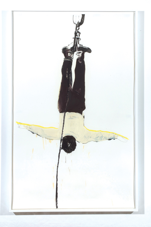
Another aspect to the exhibit is the exploration of the impact of Houdini and his mystique on contemporary artists — paintings and other installations from artists such as Deborah Oropallo and Raymond Pettibon add to the survey of his legacy.

“So many artists in the past 20 or 25 years have really been taken by Houdini as inspiration and as a model for how an artist works; they find this real connection with the art of the magician and the art that they make, that they are both illusionists,” says Solomon.

For 10 years after his death, Houdini’s widow Bess conducted séances on Halloween attempting to contact and communicate with him from beyond the grave — with his ever-growing popularity, and a new fan base with each new generation, somebody, somewhere in the world will undoubtedly be trying to do the same on Monday night.

“I think that there has been nobody else like him — he was such a master of communications and a marketing genius that he ensured that he left this incredible legacy,” says Solomon. “When people think of the world of magic, he is still the one and only.”


HOUDINI: ART AND MAGIC

Through Jan. 16, 2012

Thurs., 1-8 p.m.; Fri.-Tues., 11 a.m.-5 p.m.

$5–<\d>$12 (18 and under free)

Contemporary Jewish Museum

736 Mission, SF

(415) 655-7800

www.thecjm.org

Uncomfortable truths

3

arts@sfbg.com

HAIRY EYEBALL Sometimes it seems like Americans would rather undergo a root canal than honestly talk about race in this country. Witness the rounds of recrimination and defensive posturing on all sides that followed the Washington Post’s recent front page story that the hunting camp Texas governor Rick Perry has long frequented was formerly known as “Niggerhead.”

Perry acknowledged that the camp’s original name was “offensive,” and in a move akin to the white paint that Perry’s own father brushed onto the rock on which it is carved, tellingly declared, “[it] has no place in the modern world.” This is a story a lot of people, not just Republican Texans, like to tell themselves about racism — it’s all in the past, or, if racism manifests itself presently, it is a crime committed by only the most egregious and malicious perpetrators. It’s this kind of magical thinking that makes a narrative like The Help, with its privileged-but-sympathetic heroine giving her cartoonishly racist sisters their comeuppance, a guaranteed best-seller and a box-office draw.

How refreshing then is SHIFT, a series of solo projects by Bay Area artists David Huffman, Elizabeth Axtman, and Travis Somerville newly commissioned by the San Francisco Arts Commission. Employing different mediums and narrative strategies—crowd-sourced community intervention (Axtman), historical reconstruction (Somerville), science fiction-tinged Afro Futurism (Huffman) — each artist works through the messy business of how race is lived in America today in ways that are deeply personal, and at times, politically oblique.

Huffman’s contribution, “Out of Bounds,” which takes over most of the SFAC’s Van Ness gallery space (401 Van Ness, SF), packs the most visual impact of SHIFT’s three propositions and also leaves the most dots to connect. At its center is a towering pyramid of 650 basketballs, held in place solely by gravity and a simple wood frame at the pile’s base. The smell of rubber hits your nostrils before you have a chance to take in the piece visually.

Huffman, whose background is in painting, has materialized this formation before in a 2006 series of mixed media canvases which depict similar heaps of balls next to barren trees, as if they were piles of raked autumn leaves. Its current sculptural incarnation is far more monumental, like some arrangement of mythological fruit. But unlike Jeff Koons’ 1985 hermetically-sealed, readymade “Three Ball 50/50 Tank (Two Dr. J. Silver Series, One Wilson Supershot),” Huffman’s pyramid is in fact temporary: the balls will be donated to local charities after the piece is deconstructed.

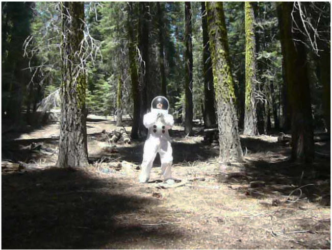
Spheres and pyramids abound throughout “Out of Bounds,” as Huffman — who is African American — uses basketball as a kind of metaphoric lingua franca across his videos (his first pieces in the medium) and abstract paintings of astronomic clusters of balls to convey other forms of travel, whether across racial or temporal lines. Not everything translates, but maybe that’s the point. The sight of a spacesuit-clad Huffman comically embracing his way through a grove of redwoods in the video “Traumanaut Tree Hugger” is both silly and discomfiting, a humorous send-up of the supposed color-blindness of progressive politics and an unintended portrait of total isolation from other humans.

Less ambiguous but certainly more ambitious is Axtman’s ongoing video project “The Love Renegade #308: I Love You Keith Bardwell (Phase 1),” on view at the Van Ness gallery and which the artist is also showing in a series of community screenings. “The Love Renegade” responds to a 2009 incident in which Bardwell, a former Louisiana Justice of the Peace, refused to marry a mixed race couple fearing the rejection they would face by society. In response, Axtman interviewed mixed race couples and the children of mixed race couples who talk about their lives and assure Bardwell that it’s gotten better for them, ending their testimonials with a pledge of unconditional love to Bardwell.

Somerville’s moveable mural “Places I Have Never Been,” on display at SFAC’s Grove Street (155 Grove, SF) window space, is perhaps SHIFT’s most conventional component in terms of its chosen medium. Focusing on six pivotal moments in Bay Area history that affected various minority populations, Somerville has rendered iconic imagery from each event onto the six sides of large cubes that stack on top of one another to create a 10×14 foot wall that when placed together forms a large-scale painting across all its faces. Some of the events, such as the internment of Japanese citizens during WWII or the White Night riots, are more familiar than others (the 1966 Hunters Point uprising that saw residents facing off against 1200 National Guard troops).

Even though I started out this review discussing current events, I’d feel like I was underselling SHIFT if I simply called it timely. The point is that Huffman, Axtman and Somerville have taken the time in the first place to think through one of the most fraught, at times ugly, and always ever-present categories that we must continue to live with. The pieces in SHIFT are discussion prompts not diagnoses. And although they’re articulated with varying degrees of direction and clarity, at least they’re encouraging the conversation about race America never seems to be having to be broached in a way that’s not about blame or personal wrongdoing but accountability to each other.

SHIFT

Through December 10, free

San Francisco Arts Commission Gallery

Various locations, SF

(415) 554-6080

www.sfartscommission.org


The sight of sound

0

arts@sfbg.com

HAIRY EYEBALL “Home taping is killing music”, declared the 1980s anti-copyright infringement campaign waged by British music industry trade group, the British Phonographic Industry. History has proven BPI’s concerns to have been mis-targeted, with cassettes becoming an increasingly irrelevant medium in the ensuing decades, even as the music industry still struggles to respond to ever-mercurial forms of bootlegging and pirating. The cassette tape, however, has—perhaps unsurprisingly— re-emerged in recent years as both an object of nostalgia and a more exclusive format for more out-there musicians to release their small, home-made batches of black metal, experimental electronica, or noise out into the world for listeners for whom Tumblr is not enough.

Composer and musician Christian Marclay’s visual art often engages with our complicated relationship to outmoded technologies of audio-visual reproduction, particularly vinyl records. The photograms in his current show at Fraenkel Gallery continues this line of inquiry, playfully condensing the cassette tape’s arc from boon to perceived threat to obsolescence to fetish object.

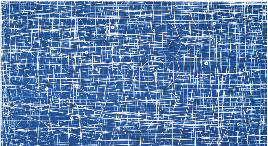
For the gorgeous 2009 photogram “Allover (Dixie Chicks, Nat King Cole and Others),” Marclay exposed photo-sensitized paper to light after he had strewn over it the magnetic innards of cassette tapes and fragments of the broken plastic shells that once contained them that had been coated in a photosensitive solution. The resulting sprawl of tangled white lines on blue brings to mind the splatter canvases of Jackson Pollock or the chalk squiggles of Cy Twombly (associations Marclay’s titular “allover” winks at). In other photograms, such as “Large Cassette Grid No. 9,” also from 2009, Marclay has arranged plastic cassette cases in block-like patterns that cover the entire paper, with each cases’ accumulated wear and tear providing subtle variations.

That cyan-like blue color is what gives Marclay’s chosen process, the cyanotype, its name. Discovered by English scientist Sir John Herschel in 1842, the cyanotype process was historically used to make blueprints. I’d like to imagine that this irony isn’t lost on Marclay. By using an outmoded photographic technology to make visual art out of an outmoded audio technology, Marclay underscores the eventual obsolescence of all reproductive technologies. His cyanotypes aren’t blueprints so much as headstone rubbings.

In “Looking for Love” (2008), a single channel video shown in the gallery’s backroom, Marclay’s stationary camera stays zoomed-in on a well-worn phonographic stylus, as his giant hands roughly skip the needle around record after record searching for any utterance of the word “love.” The film’s exaggerated scale combined with Marclay’s increasingly impatient and roughshod sample hunting can be read as a parody of the audiophile as techno-purist. But the film also speaks to our enduring investment in music—be it the Dixie Chicks, Nat King Cole, or any of the other inaudible “others” that went into the making of Marclay’s cyanotypes—even as our experience of listening to it becomes more and more immaterial.


HOMETOWN GIRL

Fran Herndon was not a name I was familiar with, so I’m glad to now be acquainted with this largely unsung player in San Francisco’s artistic firmament of the 1950s and 1960s (and all around bad-ass) thanks to the eye-opening selection of early oil paintings and mixed-media collages organized by Kevin Killian and Lee Plested currently on view at Altman Siegel.

An Oklahoma native, Herndon moved to San Francisco in 1957 with her husband, the California teacher and writer Jim Herndon, who she met while traveling in France. She quickly fell in with the likes of the Robin Blaser, Jess and his partner Robert Duncan, and Jack Spicer, with whom she formed an intense intellectual and aesthetic bond. Together, they founded the mimeographed poetry and art magazine J, and Herndon created lithographs for poet Spicer’s 1960 master-work The Heads of the Town Up to the Aether. All the while, Herndon continued to produce her own varied body of work that was as much a response to her newfound creative circle of friends and collaborators as it was to the times in which they were making art.

The series of sports themed collages she made in 1962 are especially representative of Herndon’s gift for exploding the hidden currents of emotion contained in her source material—in this case, images clipped from popular magazines such as Sports Illustrated and Life are transformed into near-mythological tableaux of victory and defeat in which race and the volatile racial climate of Civil Rights era-America are front and center (Herndon, who is of Native American heritage, has said “[America] is no place for a brown face”).

In “Collage for Willie Mays” the baseball legend is depicted hitting a homer out of a Grecian colonnade whereas in the decidedly darker and Romare Bearden-esque “King Football” an actual mask has fallen away from the titular ruler, revealing a skull-like visage wrapped in a cloak of newspaper clippings about the 49er’s then-scandalous decision to trade quarterback Y.A. Tittle for Lou Cordilione. The headlines about devastation and death speak to other off-field losses, though.

Other pieces resonate on a more emotional level. The gauche-smudged greyhounds in “Catch Me If You Can” bound past their bucolic counterparts like horses in a Chinese brush painting—all speed and wind—and are as much signs-of-the-times as the more politically overt anti-draft and anti-war collages Herndon made later in the decade.

Certainly, there was no time to wait. So much of Herndon’s art seems to come from an urge to document her “now” with whatever tools she had on hand, a present being lived and produced in the company of so many extraordinary others, from Spicer to Mays. Even her paintings seem to have been worked on only to the point at which their subjects just emerge distinct from their swirled backgrounds of color. Nearly fifty years later, Herndon’s urgency is still palpable.


CHRISTIAN MARCLAY: CYANOTYPES

Through Oct. 29

Fraenkel Gallery

49 Geary, Fourth Floor

(415) 981-2661

www.fraenkelgallery.com


FRAN HERNDON

Through Oct. 29

Altman Siegel Gallery

49 Geary, Fourth Floor

(415) 576-9300

www.altmansiegel.com

Caves of forgotten dreams

0

arts@sfbg.com

HAIRY EYEBALL If you follow Canyon Drive from Hollywood Boulevard all the way up into the hilly territory of Los Angeles’ Griffith Park, you’ll reach a cul-de-sac. Beyond that, accessible by foot, is a small stone bridge which leads to a dirt trail that eventually lets you out in what’s known as Bronson Valley. This is where you’ll find the Bronson Caves.

Even if you’ve never visited the caves in person, you’ve probably at least seen them: they’ve been used in countless motion pictures and television shows. One of the mouths served as the exterior shot for the Bat Cave in the original ’60s Batman TV series. Natalie Wood’s long lost Little Debbie is discovered in one of the caves in 1956 flick The Searchers. The caves also make cameos in plenty of schlocky, B-grade sci-fi and fantasy cheese of both classic (Invasion of the Body Snatchers, 1956) and more recent (The Scorpion King, 2002) vintage.

Given their status as one of the film industry’s leading landscape doubles, it’s only fitting that the caves aren’t actually caves. There’s nothing natural about them: they’re all that remains of an early 1900s quarrying operation to supply stone with which to pave the streets of a rapidly-growing LA. On a clear day, from the other side of one of the tunnels, you can get a seemingly eye level view of the Hollywood sign.

This long history of artifice amid geologic permanence is both everywhere and nowhere in Brice Bischoff’s series of large-scale C-prints of the Bronson Caves currently hanging at Johansson Projects. The caves are the photographs’ crispest formal feature, although it’s the dazzling and seemingly supernatural rainbow-hued blurs within and near them that first catch your eye.

The colorful shapes — which vary in form from blasts of light to smoky wisps — evoke both the caves’ history as a site for staged close encounters of the third kind, as well as nineteenth century spirit photography. They’re also simply beautiful to look at. Their origin, however, is more mundane: wearing raggedy costumes made from colored paper, Bischoff gestures before his stationary camera using the space of the caves to suggest a course of movement. The time lapse captured by the camera’s long exposure renders his presence ghostly while setting into relief the surrounding rocky proscenium, although the artist never disappears entirely. (In one photograph, there is the suggestion of a human form wrapped in the Jamaican flag.)

Even though Bischoff’s presence before the camera is required to create each image, his photographs are the opposite of performance documentation. Rather, they are formally and thematically similar to Hiroshi Sugimoto’s ghostly black and white portraits of old movie palaces, for which the photographer left his exposure open for the duration of a projected feature so that the screen appears as a glowing white light that illuminates the ornate architectural decor around it. So to do Bischoff’s photographs collate an accretion of instances which, individually, are less important than the location in which they’ve occurred. They bring to the fore a history which, at 24 frames per second, has always been relegated to the background.

The Bronson Caves aren’t the only natural feature on display in this exhibit organized around California landscapes. Tabitha Soren’s carbon pigment prints that combine crashing Pacific waves into vertiginous tsunamis and Ellen Black’s videos of doctored beach-scapes and mating snakes pack plenty of visual punch but lack the elegant conceptual underpinnings of Bischoff’s series.

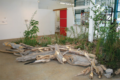
For a more strenuous walk in the wild, you have to trek down Broadway to Jack London Square where at Swarm Gallery Colin Christy’s living installation “Wild and Scenic” throws scare quotes around both terms. For this non-earthwork earthwork Christy transplanted native and invasive plants found around the American River from Coloma, California to a dirt mound in the gallery. The plants are watered on a regular basis, and they’re painted with a bio-luminescent pigment to differentiate between native and non-native plants, so that Christy can track their growth patterns by taking long exposure time lapse photographs at night.

Of course, there’s another contender in this battle royale: humans. The pile of wood, glinting with patches of gold spray paint, that forms a sort of bulkhead on one side of the mound, references the role the American River was forced to play during the Gold Rush, itself a massive piece of terraforming that has indelibly altered California’s landscape. While drawing attention to this history of environmental degradation, Christy’s piece — in all of its gratuitousness — cannot help but be somewhat complicit in perpetuating its legacy. There’s life on the line, here, even if it isn’t human.

BRICE BISCHOFF, TABITHA SOREN, AND ELLEN

BLACK

Through October 15

Johansson Projects

2300 Telegraph Ave., Oakl.

(510) 444-9140

www.johanssonprojects.com


INVASIVE HORIZON: NEW WORK BY JOSEPH

SMOLINSKI AND COLIN CHRISTY

Through Sept 23

Swarm Gallery

560 Second St., Oakl.

(510) 839-2787

www.swarmgallery.com

Vision statement

0

arts@sfbg.com

FALL ARTS You better start doing your stretches and invest in a good pair of walking shoes. There’s as much ground to cover as there is art to see this fall, and if you get to every gallery, studio, and museum on this far-from-comprehensive list your eyes will probably be as sore as your feet. But as any seasoned hiker will tell you, the views are well worth any aches incurred along the way.

Julie Heffernan: Boy Oh Boy II” “Boschian” is an oft-overused adjective in art writing, and Heffernan’s more-is-more paintings, chock-full of twisted allusions to Renaissance art (Bosch included) and all sorts of fantastic razzle-dazzle, will have you scrambling for synonyms. (Sept. 3–Oct. 29, Catharine Clark Gallery; www.cclarkgallery.com)

Pamela Jorden” I’ll leave the question of whether or not painting’s dead up to more qualified coroners, and simply state that the oil-on-linen works of the young, Los Angeles-based Jorden make a powerful case for the continued relevance of gestural abstraction. There are echoes of Richard Diebenkorn or Clyfford Still in Jorden’s fractured cataracts of color (her blues will make you blush), but compositionally her canvases evince an alchemy that’s entirely her own. (Sept. 16-Oct. 15, Romer Young Gallery; www.romeryounggallery.com).

SF Open Studios Artists, they’re just like us! Seriously, though, one of the many pluses of ArtSpan’s annual city-wide event is that it helps demystify and de-romanticize what it means to be a working artist. Get to know the creative types in your neighborhood, see where the magic happens, and maybe help stimulate the local economy (hint, hint). (Oct. 1-18, various venues; www.artspan.org.)

Lionel Bawden: The World of the Surface” The title of Badwen’s American debut is a half-truth. His sculptural works, comprised of hexagonal colored pencils grouped together and shorn, topiary-like, into amorphous shapes, suggest a world far below the surface: caves, fatty tissue, cells. Dive in. (Oct. 1–Nov. 26, Frey Norris Gallery; www.freynorris.com.)

Houdini: Art and Magic” How does a museum escape the confines of the now tired “contemporary artists responding to famous historical figure X” approach to curating? Do like the Contemporary Jewish Museum and put on a show about legendary escape artist Harry Houdini. Come for tributes by Vik Muniz, Jane Hammond, etc. (what, no Matthew Barney?) but stay for a recreation of his famous Water Torture Cell illusion, along with the hundred other bits of Houdiniana. (Oct. 2–Jan. 16., 2012, Contemporary Jewish Museum; www.thecjm.org.)

Ralph Eugene Meatyard” The very banality of Meatyard’s biography — he was a happily married optician in Lexington, Ken. who did photography as a weekend hobby — only makes his singular and startling body of work that much more so: from children creepily posed with dolls and masks to bold experiments with abstraction and “no focus” imagery, Meatyard’s pictures push into territory far more strange and wondrous than the Gothic South. (Oct. 8- Feb. 26, de Young Museum, www.famsf.org.)

“Geoff Oppenheimer” Oppenheimer makes conceptually smart and visually arresting installation and video work that frequently voices the unspoken dynamics behind public performances of controlled discourse, such as press conferences. Be prepared to be discomfited. (Oct. 28–Dec. 11, Ratio 3; www.ratio3.org).

The Air We Breathe” I have some serious reservations about the San Francisco Museum of Modern Art’s decision to organize their first major contemporary group show in a long while around “the cause of marriage equality” (for starters, why not host “Hide/Seek,” the previously censored and now traveling exhibit about same-sex desire and American portraiture currently at the Tacoma Art Museum, instead?). That said, something truly queer, politically risky and aesthetically challenging has gotta happen when you put specially commissioned works by the likes of John Ashbery, Dodie Bellamy, Raymond Pettibon, Ann Hamilton, and Robert Gober (and many others) under one roof, right? For now, consider my tongue held and eyebrow raised. (Nov. 5–Feb. 20, 2012; SFMOMA, www.sfmoma.org.)

The persistence of objects

3

arts@sfbg.com

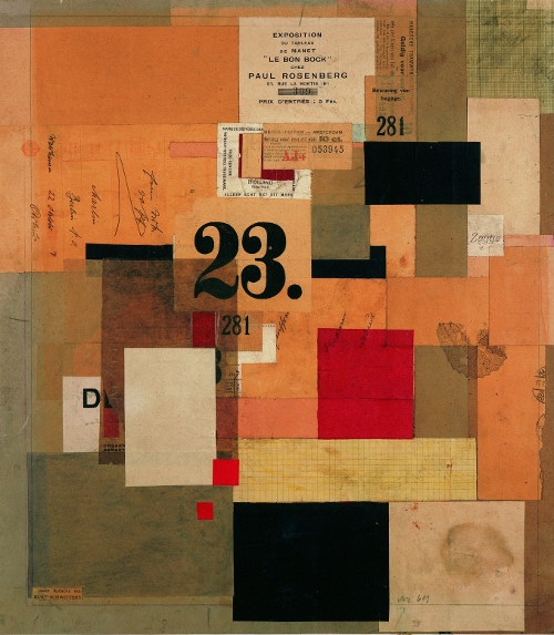
HAIRY EYEBALL German artist Kurt Schwitters (1887-1948) acted as an interpreter for the discards of modern life, or what Alfred Barr, the first curator of New York’s Museum of Modern Art, tellingly referred to as, “witnesses stolen from the ground.” He listened to what the matchbook covers, torn ticket stubs, crinkled packaging, scrap paper, fabric remnants, and other junk that he took back to his studio had to say about form and color, and in turn, re-presented their testimonies to the world in which they once circulated.

Berkeley Art Museum’s exhibit “Kurt Schwitters: Color and Collage,” the first US survey of the artist’s work in 25 years, traces the dialogue between found things and made objects that comprises Schwitters’ remarkable oeuvre. The 30 some-odd works that fill BAM’s sixth floor gallery are densely indeterminate, neither strictly paintings nor collages, but hybrids of both that reflect Schwitters’ association with the Berlin Dadaists — and also his background in painting, which accounts for both the influence Expressionism, and later, Constructivism, would have on his approach to composition.

In some pieces the assembled components have been pushed and flattened into each other, with the paste acting as both fixing agent and mixing medium, giving the work the appearance of having been painted — which in a sense it has been, if you substitute paper scraps for brushes and oils. In other works, bas relief-like effects are created through successively built up and painted-over layers in geometric arrangements that become more precise over time. In every piece, there is a careful attention to the grain of the materials used as well as their color (Schwitters gravitated towards an autumnal palette of reds, blacks, browns, and yellows, with occasional streaks of blue or gray).

As with other artists of his generation, Schwitters’ life and career was to be inevitably shaped by both world wars (his trajectory from Germany to Norway to England was largely determined by where the Nazis weren’t). Schwitters referred to his output interchangeably as Merz, a neologism based on the second half of Kommerz, the German word for “commerce.” The designation reflected his desire for his practice to, in his words, “make connections, if possible, between everything” in a world he saw as increasingly fragmented.

Whereas his Dadaist contemporaries such as John Heartfield and Hannah Höch cut apart newspapers and film rags and reconfigured them as monstrous satires of the noisy, busy society that produced them as spectacular propaganda, Schwitters’ work proposes an engagement with its various found source materials based on assimilation and incorporation rather than harsh juxtaposition. Everywhere in Schwitters’ work there is the glint of the familiar: the postage marks, the trademarks, bits of text, and reproduced images in his skeins of torn pulp and paint identify specific places, times, and events.

The Merzbau — a vast, ongoing architectural assemblage that took over six rooms of Schwitters’ family home in Hannover and which was completely destroyed in a 1943 bombing raid — is perhaps the apotheosis of Schwitters’ vision. Like a beaver building a dam, Schwitters constantly added bits and pieces, inviting friends to build out alcoves within the all-white grotto-like rooms whose square lines had totally given way to myriad angled surfaces and seemingly-impossible proportions.

On BAM’s ground floor sits Peter Bissegger’s meticulous, life-size reconstruction (1981-83) of one of the Hannover rooms. It’s a doozy to walk into, and, once you’re out again, near-impossible to try and square the three dimensional geometric assault just experienced against the three wall-mounted 1933 black and white interior photos on which the reconstruction was based. Save perhaps for the Winchester Mystery House, you will simply not experience another space like it, or have your experience of space so wonderfully warped (even BAM’s interior, which offers a Brutalist response to the Guggenheim’s famous spiraling rotunda, seems positively orderly by comparison).

While undeniably cool as an object, in some respects, the reconstructed Merzbau conceptually cuts against Schwitters’ process of ongoing accumulation that led to its construction in the first place. To have the Merzbau be a wholly transportable thing that can be taken down and re-assembled, jigsaw puzzle-style (as demonstrated in an accompanying time lapse video of the piece’s installation), is to fail to treat it as something that has no final form but is always in the process of becoming. Indeed, it’s telling that Schwitters built other Merz environments wherever he moved, at each location spinning anew another web of form and shape culled from bits and pieces of his surroundings. The task he had set before himself to connect the world anew would prove to be unending. 


KURT SCHWITTERS: COLOR AND COLLAGE

Through Nov. 27, $7-$10

Berkeley Art Museum

2626 Bancroft, Berk.

(510) 642-0808 www.bampfa.berkeley.edu

Just say no

0

arts@sfbg.com

HAIRY EYEBALL Summertime is supposed to be about taking it easy and soaking up good vibes. This is decidedly not the case with “Negative Space,” Steven Wolf Fine Arts’ current group show that, like an old punk rock mix-tape, delivers one lean, catchy declaration of refusal after another.

This is not to say that “Negative Space” sounds only one note. Each of the 10 featured artists offers a different enough riff on the exhibit’s title (one shared by Matt Borruso’s slim, collage-filled hardcover volume, on display here; itself a nod to the late critic Manny Farber’s classic 1971 collection of film criticism) to avoid turning an organizing principal into too much of a gimmick. There’s also enough well-delivered black humor to prevent this modest collection of deliberately difficult, critically-minded and middle-finger-waving art from becoming either overly self-serious or gratingly puerile.

Nicholas Knight, for one, is more prankster than killjoy. His Permission Slip (2010) is a pad of those very paper indulgences — free for the taking — printed with the artist’s signature (as “witness”), along with a place for the holder to sign into effect the statement, “I have permission.” “Permission to do what, exactly?” is the natural follow-up question, and one which Knight’s ludicrous contract leaves unanswered with a pithy shrug of non-commitment.

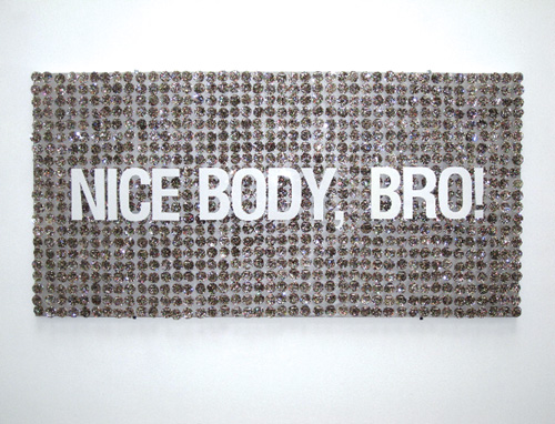
Jeffrey Augustan Songco’s Nice Body, Bro! (2011), which features the titular phrase spelled out in white three-dimensional lettering over a background of what look like rainbow-colored paillettes, becomes a sight gag about transubstantiation once one knows, courtesy of the wall card, that the large sequins are, in fact, glitter-covered communion wafers.

More clever is David Robbins’ Fuck Buttons, 1985-87, a tic-tac-toe grid of purple-and-orange hued photographs of 1″ buttons, each adorned with a different usage of the word “fuck.” The piece’s initial giddy rush of profanity gradually runs out of steam as various self-canceling dialogues emerge out of the buttons’ placements next to each other. The resulting imaginary arguments read like obscene variations on the old “who’s on first?” routine (for example, the piece’s middle row, left to right, reads: “Fuck you,” “Don’t fuck with me,” “Fuck me”).

The real stand-outs of the gallery’s front room, however, eschew the Pop-isms of Songco and Robbins. Whitney Lynn’s sculpture Animal Trap (2011), a black plexiglass cube with an open bottom propped up at an angle by a sawed-off tree branch, sits in the middle of the floor, as if lying in wait. The piece takes Minimalist sculpture’s classic forms (the cube) and materials (transparent plastic, wood) and, with its suggestive title and familiar arrangement, freights them with unexpected emotion and an implied narrative that has a decidedly unhappy ending.

Animal Trap faces down James Hayward’s Automatic Black Painting #9 (1975), perhaps the purest, if also the most traditional, interpretation of the exhibit’s title. Unlike Ad Reinhardt’s black paintings from the previous decade, which reveal embedded grids and distinct shades upon prolonged viewing, Hayward’s darkness harbors no hidden designs. In fact, the point of his early monochromatic canvases, such as this one, was to erase his hand entirely by laboriously building up thin layers of pigment to avoid any traces of brushstroke. The resulting 36 x 36 inch oil slick is all that remains of Hayward’s slow, cumulative self-exorcism.

In the gallery’s rear “lounge” area hang Christine Wong Yap’s meticulous, cartoon-like ink drawings on gridded vellum, illustrating various quotes from positive psychological studies on topics such as learned optimism and creativity as applied to the lives of artists. Despite the occasional glint of a glitter pen or iridescent foil rainbow, these selections from the series Positive Signs (2011) come off as more humorously pessimistic when presented together than they did when they originally appeared on the San Francisco Museum of Modern Art’s Open Space blog earlier this year as weekly posts.

Wong Yap’s charts and diagrams, to some degree, metabolize the very clinical discourses about happiness and creativity that they also satirize, making for a strange cocktail of uppers and downers when viewed alongside the lithographs of posters and texts by Guy Debord and the Situationist International — earlier and more pointedly political examples of what would later be called culture jamming — that hang opposite.

It is easy to imagine, say, Wong Yap depicting “live without dead time,” an old Situationist slogan that was scrawled by May ’68 protestors on the same Paris streets that Debord had previously cut apart and re-mapped for dreamers and drifters in his famous chart Guide Psychogeographique de Paris (1957, also hanging), as another nugget of motivational wisdom. The Spectacle for the win, folks?

Then again, maybe I’m just being pessimistic, an attitude which “Negative Space” doesn’t so much as inundate you with, like the noxious signature scent that wafts out of Abercrombie and Fitch stores, but rather involuntarily triggers, as when a stranger begins to violently cough on a crowded bus. You find yourself shrinking away, but the impulse to cough, too, is irrepressible.

“NEGATIVE SPACE”

Through Aug. 27

Steven Wolf Fine Arts

2747 19th Street, Ste. A, SF

(415) 293-3677

www.stevenwolffinearts.com

California dreaming

2

arts@sfbg.com

HAIRY EYEBALL In his review of the latest Venice Biennale, Boston Globe art critic Sebastian Smee threw down something of a gauntlet when he wrote, “The received wisdom is that contemporary art is mostly about ideas. In truth, however, it’s mostly about gestures.”

Smee’s generalization offers plenty to chew on and plenty to disagree with. For starters, it implicitly presents one of art’s oldest chicken-egg scenarios — one that was muddied decades ago by Marcel Duchamp and later Conceptual Art — as a false choice between thought and spectacle, sustained engagement and capricious showmanship.

But it can also be read as a pretty spot-on diagnosis of the current moment in art — at least, as refracted through the fun house mirror of the Biennale — in which having a gimmick, however thought through or critically engaged, or bringing out the big guns guarantees attention in an increasingly crowded market already clogged with gimmicks and big guns.

Bay Area Now, Yerba Buena Center for the Arts’ triennial snapshot of local creative culture, is the closest thing the Bay Area has to the Biennale and also, thankfully, the furthest thing from it. Still, Smee’s comment provides a useful rubric for navigating its sixth installment, which is full of gestures (some well-executed, others not so much) that at times overshadow the ideas (some half-baked, others worth mulling over) they’re meant to put across.

Visual art curators Betti-Sue Hertz and Thien Lam have pared the number of participating artists, now augmented by art collectives, to a tidy 18. This smaller range gives each participant’s work — most of it created especially for BAN6 — a little more breathing room, although the exhibition’s layout isn’t exactly conducive to following the connecting threads (environmentalism, geopolitics, Americana, and local subcultures, among other topics) unspooled in their curators’ statement.

Tammy Rae Carland’s wonderful series of work about the self-effacing price female comedians have had to pay (and continue to pay) to get a laugh is the first thing you see when you enter. But her photographs of local comediennes in ambiguous forms of self-presentation, text pieces that isolate the painful punch lines of Phyllis Diller, Joan Rivers, et al., and banana peels cast in brass are spread between two floors: a confusing arrangement if you don’t directly proceed up the stairway next to which Carland has created an elegiac installation that, save for the large helium balloons suspending a porcelain microphone, is also easy to miss.

YBCA’s main gallery is another case in point: it’s a good site for large installations that pack a lot of visual impact (think Song Dong’s Waste Not or Nick Cave’s soundsuits), but can pose a challenge for arranging groups of smaller-scale pieces coherently. It’s too bad, then, that the three box-like structures housing works by Brion Nuda Rosch, Rio Babe International, and Chris Sollars cut diagonally across the space like a semipermeable wall of shipping crates. Incidentally, these installations are also some of BAN6’s least compelling pieces.

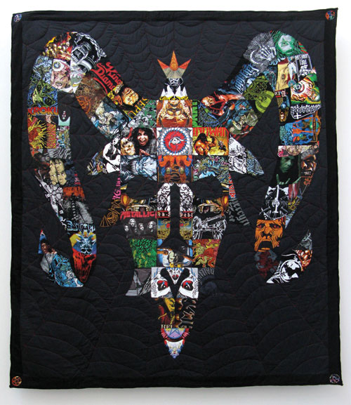
Harder to ignore is Ben Venom’s See You on the Other Side, a giant quilt whose centerpiece motif of snakes sprouting from a human skull, all made from old metal band T-shirt scraps, only becomes visible as your eyes adjust to the surrounding negative space. It is, in a word, awesome. But it’s also a canny fusion of craft traditions already present in metal subcultures — the quilt is flanked by two cut-off embroidered and studded denim vests, familiar handmade vestments of the tribe — with an older American precedent.

Quilting is also taken up in Suzanne Husky’s nearby Sleep Cell Hotel installation, a collection of three potentially inhabitable nest-like wooden structures that resemble porcupines, replete with quilts covered in radical slogans. A goofy infomercial touts the dwellings as the next development in politically conscious eco-tourism, while a hand-drawn sign warns of their structural unsoundness. Husky’s isolation tanks take the piss out of radical chic and backpackers alike while questioning the impact even the most well-intentioned and off-the-grid 21st century nomads leave in the wake of their habitats beyond carbon footprints.

That question is reframed in more ambiguous terms by Ranu Mukherjee’s wonderful series of drawings and watercolors of “nomadic artifacts” located in YBCA’s smaller second gallery. Each work is based on an image or stories sent to Mukherjee by friends and associates that reflect their conception of the nomadic, a process of translation neatly embodied by the blank fields against which a camper van or an ancient Egyptian temple is depicted. Isolated from their original contexts, these purloined postcards from the edge form an ongoing archive of mobile existence (the call for submissions is still open).

This second room — darkened to accommodate a video projection by Mukherjee as well as Sean McFarland’s crepuscular, large-format photographs of forest interiors — is actually BAN6’s most coherent grouping, with Weston Teruya’s architectural model-like paper sculptures and Richard T. Walker’s winsome three channel video installation rounding out a chorale of differing takes on land use, abuse, occupation, and representation.

In many cases at BAN6, ambition tends to exceed execution, but the results — as with Tony Labat’s large neon marijuana leaf that, seen from the outside, makes YBCA’s Mission Street lobby look like the city’s chicest pot dispensary — still pack a punch. Whether that is enough, or enough for a “moment in time” group survey such as this, is another question.

BAY AREA NOW 6

Through Sept. 25

Thurs.–Sat., noon–8 p.m.; Sun, noon–6 p.m., $5–$7

Yerba Buena Center for the Arts

701 Mission, SF

www.ybca.org


A minor place

0

arts@sfbg.com

HAIRY EYEBALL The painter Margaret Kilgallen died in 2001; she was just 33 years old. A year later, critic Glen Helfand would write in the Guardian (“The Mission School,” 7/1/2002) a coming out party for Kilgallen, her husband Barry McGee, and friends such as Chris Johanson and Alicia McCarthy, whose scruffy, heartfelt, and street-influenced art had started to attract a popular following abroad as well as intense interest from beyond the Bay Area art world.

When an artist dies young, it is hard to not view their work through the lens of their cruelly curtailed biography. The work that remains is always haunted by speculation about what could have been. Posthumous exhibits will always be, to some extent, tributes, and those who write about that artist’s work face the very human impulse to eulogize, as well as the critical one to historicize.

This dilemma is especially true for Kilgallen and her art. In the decade since her untimely passing due to complications from breast cancer, the Mission School has been variously contested and embraced as both an aesthetic and historical category, and the artists Helfand associated with it have become well-known, frequently imitated, and displayed in increasingly prestigious venues. Kilgallen, along with Johanson and McGee (with whom Kilgallen had a daughter just three weeks before she died), is prominently featured in the Geffen Contemporary’s current, much-hyped summer blockbuster “Art in the Streets.” And viewers need only spend a few hours trolling Etsy to sense the larger stylistic impact the Mission School has had on a younger generation of creative types.

“Summer/Selections,” Ratio 3’s current exhibition of paintings by Kilgallen and the first San Francisco solo show of her work in 13 years, is a bittersweet homecoming, to be sure. But it’s also, like Kilgallen’s art, unsentimental — which is not the same as unfeeling. It’s a reminder that while time doesn’t heal all wounds, it can sometimes afford us enough distance to see with greater clarity those qualities of the departed that so compelled or moved us in the first place. And, undoubtedly, the soft power of Kilgallen’s talents as a sympathetic observer is fully on display here.

Like her contemporaries, Kilgallen culled much of her imagery from hand-painted storefronts and signage along Mission Street, thrift-scored printed matter, old-fashioned typography, and the hand-scrawled texts of the homeless and itinerant. But sometimes the signal-to-noise ratio in her larger pieces — the crazy quilts of painted and stitched-together canvas scraps, or even her wall murals — drowned out the delicacy and assuredness at work in each individual component.

The remarkable selection of acrylic paintings — most from 2000 and all untitled — hanging in Ratio 3’s main space offers some much-welcome breathing room. They are single-subject studies of objects (groups of shoes, wigs, lips, trees, and plant life), simple repeating patterns (droplets, waves, grids), or (mostly) female figures on canvases made from discarded endpapers or repurposed grocery bags — another instance of Kilgallen’s sensitivity to the material grain of her surroundings.

Whether in the color gradations and tiny spiked edges of a leaf, or in the finely outlined toenails of a mule-clad foot, Kilgallen’s remarkable control over line and paint application imbues each canvas, even the simplest or most abstract, with an untold back-story. This is especially true of the women, who all have laugh lines but usually address the viewer with a tight-lipped smirk. If Kilgallen’s flora could have come from a children’s book, her women could pass as characters from a Dan Clowes comic.

The untitled collage pieces in the back room — smaller-scale examples of Kilgallen’s quilt-like assemblages of canvas — are more abstract, yet still retain the just-right sense of color, line and proportion on display in the other paintings. In one piece, from 1999, a single fluffy gray cloud is the only graphic break in a long expanse of sutured turquoise. Another from the same year resembles the collaged remains of a billboard’s past incarnations. But like all of the pieces in “Summer/Selections,” it feels wholly fresh.

I wish the same could be said of the recent work of Johanson, an SF expat and Kilgallen’s contemporary, whose current show at Altman Siegel is about as coherent and compelling as its title: “This, This, This, That.”

I have always preferred Johanson’s folksy takes on Sol LeWitt’s rainbow-hued precision over his text or figure-filled paintings, and there are plenty to take in here. The problem is one of editing.

For every piece — such as the carefully thought-out uneven grid of squares and rectangles “Fall Apart and Let It Go” (2011) — that feels like Johanson is trying to push himself and his explorations of color into a more formal direction, there is another that reads as an easy way out.

The acrylic and latex color shards of “Same Brain, Same Body, Different Day” (2011) nicely mirror the visible segments of the pressed grain of the wood they’re painted on, whereas “Celebration of Life Through Found Palette and Paint” (also 2011), a painted panel mounted to an upright, rainbow-colored wooden shipping palette, just feels lazy.

Certainly, many artists have made repetition a compelling cornerstone of their practice, extending their engagement with a single technique, approach, or material into a fruitful long-term relationship. Johanson, however, seems like he is simply in a rut, making more and more of the kind of art that first brought him wider renown with diminishing creative returns. Warhol did all right for himself in the 1970s, though, and I’m sure Johanson is doing just fine as well. But I know he’s capable of doing more.  

MARGARET KILGALLEN: SUMMER/SELECTIONS

Through Aug. 5

Ratio 3

1447 Stevenson, SF

(415) 821-3371 www.ratio3.org

CHRIS JOHANSON: THIS, THIS, THIS, THAT

Through July 30

Altman Siegel

49 Geary, Fourth Floor, SF

(415) 576-9300, www.altmansiegel.com


Fake-out

0

arts@sfbg.com

HAIRY EYEBALL It’s not just the title of Stephanie Syjuco’s solo show “RAIDERS” — her first at Catharine Clark Gallery — that brings to mind Indiana Jones. Something of the latter-day swashbuckler comes across in Syjuco’s art, which, like Indy, initially seems to be playing to all sides for the sake of plunder — when in fact this cleverness is the outward expression of a deeper skepticism toward the very institutions it’s engaged with.

But Indiana Jones is also a pop cultural commodity and a franchise that has netted millions for creators George Lucas and Steven Spielberg. This too, I imagine, is not lost on Syjuco, whose work frequently strips Pop Art bare of its smart, slick exterior (as well as Conceptual Art of its pretensions) to access the larger and far less glamorous network of market forces, production processes, and questions of ownership that shape it as a commodity.

Whereas Takashi Murakami installed an actual Louis Vuitton boutique inside Los Angeles’ Museum of Contemporary Art, Syjuco’s project “Counterfeit Crochet” called on hobbyists the world over to knit fake designer bags, complete with logos, and even provided the patterns and instructions. She has also, on more than one occasion, set up detourned versions of shops and marketplaces inside museum walls.

“RAIDERS” opens with an installation of what at first glance appears to be a collection of handsome Asian antiquities — mainly vases and small, decorative vessels — arranged on the very shipping crates they were transported in. It quickly becomes obvious that what we’re looking at is truly a set-piece, and that the “priceless” cache before us is actually an arrangement of life-size photographic reproductions adhered to laser-cut wooden backings.

Raiders: International Booty, Bountiful Harvest (Selections from the A____ A__ M______) — to give the installation its full title — becomes more interesting when you consider that Syjuco used images downloaded from the Asian Art Museum’s online database of its holdings as her source material. Love and theft (if I may poach the title of Eric Lott’s remarkable study of American minstrelsy) are certainly forces that have shaped many a museum’s prized holdings, and it is this history — one so often bound to colonialism and its aftermath — that is also embedded in Syjuco’s fakes.

And Syjuco decidedly, politically, traffics in fakes, not forgeries. Practically every piece in “RAIDERS” has rematerialized online, open source materials — be they digital images or readily accessible canonical texts — into art objects that are themselves parodies of object-ness. Conceptually whip-smart and materially banal (wood, tape, paper, and glue are common ingredients), Syjuco’s pieces continually taunt us with the question, “Why buy the cow when you can get the milk for free?”

In the gallery’s back room, jewel-case-size blocks of wood covered in pixilated digital prints of CD cover art representing Syjuco’s entire collection of “music illegally downloaded or pirated from others” are, as the bright orange stickers adhered to their shrink-wrapped exteriors proclaim, really available for the “blowout price” of $9.99 a piece.” Across from this pile that looks as if it had been airlifted straight from a Tijuana bootlegger, is Phantoms (h__rt _f d__kn_ss) an installation organized around Joseph Conrad’s Heart of Darkness, replete with a table, sawhorses, houseplants, TV monitors, and 10 bound copies of different online, public domain versions of Conrad’s text that are strictly “price upon request.”

Syjuco is certainly not the first artist to take on the art world’s biggest white elephant: value. But she wields her scalpel with a thoughtful precision and economy of gesture that will forever be beyond the abilities of a gaseous giant such as Damien Hirst. And that, to borrow another clichéd bit of market-speak, is truly priceless.


INKSTAINS

If you missed the San Francisco Museum of Modern Art’s excellent Eadweard Muybridge retrospective that closed earlier this month, Matt Bryans has created something of an homage to the early master’s photographic panoramas and doctored views of a not-quite-virginal Yosemite at SF Camerawork.

“Untitled” unfurls along one of the gallery’s walls for nearly 30 feet, a fantastical expanse of ever-shifting landscape seemingly captured from a middle distance. Glaciers give way to snow-capped peaks, which then dip into valleys that ease into rolling plains and finally abut more misty crags. In the piece’s upper half, clouds swirl and dissolve across the arc of the sky as in a Chinese ink painting.

Although the piece has the weathered patina of an old daguerreotype and recalls Muybridge in its staged epicness, Bryans is a collage artist who works solely with a medium whose livelihood has been called into question about as often as film photography’s: newsprint. “Untitled” — which like the other large collage commissioned by SF Camerawork is all explosions and stars wrapped around a support column — was created using only India erasers and inky photographs clipped from newspapers.

Scanning the sky of Bryans’ panorama, you can make out the smudged traces of what was once type. And the closer you look, you start seeing the fissures between the thousands of carefully glued pieces that Bryans has transformed into a seemingly organic whole, which nonetheless appears on the point of disintegration.

The panorama piece is large enough that it sags a little and billows whenever a current of air hits it. It seems to hang heavy with the losses it embodies — photography’s ghosts, newspapers as a disappearing medium, the unknowable contexts of the images themselves — a load that’s almost too much to bear. 

STEPHANIE SYJUCO: RAIDERS

Through July 16

Catharine Clark Gallery

150 Minna, SF

(415) 399-1439

www.cclarkgallery.com

MATT BRYANS: BREAKING THE LAND

Through Aug. 20

SF Camerawork

657 Mission, SF

(415) 512-2020

www.sfcamerawork.org


Crying in public

0

arts@sfbg.com

HAIRY EYEBALL Weaving my way through the groups of slower moving shoppers and tourists ambling out of the Powell Street BART Station, I realized I was already too late.

I had wanted to be present for the June 11 noon kickoff of Market Day — the large-scale public art event tied to Allison Smith’s current Southern Exposure exhibit “The Cries of San Francisco” — but when I reached Mint Plaza and had been handed a schedule I saw that my timing had been off by an hour.

Oh well. The point of Market Day wasn’t to necessarily be at a certain place at a certain hour to see a certain something. The “something” was supposedly happening all around me. The nearly 70 Bay Area artists, performers, and craftspeople Smith had gathered for this ambitious public art project had dispersed throughout Mint Plaza, and up and down Market Street between Fifth and Third streets, to peddle their wares (many homemade), offer more ineffable “services” (such as owning the expletive of your choice or telling you a story), or to simply “perform” in “character.”

The criers were to be like tiny pebbles subtly altering the fast-moving watercourse of weekend foot traffic. Granted, participation is hard to measure for something like “The Cries of San Francisco,” but wherever I turned, people seemed engaged even if the number of folks documenting a given artist seemed to greatly outnumber the members of the public they were interacting with.

I decided I needed a little more intimacy if I was to get my feet wet. I started back toward Market and ran into a woman dressed in steampunk-ish attire. Her name was Jamie Venci, a.k.a. the Questing Choreographer (each participating artist conveniently had a large nametag). She offered me an informative pamphlet about one of three historic buildings in the vicinity that had survived the 1906 earthquake if I promised to carry out the site-specific choreography contained within.

I agreed, and for convenience’s sake, I went with the Mint Building. Not five minutes later, I was on the steps of “the Granite Lady” attempting to convey the shape of its crenellated outline with my arms — per a step in Venci’s cutely drawn instructions — in what must have looked like a particularly inept approximation of tai chi.

Conceptual art requires a suspension of disbelief on the part of its audience. I was not merely being ridiculous in public, but was publicly enacting a new relationship to a space I had not really considered too closely before. I, as much as Venci, was the Questing Choreographer, and together we had collaborated on a piece.

The satisfaction I took in my demonstration of good faith was fleeting, as questions took over. What had passersby thought about what I was doing? And how could they really have anything to think about without some context for my undertaking? If a person dresses up in a colorful manner in San Francisco and carries on in public does anyone raise an eyebrow, let alone pause to consider the host of artistic and economic concerns that “The Cries of San Francisco” aimed to bring to the streets?

Materials for the event cited Mohamed Bouazizi, the Tunisian street vendor who set himself on fire to protest police harassment, as well as Carol Reed’s 1968 film version of the musical Oliver! as representational precedents. But despite the presence of Art for a Democratic Society’s Class War Store cart full o’ Marxism, the tenor of many of the criers was more playful than revolutionary. Whimsy was the order of the day.

Ha Ha La (Nathaniel Parsons) pushed around an “amusement park,” a steep ladder that participants would gingerly climb up and down while Parsons bellowed a New Age-y chant affirming their bravery and blessedness through a conch shell. After I took my turn on the rickety structure, I chose a souvenir badge that read, “You don’t have to behave you just gotta be brave.”

Also hard to miss was Maria de los Angeles Burr, who, as the Unsellable, had transformed herself into a walking pile of paper bags. “I have become burdened by too many possessions,” she muttered to me, as confused shoppers exiting from the Westfield Centre stopped to take pictures or gawked while hurrying on their way.

I wondered if they got the visual pun, or would simply move on and tune out the other criers much in the same way many of us avoid other solicitors like petitioners or canvassers.

I also wondered what the Market Street regulars — the men who sell cheap earrings, bootleg Giants merchandise, and faux-cashmere scarves from tables or the young hip-hop dancers who busk near the Powell Street cable car turnaround — thought about the criers. Did they view them as competition? As a friendly change-of-scene? Or did they see them at all?

By 4:30 p.m., all the criers had reconvened at Mint Plaza. They seemed tired from their day of art-making and being “on.” Continuing at a full clip, however, were tweens Colin Cooper and Cole Simon, by far the loudest and youngest hawkers, who had set up shop as the Masters of Disguise (one of their parents informed me that their after-school art teacher, a California College of the Arts student, had encouraged them to get involved with the project).

I walked away from our genial encounter $1 poorer but with a pair of plastic pink sunglasses and an orange mustache to my name. I felt braver with them on.

The carnival continues: the gallery installation component of “The Cries of San Francisco” is up until early next month and will host a series of performance events. Future Saturday marketplaces are scheduled for two Saturdays, June 18 and July 2 (noon to 6 p.m.). And on Wednesday, June 15 at 7 p.m., various criers will present a showcase of musical storytelling, speeches, and other forms of public address.

THE CRIES OF SAN FRANCISCO

Through July 2

Southern Exposure

3030 20th St., SF

(415) 893-1841

www.soex.org


Art fair city

1

arts@sfbg.com

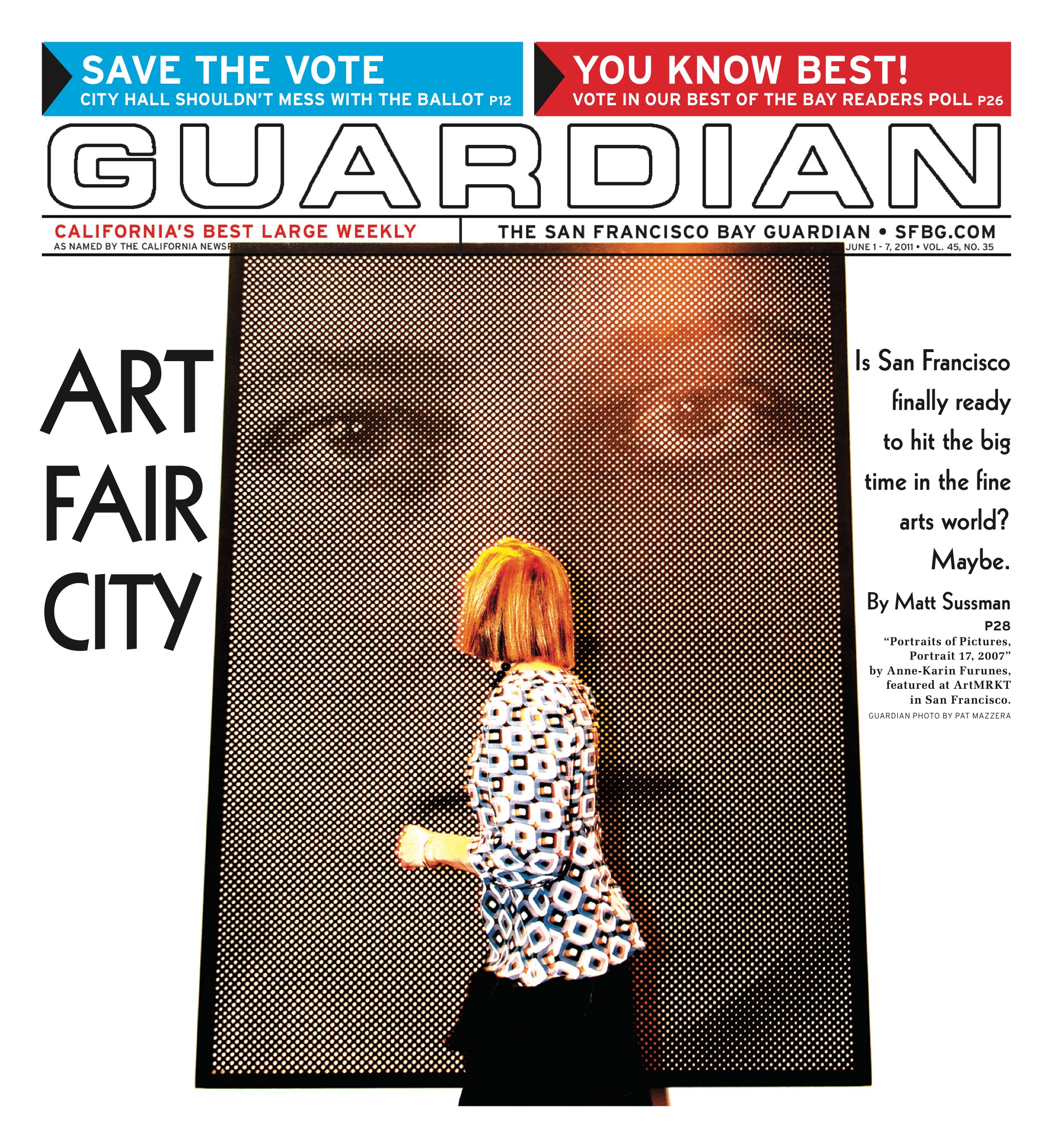
HAIRY EYEBALL The booths have been dismantled, countless plastic cups and empty liquor bottles are heading to recycling centers, and the exhibitors have returned to the quiet of their respective white cubes. San Francisco’s big, busy art fair weekend has come and gone. By many accounts it was a success for a city that two years ago hadn’t had an art fair in almost two decades, even if, in retrospect, it doesn’t feel like the lay of the land has been significantly altered.

The buzz generated by the raucous preview parties for SF’s two newest fairs, artMRKT and ArtPadSF, carried on throughout the weekend, no doubt helped by the good weather and ever-present availability of booze. When I arrived at the Phoenix early Saturday afternoon, the young, stylish crowd (which included a few families) milled around the hotel’s patio, awaiting a much-hyped synchronized swimming performance organized by Bean Gilsdorf, a California College of the Arts student. Other visitors popped in and out of the midcentury modern hotel’s rooms, each occupied by a gallery, like excited college students on their first day at the dorms. “It’s been positive so far,” said Patricia Sweetow, one of the first gallerists to sign on with ArtPadSF.”The fairs give the community a focus, a place, a reason to celebrate.”

Wendi Norris, co-owner of Frey Norris gallery, echoed Sweetow’s comments when we chatted at her booth beneath the fluorescent glare of the Concourse’s lights. “Participating in this makes me feel like part of a community, instead of an island,” Norris said, adding, “of course, there’s the business side of things, but that’s not the only reason we’re here.” It was past 5 p.m., and the steady stream of foot traffic throughout the art-covered cubicles slowed as people drifted toward the corner bars. I hoped that they would stop en route at the tables for local arts organizations and nonprofits, which, truer to Norris’ words than she perhaps intended, had been placed at the outer edges of artMRKT’s grid-like layout like outliers in an archipelago.

Still, none of the partnering orgs involved could be said to have suffered from underexposure. Attendance at the fairs was high. ArtMRKT boasted 13,000 visitors over its three days (impressive, considering that incumbent SF Fine Art Fair’s total was 16,600). Meanwhile, ArtPadSF brought in 9,000 visitors (with 2,000 tickets sold), a high number given the Phoenix’s smaller size and the fair’s edgier aesthetic. Certainly, artMRKT and ArtPad’s turnouts were helped by the shuttle service that ran between them on the weekend (something that further underscored Fort Mason’s relative geographic remoteness).

The fairs were also strong fundraisers. UCSF’s Art Program netted $10,000 at artMKRT’s preview benefit, and ArtPad’s party raised $15,000 for its beneficiary nonprofit, the Black Rock Arts Foundation. Additionally, the SF Fine Art Fair raised $2,000 in donations for the SF Art Commission’s ArtCares conservation program, and each of the local arts organizations that participated in artMRKT’s MRKTworks online and mobile auction now has $1,500 more to their name.

Given those numbers, the question isn’t whether San Francisco can support art fairs — clearly it can, although I don’t think a city our size needs three to its name — but rather, What kind of fairs can best support art in San Francisco? ArtMRKT and ArtPadSF’s differing approaches and ambiances complimented each other immensely, and it was heartening to see such a concerted outreach effort to noncommercial spaces as well, even if, as at artMRKT, their presence didn’t really register onsite or in terms of programming.

One criticism I heard from a portion of gallerists, collectors, and attendees was that none of the fairs offered a strong enough curatorial sensibility, and that there weren’t enough prominent names among the non-SF participating galleries (several prominent SF galleries were also notably absent). Art fairs are, to some degree, always going to have to deal with the problem of offering something for everyone and nothing for some. But implicit in this critique is that none of the fairs presented themselves — and by extension San Francisco — as a unique market to be taken seriously by collectors.

To repeat a sentiment expressed in local critic and former Guardian contributor Glen Helfand’s take on the fairs for SFMOMA’s Open Space blog, the presence of art fairs isn’t going to turn San Francisco into a market boom town overnight. And that’s fine. In Helfand’s words, “[the Bay Area’s] market is determined by scale and temperament — we’ve got intimacy and experimentation on our side, but a curiously uncomfortable relationship to conspicuous consumption.” Smaller fairs such as ArtPadSF, at which the art was by and large more affordably priced and modest in scale, are one way perhaps to ease that discomfort, while still allowing local galleries, arts orgs and artists tobuild out their contact networks.

Certainly by late Sunday afternoon, as packing materials emerged, the optimistic skepticism expressed by many in the art community in the weeks leading up to the fairs seemed to have given way to pleasant surprise.

While talking to Kimberly Johannson of Oakland’s Johannson Projects, I witnessed a very happy 20-something purchase her first piece of art: a palm-sized, chirping kinetic sculpture of a bird-like creature by Misako Inaoka. Transactions like this could be taken as a hopeful sign that the future of art collecting in the Bay Area doesn’t rest solely with the established few or with moving units (although sales figures of SF Fine Art Fair, which boasted $6.3 million spent on modern and contemporary artwork, offer a different form of reassurance).

It will be interesting to see if and how these fairs, in particular ArtMRKT and ArtPadSF, grow and expand. “We need to keep in mind that these fairs are in their infancy,” cautions SF Art Commission Gallery director Meg Shiffler, who also attended and participated in the fairs, in an e-mail. “But people showed up. This goes a long way in validating the substantial support for the visual arts that exist in San Francisco.”

For a city that too often portrays itself as the woeful underdog routinely losing its visionaries to New York City and Los Angeles, that validation is critical.

Exercises in style

0

arts@sfbg,com

HAIRY EYEBALL Will Yackulic’s return to painting has none of the grandiosity or pretension that the phrase “return to painting” might suggest. Rather, Yackulic’s abstract canvases at Gregory Lind offer a contained (one might say modest, even, as each rectangle measures in the neighborhood of 144 square inches) but no less exhilarating exploration of the tension between the two qualities of his work that are so perfectly pinpointed by the show’s title, “Precision and Precarity.”

Although it has been six years since Yackulic last picked up a brush, his approach here is not unlike the works on paper he has steadily created in the interim. Much like his wave fields made from the dense accumulation of precisely spaced typewriter keystrokes, there is a finessing of the medium in this new group of (mostly) oil paintings that never claims mastery. The material seems to have had as much of the final say as the artist’s hand.

The subject of the conversation — geometric abstraction — has been a recurring one for Yackulic. This time, instead of floating geodesic orbs, the starting point was a Jenga-like stack of woodshop scraps Yackulic constructed and then set about capturing using a variety of colors, paint application techniques, perspectives, and degrees of abstraction. One canvas, the appropriately titled Smolder, even appears to have been burnt with a cigarette.

Some paintings come across as proper still lifes, engaging with the woodpile as a physical object. Taken together, the heavy yolk-yellow highlights and brown shadows of Claypool’s and the nocturnal blues and watery purples of Crepuscular and Evening Arrangement form a dance of the hours played across what could be a model of one of mid-20-century architect Joseph Eichler’s experiments in suburban modernism.

Other canvases respond to the form as a prompt about pure shape, discarding fixed dimensionality. In Over/Under, jutting lines become breakwalls for an incoming tide of indigo that has spilled over into the canvas’ azure lower half. Yackulic also employs other shapes (the cross-hatches in XXX, the Easter-ish green and pink dots of Sick Day) to colonize what becomes, over the course of the show, familiar terrain.

All this shape shifting brings to mind Raymond Queneau’s Exercises in Style (1949), in which the experimental French writer retells the same banal incident 99 times employing a different voice, genre, or formal device with each successive iteration. Yackulic does much of the same thing in “Precision and Precarity,” only the story he’s retelling is the abstract tradition in modern art.

Retelling, though, shouldn’t be confused with repeating, and Yackulic doesn’t shy away from giving his exercises in style some bite when necessary. The aforementioned Smolder, although hung closest to the gallery’s entrance, provides a humorous coda to the rest of the show. Slanted lines, suggestive of the beams of Yackulic’s original model, disappear into a black cloud of pencil smudge as if to playfully say, “You know what else depends on precision and precarity? Arson.”


SKELETONS IN THE CLOSET

Camilla Newhagen’s soft sculptures made from everyday clothing are anything but soft. Bras and reclaimed suits are stuffed full of polyester and contorted into unsettling anthropomorphic forms reminiscent of Hans Bellmer’s monstrous feminine sculptures. However, the strongest piece in the powerful but small selection of Newhagen’s work now at Jack Fischer is the least assuming: a man’s white Oxford shirt on a hanger, sheared of everything save its collar and one sleeve, and tacked to the wall with the aid of invisible push pins.

Ghostly and extremely sensuous, Pin Point Oxford evacuates gender and class from an overly marked and rather quotidian garment. The white button-down is no longer so buttoned-down. Much like the work of Belgian designer Martin Margiela, who famously fashioned dresses to look like dress-forms and vests from leather gloves, Newhagen has created a piece of irresistible anti-clothing. It’s a pity you can’t slip it on. *

WILL YACKULIC: PRECISION AND PRECARITY

Through April 30

Gregory Lind Gallery

49 Geary, Fifth Floor

(415) 296-9661

www.gregorylindgallery.com

CAMILLA NEWHAGEN

Through May 7

Jack Fischer Gallery

49 Geary

(415) 956-1178

www.jackfischergallery.com

Lucky charms, safe journeys

0

arts@sfbg.com

VISUAL ART A sense of play — more street-smart than sentimental; international, but also attuned to a universal understanding of nature — is central to Yukako Ezoe’s art. Ezoe’s vividly colorful paintings and collages and vibrant jewelry work are informed by her experiences as a student and teacher, and often directly connected with everyday necessities and pleasures. Ezoe has curated and contributed to a show of kite art and made a revealing single-edition photo-interview book about the myriad barbershops in the Mission. She and her husband, the artist and DJ Naoko Onodera, often show work under the name Bahama Kangaroo, and she’s used that moniker for her first solo show, at Kokoro Studio. Ezoe has upcoming shows at Ritual Cafe and Edo Salon, and this week she’s taking part in “Rise Japan,” a fundraiser for earthquake and tsunami relief in Japan. We sat down together recently for a midafternoon talk.

SFBG How did the name Bahama Kangaroo come about?

Yukako Ezoe Naoki [Onodera] has an album titled Bahama Kangaroo. It’s beachy ’70s disco. Jonh Blanco and I were working on an event for Indie Mart and trying to figure out what the name of our craft team, and I asked Jonh to listen to the record. He said, “Our team should be Bahama Kangaroo!” Then Naoki and I ran with it.

SFBG The badminton dreamcatchers you’ve made have a number of facets: the spider’s web-like stringing and also the MP3s you place in the badminton racquets’ handles to record dreams or ideas. What was the inspiration behind them?

YE Futurefarmers had asked me to contribute to a show in which the theme was “What’s your learning journey?” While I went to school, I learned and got ideas while I was hanging out with friends and playing. So the voice recorder in the badminton dreamcatchers is like a memo or school tool.

The gold badminton dreamcatchers were part of a badminton show that Hana Lee, Leslie Kulesh, and I did at the Diego Rivera Gallery at San Francisco Art Institute. We turned the whole gallery into a gym.

SFBG Is there a creative interplay between your teaching and art making?

YE I think so. I get ideas from students. Seven-year-olds will draw something monstrous and I’ll be influenced by it.

The homeless kids I work with [at Larkin Street Youth Center] are super-ambitious and straightforward. They’ll crush something to make it fit within a work. The kids at Lark Inn are in survival mode. If I’m trying make a dreamcatcher, they don’t want to do it. If I do sewing or make wallets or notebooks, they’re into it.

SFBG Two artists mentioned in the writing connected to your current show at Kokoro Studio are John Audubon and Yokoo Tadonori. They make for a great, unexpected combination.

YE I love Yokoo Tadonori’s use of composition and his juxtapositions. One of his pieces has a salaryman hanging right in the middle of it. I don’t like it, but it’s brutal and cruel — and true.

SFBG Your compositions are often symmetrical. Why’s that?

YE I used to do monoprinting, and I was obsessed with the geometric [aspects of] library catalogs, airplane tickets, and blueprints. That’s stuck with me. I’m also OCD-ish, too, I have a whole bunch of drawers filled with weird things.

SFBG Kokoro Studio’s writing for “Bahama Kangaroo” also mentions self-portraiture, which might not be obvious when you look at the work. I went in wondering if there were going to be paintings of you.

YE No way! [laughs] A solo show is sort of about you — artist ego [laughs]. But the pieces are portraits of my thoughts and ideas. In one, I’m like an owl, spacing out and thinking. The two lions in some pieces are like me and Naoki doing a high five. Another piece, Too Many Bats, has to do with how hard and competitive it is to be an artist. I’ll think of people and turn them into characters.

SFBG Framing is present as an element within some of your recent paintings and collages. How did that come about?

YE I’ve been influenced by Afghan trucks. There’s a book of photos of them [Afghan Trucks, by Jean-Charles Blanc]. They’re a bit like trucks with murals on the side. Back in the day, travelers would decorate their camels with lucky charms so they’d have safe journeys, and nowadays they do it with trucks.

SFBG What are you working on at the moment?

YE Right now I’m making jewelry, altering clothing, and cleaning my room. I go back and forth [between different activities and forms].

I used to work for a bridal jewelry store that was really bling-y. I want my jewelry to be more sculptural, and to have a clustered quality that’s similar to the collages I make. *

BAHAMA KANGAROO: ART BY YUKAKO EZOE

Through Thurs/24

Kokoro Studio

682 Geary, SF

(415) 400-4110

www.kokorostudio.us

RISE JAPAN: JAPAN EARTHQUAKE AND TSUNAMI RELIEF FUNDRAISER

Kokoro Studio

also: Gallery Heist

679 Geary, SF

(415) 563-1708

www.galleryheist.com

Touching from a distance

0

arts@sfbg.com

HAIRY EYEBALL “Art enables us to meet my parents again after they have departed,” the contemporary Chinese artist Song Dong says in a statement that introduces his current show at Yerba Buena Center of the Arts. “In my art, they have never been away, and will live with us forever. I think they might still be worrying about our children and us. I wanted to have an exhibition where we would bring them back to us and tell them, ‘Dad and Mom, don’t worry about us, we are all well.’ “

Taking its title from that final reassurance of filial piety, this deeply personal and truly monumental exhibit is a testimony to Song’s sincere belief in the power of art as a means to connect. And you will likely leave a believer too. Art, as Song elaborates in the two decades of work collected here along with accompanying explanatory texts commissioned for the exhibit, allowed him to rebuild his once-strained relationship with his parents while they were still alive. It also allowed him to create a record of their lives together as a family who weathered the worst years of the Cultural Revolution (1966-76), and to help himself and his young daughter connect to the stories and the struggles of his parents’ generation.

Making daily life the stuff of creative practice has its art historical precedents in conceptual art, a label that has often been attached to Song’s output. But such contextualization is largely beside the point in the face of the electric current of emotions — sadness, longing, remorse, gratitude — that it’s hard not to feel while watching the earlier video pieces Song made with and about his father, or surveying the massive installation piece, titled Waste Not, that he collaborated on with his mother.

The video works, the first pieces viewers encounter, offer variations on a simple yet effective technique: Song films himself or someone else sitting in front of a projection of an earlier recorded interview (usually with his father), continually having the person align their face with the face of whoever is speaking in the projected video. Sometimes it is Song aligning himself with his father; sometimes with his father and mother. And in one piece, a viewer can put himself in a Song family portrait via a similar process (the resulting snapshots are uploaded to YBCA’s Flickr account). The effect is ghostly, blurring the projected subject and the filmed subject into a new, purely virtual being.

The sprawling Waste Not is undoubtedly the heart of “Dad and Mom,” which displays the entire contents of the house Song’s mother lived in for 60 years, and where she married and raised Song and his younger sister. Here, organized into neat piles that fill up YBCA’s entire large gallery, are the contents of a life: clothes, kitchen utensils, toiletries, school supplies, shopping bags, toys, shoes, furniture. At the center of the space hang the remains of the house’s walls and room, a skeleton of beams that seems an impossible vessel given the sheer volume of its former contents.

Having grown up amid the lean years of the Great Leap Forward, Song’s mother subscribed to the belief that nothing should go to waste (from which the installation takes it title), so she recycled and saved everything she could, from plastic bottles and fabric scraps to gasoline canisters and balls of string. Song, in turn, saw creating the installation with her as a way to continue this practice. By turning her accumulated junk into a traveling archive, nothing would have to be discarded and everything would be meaningfully preserved.

Originally conceived by Song in 2005 as a way to help his mother cope with the grief over her husband’s sudden death three years earlier, the work has now become a memorial to her memory as well. SONG DONG: DAD AND MOM, DON’T WORRY ABOUT US, WE ARE ALL WELL

Through June 12 Yerba Buena Center for the Arts 701 Mission, SF

(415) 978-2787

ww.ybca.org

Holy paint rollers

0

caitlin@sfbg.com

CULTURE In the Mission there are few things more — and less — sacred than a mural. Every day in the neighborhood a communion is performed: new street art is produced, and in exchange, other street art is mangled, marred by tags scrawled by unimpressed or jealous (depends on who you ask) hands. But some wall pieces in this storied land of concrete canvases are holy in more than just the figurative sense. Two neighborhood mural projects in particular fit this frame, one blessed by priests and one possessing clues about the earliest days of the Mission Dolores.

Caledonia Alley runs alongside St. John the Evangelist’s Episcopal Church. Jesus looks down on the narrow street, which was once so thoroughly covered in needles that Elaine Lew, who was born and raised in a house on Caledonia, says, “You couldn’t drive your car down it because you’d pop your tires.” Every Sunday, families lined up for the free food the church distributed, sharing the space with people openly selling and using drugs.

But since Jesus came to the alley, things have been different. Street artist Dan Plasma happened upon Caledonia looking for fresh wall space to paint, and proposed to the church that he cover their heavily-tagged alley wall with something space-specific. St. John’s acquiesced, so Plasma and his friends, respected artists Mike Giant and Mark Bode, went to work on a spray paint tableau of the crucifixion, with St. John and other biblical figures in supporting roles.

“It really made a big difference in the alley,” says Lew, who notes that the blatant drug activity has subsided in the year since the crew completed the piece. The church recognized the change, and the rector let Plasma know that it would be officially blessing the mural in a ceremony. “I called up Mark and Mike and told them, ‘It’s going to get sprinkled with holy water. We gotta put on some clean shirts,’ ” says Plasma. A year later, the wall is still utterly free of the tags that go on so many other works.

Funds allowing, a miracle of a different sort will soon be watching over the neighborhood’s only weekly farmers market. Artist Ben Wood has made a habit of finding our city’s little-known historical perspectives and presenting them to the San Francisco of today. In 2004, he spent the Fourth of July projecting images of the Ohlone onto Coit Tower and Andrew Galvan, Mission Dolores’ curator — and direct descendent of Ohlone who converted at the church — told Wood there was an original Ohlone mural hidden behind the mission’s central reredos, or altar.

“It’s been hidden for 200 years,” Wood says in a phone interview. “The possibility of recreating the mural for the public — it would allow people to ask questions about life back then.” He and a Presidio historian set to work documenting the piece, dropping a camera into the crawl space between mural and altar and eventually coming up with a composite image of a spiraling, curving design of purple lines and dagger-pierced hearts they hope to recreate on a wall of the historic Mission Market that abuts the relatively new, open-air Mission Community Market.

“The mural is really telling about the tradition of being a muralist in San Francisco,” says [CORRECTION: Jet Martinez clarifies that this is a misquote. The Guardian regrets the error.]

Jet Martinez, street artist and central figure in the Clarion Alley collective, was selected by Wood to work on the piece because of his mastery of intricate patterns in past murals of Oaxacan embroidery and prehistoric plant life. Their team created a Kickstarter account (www.kickstarter.com/profile/missiondoloresmural) for the project and hope to collect the majority of the $8,000 needed for the work by the end of the month. If they succeed, it will add another dimension to the canonization of street art in one of muralismo‘s most well-known neighborhood of galleries.

The line, the line

0

arts@sfbg.com

ART “Philip Guston: A Life Lived and Discussed” is an event for anybody who appreciates provocative talkers.

The subject of Michael Blackwood’s Philip Guston: A Life Lived is quotable throughout the 1981 bio-doc. Shot at various points during the last decade of Guston’s life, the film opens with a retrospective being hung at SFMOMA in 1980. The painter, who will pass away within the year, is seen walking through the show, chatting with the curator and, somewhat later, his wife Musa. He frequently touches the paintings, taking advantage of the fact that, as he puts it, “This is the one show where nobody will tell me not to touch the work.”

Next, there’s a news conference where Guston parries questions and charms his audience, who are busy scribbling notes. Blackwood’s movie then flashes back to the early 1970s, when Guston enters his last highly prolific period. He’s seen at home in Woodstock, N.Y., hanging out in his studio. Surrounded by recent paintings, he frequently moves them around, in order to display examples of what he’s discussing. At one point, he paints over a new work because it’s “too much of a painting.” He also breezily discusses his creative life, recalling his teenage years in Los Angeles with Jackson Pollock, his rising prominence as an Abstract Expressionist in New York City during the 1950s and ’60s, and his artistic concerns at the present moment.

Guston stresses his displeasure with the mistaken, seemingly necessary yet all-too-easy categorizing that plagues the art world. As he says, referencing the readily rehashed modernist values found in his early painting Mother and Child (1930): “You have to come from somewhere.”

An enthusiasm for painting that is in “the midst of happening” drives Guston’s work. He doesn’t seek to achieve an image in which there’s a recognized “this with that, and that and that.” Rather, he desires that a painting be a thing realized for the first time to (or by) the world. He wants it to be unfamiliar, to leave questions, and to settle nothing.

Frequently making declarations like “I really enjoyed myself painting this,” Guston also reflects on his darker moods. His outlook on existence? He doesn’t “think of it as pessimistic,” but nonetheless feels “doomed.”

As Guston gestures about, endlessly smoking cigarettes, it’s easy to see how autobiographical his later paintings are, with large heads, eyeballs, and cigarettes crowding the large canvases. He paints his world; and in doing so, seeks to offer something new to ours.

At slightly less than an hour, Blackwood’s film leaves you wanting more — and luckily, the University of California Press just published Philip Guston: Collected Writings, Lectures, and Conversations (344 pages, $29.95). The book is edited by Clark Coolidge, who makes a short appearance in the film discussing old brick buildings and how paintings are “dumb creatures.” After a screening of Blackwood’s portrait, Coolidge will be on hand for a public conversation, along with Bill Berkson, a fellow poet and friend of Guston.

Patrick James Dunagan is the author of There Are People Who Think That Painters Shouldn’t Talk: A GUSTONBOOK (Post-Apollo Press, 96 pages, $15).

PHILIP GUSTON: A LIFE LIVED AND DISCUSSED

With Bill Berkson and Clark Coolidge in conversation after the film

Mon./14, 7 p.m.; $10

Balboa Theatre

3630 Balboa, SF

(800) 838-3006

www.brownpapertickets.com

The unseen enemy

0

Trevor Paglen’s photography has always been about making the unseen visible. His luminous chromogenic prints unsettlingly reveal that the machinery of war and surveillance controlled by the military-industrial complex is more often than not hiding from plain sight; one need only have the right high-powered lens to gaze back.

One of the ironies of Paglen’s work, owing largely to the great distances from which he must photograph his purposefully obscured subjects, is how minuscule and non-particular they appear within the photographs themselves (this is also why Paglen’s work, in particular, suffers in reproduction). Test sites are twinkling oases amid vast surrounds of rock and sand, orbiting satellites are often no more than streaks of light, and unmanned planes are but black flecks against large expanses of sky. The human element is absent or left implied.

“Unhuman,” the title of Paglen’s second solo show at Altman Siegel, is thus quite appropriate, calling to mind the unmanned and auto-piloted craft that he repeatedly shoots while also drawing attention to the reality that much of this technology will continue to exist and perhaps, one might speculate, even continue to operate long after we have vanished. The recent work in “Unhuman” zeros in on both concerns.

Take the black and white photograph, Dead Military Satellite (DMSP 5D-F11) Near the Disk of the Moon, in which the titular forgotten object, lighted only by a half-veiled moon, is barely visible amid the surrounding darkness of space. The shot could easily be mistaken for a matte painting from Alien, and its seeming impossible vantage point makes Paglen’s dogged tracking of the dead satellite somehow all the more poignant.

Other photographs are less subtle. In the diptych Artifacts, a black and white photograph of the famous Anasazi cliff dwellings in Arizona’s Canyon de Chelly National Park hangs next to one that captures the glowing traces of spacecraft perpetually orbiting thousands of kilometers above the equator. Although the score-marked cliff face in the first photo forms a nice formal counterpoint to the hatch-markings of time-lapsed stars in the second, the pairing (perhaps a nod to Kubrick’s bone-satellite?) offers too heavy-handed and easy a comparison.

But Paglen doesn’t need to spell things out so directly. The show’s most stunning pieces are a series of lush skyscapes in which reaper and predator drones hover mote-like amid large, gaseous swathes of color seemingly lifted straight from a Rothko or Turner. The abstract beauty of these images is held in tension by the near-unseen menace that their titles call attention to. It’s a tension exacerbated by the limits of Paglen’s own machine-enhanced vision, such as when he photographs a similar type of dronecraft in a blurry, enlarged “close-up” two miles from the Indian Springs, Nev., site where it sits parked.


TENDERLOIN SATORI

For her debut at Silverman, local Deva Graf looks to both midcentury Minimalist sculpture as well as her ongoing studies at the Mount Baldy Zen Center in California’s ski country. The pairing isn’t so unlikely, and the two installations Graf has created on either side of the small space evoke both the simple shapes and natural materials of de Maria and Smithson sculptures as well as those of objects used in Zen practice.

To the right is Mother’s Vigil, an arrangement of three small stone sculptures of Buddhist deities surrounded by lighted candles (around 40 are used for the piece each day) set into earthenware bowls filled with sand. In Bindu, on the opposite side, a lighted pyramid-shaped candle on stone pedestal sits below an eye-level framed piece of paper with a black India ink square at its center. An arc, also done in India ink, is traced on the wall above both painting and candle.

The features and iconography of each installation overtly solicit the viewer’s contemplation and concentration. Alas, that’s a tall order when floor-to-ceiling windows are the only thing between you and heavily-trafficked Sutter Street.

TREVOR PAGLEN: UNHUMAN

Through April 2

Altman Siegel Gallery

49 Geary, Fourth Floor, SF

(415) 576-9300

www.altmansiegel.com

DEVA GRAF: GOOD MORNING

Through March 12

Silverman Gallery

804 Sutter, SF

(415) 255-9508

www.silverman-gallery.com


Not forgotten

0

arts@sfbg.com

HAIRY EYEBALL Around 500 people a day pass through the long corridor that bisects San Francisco City Hall’s lower level: supervisors dashing to the café for a quick lunch; tour groups of elementary school children; aides making a post office run; the occasional member of a wedding party looking for the bathroom.

It is also one of the last places where you’d expect to find a politically vital art installation, which is what makes San Francisco Art Commission gallery director Meg Shiffler’s decision to hang its current exhibit, “Afghanistan in 4 Frames,” in such a public and heavily-trafficked area so gutsy. Though the SFAC regularly puts on three to four art shows a year in the City Hall space, none in recent memory have resonated so powerfully with the dynamics of the venue itself.

The “4 Frames” exhibit presents a ground-level (no pun intended) portrait of the country through the lenses of four photojournalists who, over the past five years, have embedded themselves with various military forces and units stationed there. Though each photographer varies in style and background, their work — presented as photo-essays — shares a focus on the day-to-day, intersecting lives of civilians and soldiers off the battlefield.

James Lee, a U.S. Marine Corps veteran and current San Francisco State University graduate student whose move to photography from writing was a recent one, captures in crisp color the downtime faced by young Afghan National Security Force soldiers stationed near the Pakistan border.

In contrast to the all-male environment Lee documents, Lynsey Addario’s series “Women at War” focuses on the experience of female U.S. troops and their engagement with female civilians. The Pulitzer Prize-winning photographer has a knack for taking a picture at the moment her subjects are at their most unguarded, whether sharing a laugh with each other or shaving their legs in the barracks.

Addario’s photos are pointedly hung on a wall across from Bay Area photographer Eros Hoagland’s slightly more testosterone-driven series, “Siege Perilous.” The high contrast black and white photos depicting British military forces in the Korengal Valley and Helmand Province practically crackle with tension.

Another veteran photographer, Teru Kuwayama, is the only one who works with actual film, and his grainy, black and white Holga and Leica portraits of rural clans and armed mercenaries feel as if they are from another era. Kuwayama’s most timely work on Afghanistan actually resides offsite and online: his Web reporting initiative, Basetrack, links deployed Marines with life at home through images and video created by embedded journalists (although just last week military brass asked the embeds to leave).

Afghanistan made front pages again last summer after WikiLeaks uncovered 90,000 pages of classified materials chronicling a five-year window in the U.S. military’s long slog there. But “4 Frames” reminds those who encounter it — as well as those who seek it out — that regardless of the headlines, there will always be an ongoing, human side to what has been so often dubbed “the forgotten war.” And forgetting is not a luxury we can afford.


THE ATROCITY EXHIBITION

Although a vastly different beast from “Afghanistan in Four Frames,” SFMOMA’s current juggernaut of a thematic survey “Exposed: Voyeurism, Surveillance and the Camera Since 1870” offers a pointed study in contrast, demonstrating how not to curate a photography show with clarity of vision or regard to what could be called an ethics of representation.

As proclaimed by its title, “Exposed,” which was organized by SFMOMA and the Tate Modern in London, where it originally premiered, attempts to track — across various eras, technologies, and milieu — what the introductory wall text calls the “voyeuristic impulse” in modern and contemporary photography: “an eagerness to see a subject commonly considered taboo.”

With such an open-ended criteria, the curators have essentially given themselves carte blanche to include everything from early 20th-century “detective cameras,” Walker Evans’ portraits of unknowing New York City subway passengers, Ron Galella’s paparazzi snaps of Jackie O., Nick Ut’s iconic image of a crying Kim Phuc in Vietnam (as well as his 2007 picture of a crying Paris Hilton), Robert Mapplethorpe’s BDSM pictures, surreptitious documentation of the liberation of Nazi concentration camps, and Trevor Paglen’s near-abstract renderings of distant military sites.

The 200 or so pieces are arranged in thematically-grouped galleries (“Celebrity and the Public Gaze,” “Witnessing Violence”) that wind through half of the museum’s fifth floor. By the time you’ve made it through the lengthy, final “Surveillance” section of the show, “Exposed” feels more like a photography catalog that become the genesis for an exhibit, and not the other way around.

Such tidy categorization has the negative effect of creating closed systems rather than allowing different pieces to speak to each other. For example, two harrowing, anonymously-attributed lynching photos belong next to one of the most moving selections in “Exposed,” Oliver Lutz’s Lynching of Leo Frank, which hangs in another gallery. At the same time, the very proximity of death images and paparazzi shots cheapens both.

When presenting highly-charged, difficult images, many of which document humankind at its most brutal and unsavory, the context they are displayed in becomes as crucial as the images themselves. “Exposed,” which feels like the result of several unseemly Google image searches rather than a decade of curatorial sweat, disappoints in this regard.

Atrocity. Murder. Fame. Kinky sex. It’s all here! The question no one seemed to ask is: does it need to be? “Exposed” is simply too much. *

AFGHANISTAN IN 4 FRAMES

Through May 13, free

City Hall

1 Dr Carlton B. Goodlett Place (ground floor), SF

(415) 554-6080

www.sfartscommission.org/gallery

EXPOSED: VOYEURISM, SURVEILLANCE, AND THE CAMERA SINCE 1870

Through April 17; free–<\d>$18

San Francisco Museum of Modern Art

151 Third St., SF

(415) 357-4000

www.sfmoma.org


Every little star

0

HAIRY EYEBALL In 1979, the UC Berkeley Art Museum and Pacific Film Archive received a generous and somewhat unusual gift from the sister of the late German-born, pioneering American sculptor Eva Hesse: an assortment of small experimental works, made by Hesse herself, in materials such as latex, cloth, wax, fiberglass, wire mesh, and masking tape. What made these objects so unusual was their very indeterminacy. Should they be thought of as proper Hesse pieces? Were they studies for the large-scale sculptures that came to define Hesse’s output throughout the 1960s, or standalone technical experiments with different materials and processes? Alternately, were they intended to simply be as is — Hesse had given away similar objects as gifts and kept others arranged throughout her studio.

Hesse, who tragically died of a brain tumor in May 1970 at 34, left little to no indication. “Eva Hesse: Studiowork,” the stunner of an exhibit currently up at the Berkeley Art Museum, is then a homecoming of sorts for many of the pieces on display. Originally curated by Hesse scholar Briony Fer and Barry Rosen of the Hesse Estate for Edinburgh’s Fruit Market Gallery in 2009, this testament to the benefits of gutsy scholarship and cross-institutional support boldly embraces the precariousness of Hesse’s curious objects head-on and encourages us to see them on their own terms.

Entering the gallery space, you immediately encounter a group of previously unseen paper works arranged out in the open on a low plinth, like scattered autumn leaves. The forms vary in thicknesses and degrees of curvature: a worked shape of adhesive-enforced cheesecloth resembles a sunken pumpkin; a crinkled piece of tissue thin papier-mâché a bowl or shard of skull. The slightest breeze could send it flying. Hesse purposefully used fragile or impermanent substances — much to the bane of conservators — as a way to imbue her sculpture with a self-sustaining mutability, a means to continue the processes her initial crafting set into motion. In this sense, time is also one of her materials, as evinced by the caved-in latex bricks and box-like containers that have oxidized over the decades to a rich mahogany color.

The delicacy of the paper works is offset by the three large vitrines in the adjacent room each filled with a variety of objects that alternately read as: replicas of exotic coral or dried chili peppers; dirty jokes; rudimentary toy prototypes; or, more directly, obstinate lumps, variously crafted from latex, wax, painted wood and rubber tubing. The soft, round, protuberant forms of our bodies are evoked everywhere, and yet to call a fold of latex “vaginal” or a coil of tubing “intestinal” somehow feels inadequate to conveying the uncanny physicality of these pieces. It’s as if someone had made you a model of your own hand to hold.

“There is no wishing away the fact that it is hard to know what to make of these things because they are intractable in some way,” cautions Fer at the start of her warm and deeply perceptive catalog essay. Rather than function as a limitation, this interpretive resistance posed by the studio works invites us to un-see them as sculpture and to view Hesse’s careful making and undoing of material as posing a perhaps unnameable but immanently enriching possibility.


DOWN ON THE STREET

My first glimpse of Katy Grannan’s street photography was a startling color photo included in Fraenkel Gallery’s 30th anniversary show “Furthermore.” The picture was of an elderly woman wrapped in a mink stole, her face obscured by windswept gray hair as she walked down a sun-bleached street. When viewing it next to the other portraits in “Boulevard,” Grannan’s third solo show at Fraenkel, I realized it wasn’t so much the woman’s “odd” outward appearance that attracted the photographer, but the sense of purposefulness conveyed in her frozen stride.

It would be quite easy to dismiss the pictures in “Boulevard” on the grounds that Grannan is a latter-day Diane Arbus, inherently exploiting her “singular” subjects in the act of photographing them. Many appear to be regular denizens of the street — the homeless, addicts, hustlers — or are folks whose self-presentation defies established norms: an aging Marilyn Monroe impersonator, a trans woman with a 100-yard stare, an extremely hirsute biker-type.

Such a charge is unfair, and I suspect, likely the work of our own unease at looking at people who we would normally turn away from, or perhaps stare at furtively, if encountered on the street. Grannan, though, seems to want to give them their moment without overextending the encounter. Hence, a photograph. She doesn’t pose her subjects and none look directly at the camera. It’s as if, as with the fur-wrapped crone, she stopped them midstride, got her shot, and they went on their way. She respects their anonymity as well (each photo is titled after the city, Los Angeles or San Francisco, where it was taken). The discomfort in looking at Grannan’s work — she extends her gaze in The Believers, a related solo film installation at 1453 Valencia — partly comes from how technically accomplished and flawless it is: she shoots midday to capture her subject’s every wrinkle, blemish, and faded tattoo.

It feels off and disingenuous to call Grannan’s work “beautiful,” but it’s hard not to look and keep looking at the people in her neighborhood, some of whom are our neighbors as well.

EVA HESSE: STUDIOWORK

Through April 10, $5

Berkeley Art Museum

2626 Bancroft Way, Berk.

www.bampfa.berkeley.edu

KATY GRANNAN: BOULEVARD

Through Feb. 19, free

Fraenkel Galley

49 Geary, SF

www.fraenkelgallery.com

arts@sfbg.com

Now and then

0

arts@sfbg.com

VISUAL ART “My ideal world [while making art] is to be on a comfortable chair by a sunny window listening to a baseball game,” says Lauren DiCioccio. For DiCioccio, such a setting is possible, because sewing is an integral part of her work, whether she’s hand embroidering The New York Times, creating cotton facsimiles of 35mm film slides and currency, or making organza replicas of plastic bags and bottles.

The new exhibition “Remember the Times” moves DiCioccio’s unique collection of handmade-readymade hybrids from the “wundercabinet” (to use DiCioccio’s term) of Jack Fischer Gallery to Yerba Buena Center for the Arts. On the second floor, she’s arranged a variety of objects on three shelves, adapting the acute vision and evocative perception of still-life painting, vanitas, and memento mori to today’s flurries of consumption and erasure. “Remember the Times” is the only current show at YBCA that can be photographed by visitors, and to be sure, adopting a photographer’s point is an ideal way of appreciating the individuality and interaction of DiCioccio’s pieces, and — especially — her attention to detail. I recently met with her at the museum.

SFBG What drew you to newspaper as a material? The ways in which you use it are unconventional — what are the challenges of working with it?

Lauren DiCioccio All of the work I’m making right now began with the newspaper. For about two years before I was showing my work or thought I could be an artist, I was making paintings. I began painting on newspaper as a material I felt comfortable about using, and that transformed into making sculptures with newspaper. At a certain point with the paintings, I realized I was more interested in the materials.

It hit me after college, when I traveled in Australia, and for six months lived in a town in the outback. It was 12 hours down a dirt road, with a 360-degree view of nothing, and 250 people, mostly aboriginal, lived there. It was a secluded world. We would get our mail twice a week, on Tuesday and Thursday, so we were one step up from the horse and buggy. The days the mail came, they would bring the newspapers, and even though they were two days old, people would just gather around and pore over them.

I became interested in the material as this trusted resource and definition of time and physical embodiment of a day. When I came home and unpacked all my paintings, I realized I was more interested in the way the newspaper itself located me in time and place.

When I moved to the Bay Area in 2004, I began working as the resident manager for the Djerassi Resident Artists Program in Woodside. I lived on site there, on a cattle ranch, pretty much isolated, and getting the newspaper delivered every day. Again, it was a situation where the newspaper was connected to how people would socialize and gather in the morning. People would really welcome it: “A newspaper! Let’s read that!”

I decided that painting wasn’t doing it for me — I wanted to do something more tactile and physical and also approachable. I set out this challenge to make a sculpture out of one newspaper every day for as long as I could. Then I made a quilt out of the newspaper, and that triggered my interest in the craft medium, which has always been a part of my life. It made me realize that craft and the newspaper have the same language, and I started to explore that more through sewing.

SFBG How did you come to select The New York Times as one subject? Also, the tactile emphasis you’re mentioning extends to the “Thank You” bags you’ve made.

LDC They are definitely specific materials — the plastic of a shopping bag, the soft paper of the newspaper are so unique to those objects, and are familiar feels and sounds and experiences for us. They’re disposable in nature, but they’re engrained in our human memory.

SFBG The “Thank You” bags are so commonplace, but they carry a lot of connotations.

LDC When I began making them, it started a divergent path in my work that I think I’m still in the fork of — I’m making these very loving recreations of both types of objects, and they both have disposable or waste aspects. The newspaper is more of a renewable resource, so the work is also about the loss of the form itself. But with the “Thank You” bags, in making them to talk about their obsolescence, I kind of think of them as ghosts of the actual object — I’m hoping for that.

I use bridal organza for the “Thank You” bag sculptures. When I first bought some, I expected it would fray and fall apart and be too delicate to embroider, but it actually stands up well. I just overlay the organza on the beg and draw with a waterproof pen on the surface before I embroider.

With the newspaper, the main series of works actually has a day’s newspaper in it. That introduces a sense of history or time. It’s important to me that the actual paper is in those pieces. It creates all these issues about conservation, and the newspaper not being acid-free, God forbid. The question would be asked, “What if 100 years the newspaper is just crumbly dust inside a bag?” — as if it that were a problem in terms of presenting it as art. But I actually think that it’s the most interesting thing about those pieces, how they’ll age and evolve.

SFBG Artists who work with paper today face those kinds of problems when dealing with those who view art primarily in economic terms.

LDC It’s so hard as an artist when you’re broached with that problem. When someone buys my work, that’s so special to me — I want them to have it as long as they want to have it, looking exactly like how they want it to look. But at the same time, conceptually, anyone who looks at [one of the newspaper pieces] should understand that it’s about decay and the life cycle and the way we all age — though now with plastic surgery, everyone wants to look as scary as possible [laughs].

SFBG How do you choose a particular page to spotlight? Is it the stories, the images, or both?

LDC It’s a combination. It’s an instinctive decision. I look for something that leaps off the page and speaks to me. At first I was only doing people who were communicating — politicians gesturing, or caught mid-speech. But I’ve loosened up the reins on that. I like sports images because they lend themselves to the way trailing thread can show the blur of time.

With all of my work I try to ride this line between precious and pathetic. There’s something somewhat pathetic about even creating these objects in such an obsessive way. It’s excessive, almost an overly tender act to sew this detailed work through functionless media.

SFBG It creates odd keepsakes.

LDC They’re happy and sad. I’m interested in the bittersweet, and nostalgia contains feelings of joy and sadness. With the images, I try to finish them up to the point where it looks like you could pull one of the threads and the whole thing would unravel.

LAUREN DICIOCCIO: REMEMBER THE TIMES

Through March 27, $5–$7

701 Mission, SF

(415) 978-2787

www.ybca.org

La Frontera

0

arts@sfbg.com

HAIRY EYEBALL Walking through Tracey Snelling’s 10-year survey at Rena Bransten brings to mind the famous opening tracking shot of Orson Welles’ 1958 noir Touch of Evil. For over three tension-ratcheting minutes Welles’ camera — all swooping omniscience — takes in the garish sights and sounds of a tourist outpost along the U.S.-Mexico border as it tails an American car that, unbeknownst to the couple behind the wheel, has been planted with a bomb that’s about to go off.

Much like the back lot border-town surveyed by Welles, the Oakland-based Snelling pays repeated visits to liminal spaces: empty strip malls, dusty souvenir shops, seedy motels, and bygone roadside attractions. From her intricate miniature models of these buildings — many outfitted with ambient noise soundtracks, realistic interior lighting, looped video clips of “occupants,” and distressed paint jobs — to the mock-ups of the sort of neon signage once seen along Route 66 that greet you as soon as you walk into the gallery, Snelling’s art drops us somewhere south of some border, just on the edge of town, and definitely on the wrong side of the tracks.

The locations Snelling chooses are for the most part generic and yet deeply familiar. This is in no small part due to their recurrence as archetypical backdrops in pop culture and Hollywood films, something her art self consciously plays with. Take Big El Mirador, a large sculpture of an adobe hotel, for which Snelling has set up six DVD players behind the piece (coordinated with a sync box) to play a different film clip through each of the building’s six window to give the illusion of action happening in the rooms. Other models feature clips swiped from movies that feature similar structures, or are, as with the sculpture of Norma Desmond’s mansion from Sunset Boulevard, miniature versions of buildings from films.

At the same time, Snelling’s obsessive eye for detail — whether getting the fluorescent glare right inside a convenience store or building a perfectly weathered Tecate billboard — make each environment feel more “true-to-life,” inviting the viewer, much as a child does with a doll house, to construct narratives for the often-unseen occupants of these ghost town dioramas.

In other pieces Snelling situates the viewer as the occupant. In the space of a few steps one goes from looking at the exterior of model of the Motel El Diablo to standing in what could presumably be one of its rooms, complete with a cramped single bed, dresser, bad art on the wall, and more suggestively, a pair of black high heels casually tossed on the floor. Another life-size installation is a walk-through gift shop filled with to the brim with motion-activated tchotchkes, fake kachina dolls, Chinatown good luck dragons, and Hindu religious posters.

This scalar slip ‘n’ slide between life-sized and downsized only further adds to the fun house atmosphere generated by Snelling’s lovingly crafted and decidedly lonely monuments to displacement.


MARKING TIME

Max Cole’s acrylic-on-linen paintings feature alternating arrangements of two horizontal elements — ramrod straight lines of varying widths and small vertical hatch-marks — executed in varying shades of gray, black, brown, and white.

Like the painter Agnes Martin, Cole is an abstract precisionist whose canvases function as time cards, that with each tick, document to an almost zero-degree the entire span of their own creation.

And like Martin, Cole’s paintings are also rooted in the natural world, despite their superficial resemblance to, say, ruled writing paper. Titles such as Briscone Pine welcome one to see the grooves and ruts of tree bark, or in the case of the show’s name, “Terra Firma,” geologic strata, in these painting’s large bands and delicate vertical marks. *

TRACEY SNELLING: 10-YEAR RETROSPECTIVE

Through Jan. 29, free

Rena Bransten

77 Geary, SF

(415) 982-3292

www.renabranstengallery

MAX COLE: TERRA FIRMA

Through Feb. 12, free

Haines Gallery

49 Geary, SF

(415) 397-8114

www.hainesgallery.com