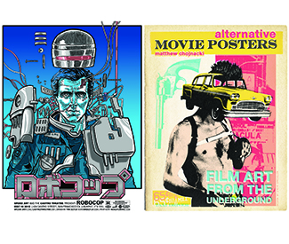
LIT Forget the glossy one-sheets you’ve seen reproduced a thousand times. The colorful Alternative Movie Posters: Film Art from the Underground (Schiffer Publishing Ltd, 207 pp., $34.99) highlights creatively re-imagined posters for pop classics like 2004’s Mean Girls (styled as a retro YA novel); 1990’s Misery (a stark drawing of a shattered ankle); and 1984’s Gremlins (a box of instant oatmeal: “Just add water!”) It also includes interviews with each of the artists, most of whom are diehard movie junkies themselves. I spoke with the book’s editor, Matthew Chojnacki, to get the inside scoop on his new project.
SF Bay Guardian Your first book, Put the Needle on the Record: The 1980s at 45 Revolutions Per Minute, was about record-album art. Were movie posters a natural progression?
Matthew Chojnacki I’m a huge music fan, and I was going to a lot of music festivals and seeing concert-poster artwork all over the place. I noticed a lot of those artists were also starting to do movie posters. Since I also love movies, I thought this would be a cool follow-up to the first book, because it’s a similar idea: How do you boil down a whole album, or a whole movie, into one image?
SFBG How did you choose which posters to include in the book?
MC I had this big matrix of what I wanted. There are a lot of different styles of art in this movement. A lot of it’s minimalist, but on the flip side, a lot of it’s hand-drawn cartoons, like Mad magazine style. And a lot of artists are doing their own, unique thing — glow-in-the-dark ink, stuff like that. So I wanted to include a lot of different styles of art, but also genres of movies and decades of film.
Also, especially with cult classics, a lot of the posters have been re-done hundreds of times; I tried to find the best [examples] for films like Fight Club (1999) and The Big Lebowski (1998). It became a big curation project. I boiled something like 10,000 images down to just over 200, and I probably contacted 105 artists and 100 agreed to do it. Most artists got two pages that show their style, with an interview alongside, which shows what types of movies motivate them and their thoughts on why these posters are important.
SFBG What are the elements that make an effective poster, and why have these alternative posters become popular?
MC What movie posters do these days is generally just [publicize] the celebrity in the cast. What they used to be, and what this [alternative art] does, is give the spirit of the movie. There are a lot of great, classic posters like The Exorcist (1973) — it didn’t tell you much about the movie, but it was an effective way to get people to see it.
I think the motion picture industry has gotten kind of lazy. They know celebrity sells, of course, but they could tell you who’s in the movie and still make it a piece of art. There are some more visual directors who do this very well, like Wes Anderson, Quentin Tarantino, or Tim Burton. It seems like they’re really involved with their marketing; their posters really pop, and give you the feeling or the emotion of what you might get with one of their movies.
But the other 95 percent of posters — you’ve probably seen those articles where they compare 100 action movies and they’re all done in the same exact way. It’s a regurgitation of the same concept. My point with the book is not only are these examples of cool posters, but also this is what it could be. It used to be a medium — just like album covers — where it took the project above and beyond. Even if the album or the movie was kind of crappy, there was still some collectibility around the imagery of these films. They used to put a lot of style and intrigue into these posters, and I think that’s something that can still be done while communicating that Will Smith’s in the movie.
SFBG Do you have a favorite poster in the book?
MC I think it’s all how you were raised. In the 1970s and ’80s, I loved hand-drawn posters, National Lampoon or Garbage Pail Kids-style, because they always revolved around T&A comedies or horror movies — R-rated movies geared toward underage people. I tend to like that kind of comic-book style. One of my favorite artists who hand-draws is Ghoulish Gary Pullin, who has a Big Lebowski and a Teen Wolf (1985) in the book. I really like his style; it’s way up my alley of what I used to like as a kid.
I love posters for movies that are kind of underrated a little bit. Everybody does Big Lebowski and The Rocky Horror Picture Show (1975), but I love when, once in awhile, someone will pluck out a Teen Wolf or something a little more obscure, and do it in a really cool way. *
Facebook.com/AltFilmArt

