Hold onto your butts, a new study on San Francisco’s rental market (yes another one) reveals the city’s newest most expensive neighborhoods.
Priceonomics went pretty darn viral last year upon release of its first study of San Francisco’s rental explosion, and round two is certain to blast through SF social media as well. And deservedly so, as the new high rental numbers are staggering.
Median rent for a one-bedroom apartment in San Francisco is now $3,120. The median rent for a two-bedroom is now $4,000, and the median rent for a three-bedroom is $4,795, Priceonomics found.
It’s not a wonder widespread evictions are sending protesters onto the streets (and into the offices of real estate agents). The numbers are a good indicator of why any eviction from a rent-controlled unit today is also an eviction from San Francisco entirely: prices are just too damn high to find a new apartment at a comparable rate.
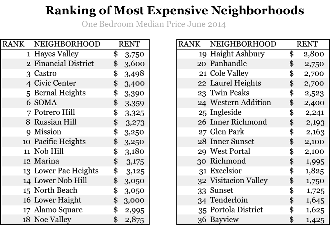
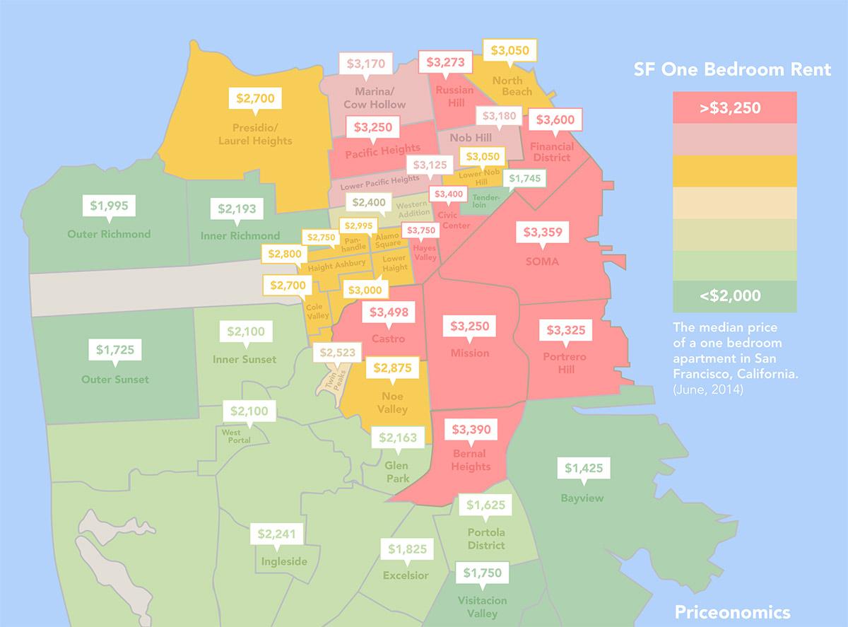
The study breaks the data down by neighborhood. Hayes Valley topped the list, with a median rent of $3,750 for a one-bedroom apartment. The Financial District and the Castro were second and third most expensive, with the Bayview coming in last at $1,425 a month.

The study also noted that historically poor areas (derisively termed “backwaters”) have jumped in price, largely in part due to an influx of tech workers and their shiny UFO-like private shuttles.
As the rents rise and turmoil bubbles over evictions, city legislation like Supervisor Jane Kim’s Housing Balance Measure was defanged by Mayor Ed Lee during negotiations over the past month. Still, there is some hope on the November ballot for relieving San Francisco’s housing crisis. Proposition G, the Anti-Speculation Tax, would discourage speculators from “flipping” properties for a profit by taxing them harshly.
Of course that’s no silver bullet, and San Francisco will need to take a hard look at its affordable housing policies to stop these prices from rising, rising, rising.
It seems like they couldn’t possibly go up higher, but then again, we always think that, don’t we?
For more on Priconomics’ findings, check out the article here.
Click the map for a higher-res version.


