By Robyn Johnson
The USDA’s freshly released Food Environment Atlas has been getting some buzz the last few days, coinciding with Michelle Obama’s recent vow to tackle childhood obesity and food accessibility issues and a lot of dialogue and ranting going on in the media about big bad Agribusiness and the hyper-idealism and hypocrisy of the locavore movement. (Mrs. Obama herself has drawn some fire — critics have taken aim at her overstatement of the severity of the rise of obesity and its possible fallout, the “inappropriateness” of mentioning her own daughters’ brush with chubbiness, and her dodginess about important societal causes of childhood obesity. Oh, the pitfalls of a crusading First Lady!)
The atlas interactively charts 90 indicators of the food environment, like availability of fresh produce, fast food restaurants, and grocery stores, amount of physical activity evidenced in the population, and food costs and taxes. Users can generate maps showing variations countywide, regionally, or by state, depending on the data available. Users can also make advance searches for multiple factors, like poverty prevalence plus number of farmers markets available, if you want to carefully dance the line between correlation and causation. Other features include percentages of low-income homes over a mile away from grocery stores, types and quantities of foods eaten at home, food insecurity, obesity rates, farm to school programs, and a slew of other statistical information. (For a real horror show search for low-income preschool obesity rates).
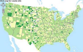
This map shows the availability of farmers markets (or lack thereof) throughout the country.
I can’t say for certain since the highly trafficked link has been breaking throughout the day, but the atlas seems to work best at giving a broader comparative perspective of the food-related socioeconomic issues of the US. When trying to identify the relative culinary desert commonly known as West Oakland, the entire Bay Area portion of the map stayed the same minty green that denotes a high access to grocery stores — clearly not the case. That being said, some interesting disparities crop up. Colorado is among the highest of the states for fast food spending per person, but also has one of the least obese populations — Coloradoans also drink the least amount of soda and rank in the highest category for exercise. Play around and see what you can find, but you may not want to jump to any conclusions ….

