• No categories

Visual Art

Sprinting toward Babylon

0

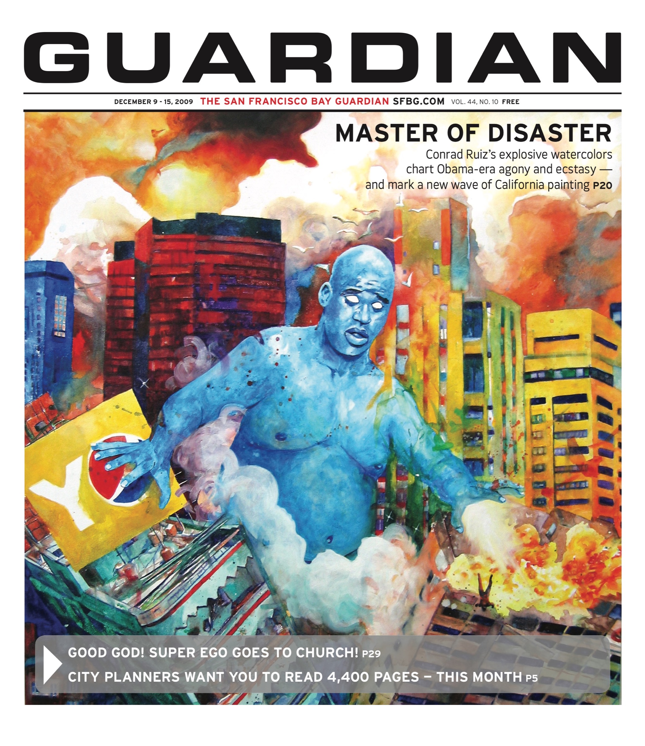
VISUAL ART I remember the first time I heard about Conrad Ruiz. I was standing by the fire on the patio of the Eagle, a spot that for me is a site of great tidings. A pair of talented San Francisco artists told me with enthusiasm about this young painter whose large-scale works depicted things like a man riding the nose of a killer whale as it burst forth from a pool, or a coach getting a golden shower of Gatorade from his triumphant team. According to their accounts, Ruiz magnified and entwined the absurdity and ecstasy of his subject matter. I had some cathartic laughs just imagining his paintings.

109-cover2.jpg
Detail from Overload. Challenger explosion not pictured.

When I first “saw” Ruiz’s art, online, it exceeded my expectations. In particular, I was blown away by Overload [2009], which among other things deserves consideration as the best piece of “Barack Obama art” to date. Panoramic and vibrant even when shrunk 25 times in size, Ruiz’s watercolor works on paper and canvas once again incited a convulsive reaction. I laughed my ass off upon seeing works such as New Fall Lineup [2009] for the first time. But the longer I looked, the more caught up in wonder I became about their myriad tiny details and teeming — at times disturbing subtextual currents.

What goes on in Ruiz’s imagination? On the eve of his first solo show, at San Francisco’s Silverman Gallery, I caught up with him as he navigated the social conflagration of Art Basel Miami, the megafair where at least one magazine tipped him as the leader of a “new generation of art stars.” Whatever one makes of that claim, Ruiz — who is also plotting some collective artistic efforts with friends — is the splashiest crest of an exciting new wave of young California painters.

SFBG How are you doing?
Conrad Ruiz I’m alright. I’m just sitting on South Beach. I wanted to find a place to gather my thoughts, and I’m watching this guy tan himself. I can’t believe he’s doing that. He’s got these great stomach muscles. [Curator and Berkeley Art Museum director] Larry Rinder and I were talking about doing sit-ups before we came here, but we both just got busy — we never did it.

Miami’s fun. I kind of wish I could take my shirt off everywhere, but I feel a little bit squishy.

SFBG It seems like your art would look good in Miami.
CR The colors are finding a home here. There are a lot of bright red and yellow bikinis around. This couple nearby are either arguing or also tanning themselves. They just sit and look at the sun, kinda like lizards.

SFBG What do you think of the Tiger Woods news frenzy right now? I wondered about your take on him. In a way, I thought he might not fit along with some of the athletic figures you depict, because golf isn’t so much about dynamism.
CR But you always hear comedians say, “Just leave it to a black American to dominate another sport.” Chris Rock essentially says, “Wait till we get on ice skates, man, we’re going to take over hockey.”

Tiger Woods has been developed into this brand, aligned with Nike. It’s a very intelligent campaign. It’s not Obama, but he’s been this person who can do no wrong. That’s the personality that has developed through whoever is handling his marketing. It’s more than his being an excellent golfer, he’s also been displayed as this great human. We don’t know that much about him, and then something like [the car accident and ensuing scandal] happens. It’s all we get, and it’s kind of sketchy, and it happened to fall on this awesome Thanksgiving weekend. I thought, “All must be right in the world if the only thing we have to talk about is Tiger Woods getting hit with a golf club by his wife.” If that’s what actually happened.

SFBG People are already Photoshopping and digitally animating visions of that.
CR That’s my job — to look up all that stuff.

109-cover1.jpg

SFBG Does 1970s cinema have any place in your mind’s eye? The Jaws [1975] shark in your painting Rough Riders [2008] and the disaster film or Towering Inferno-like [1974] quality of works like New Fall Lineup made me wonder. I could see that I might be wrong about the latter, since a flaming, exploding skyscraper has other obvious connotations.
CR My work really started with that time period and in painting advertising from that era. The colors were a lot more primary. When I was painting those advertisements, the work was more sarcastic. That beginning body of work was about developing this snarky character that evolved into what I’m making now.

It is about going back and catching some of the ridiculousness of what was so popular at one time. When you watch a disaster film now, you know the history of those celebrities. It’s hard for me to relate to that period of time, but it’s easy for me to relate to early 1990s movies like the Naked Gun franchise — O.J. Simpson was in those — and the Terminator flicks. Those are ridiculous and fun. I like them, and of course [lowers voice], that’s my Governor.

Everyone says “I hate that guy,” but even though I think [Schwarzenegger]’s doing a terrible job, I don’t want my politicians to be these people I don’t know — I’d rather have them be these celebrities I hate. If I’m going to hate who’s in office, I’d rather have it be Sylvester Stallone or somebody.

SFBG When you make work that has a contemporary element, there’s always a danger of it becoming instantly dated. But I think some of your work is both timely and ahead of its time. Overload, for example, just becomes more and more evocative.

The NASA element of the piece, with the Challenger exploding, is taking on new facets as Obama is increasingly identified with the military and space program. I saw a show at Altman Siegel Gallery by Matt Keegan earlier this year that utilized a New York Times front page photo of Obama boarding Air Force One for the first time. That’s a more direct example of what I’m talking about. Six months ago, that image had a different connotation.
CR I was really hoping Obama would get elected, because I started Overload before the election.

SFBG I have to ask about the Challenger’s presence in Overload. I was talking with the artist Colter Jacobsen recently about the fact that I’d like to put together a show of Challenger-related art. Within the art world, there are at least a dozen or so people who have incorporated the Challenger one way or another into work. That’s not even counting how it has manifested as band and album names and jokes in popular culture.
CR For me, it would be great to ask the artist about the original idea behind making a Challenger painting. Everyone has a different a point of view about what’s going on. I always feel like I’m casting with my paintings. There are these scenarios that have never happened, and since I get to decide what’s happening, I also decide who is the star —whether it’s someone from a B movie, an unsung celebrity, a friend who I’m giving a big break, or someone from a blockbuster, like Eddie Murphy and David Alan Grier.

109-cover3.jpg

Overload is a blockbuster sort of painting. I cast that [Challenger] explosion because I thought it was a very unique, amazing explosion. Once I began painting it, people began talking about its relevance, because it says something different when Obama is flying towards it, possibly causing it or stopping it.

To be very honest, I didn’t initially know it was the Challenger exploding. My Mom told me. She’s a teacher, so to her it was a terrible thing, and she asked me to really consider what I was doing. I told her, “That’s perfect.” Because to me the painting is about Obama coming to the rescue and shitting these energy projections — either he’s going to stop the war, or he causing some trouble of his own.

A few paintings later [in New Fall Lineup] I painted the Twin Towers exploding for a similar reason. I was casting this unique explosion and trying to create a different scenario with it.

SFBG I don’t often self-identify in generational terms, but when I was talking about the Challenger explosion with Colter [Jacobsen], he was saying that he had referred to it while teaching a class, and that it wasn’t even a memory for many students. Whereas for he and I, there was the teacher element, and also the fact that everyone was watching the Challenger at school that day. So as a disastrous event, it was similar to 9/11 in that the day just stopped.
CR The Challenger explosion has a lot to do with failed promise, doesn’t it? There was tremendous hope about what was about to happen, and it all fell apart in one second.

There’s an element of comedy that I’ve kind of borrowed from Richard Pryor. As I watch his stuff, it’s more like performance art. What he talked about wasn’t funny at all, it was actually horrible. He was an interesting character in that he talked about things that were definitely not right, but did so in a way that everyone would be laughing. Comedy is a way of passing serious information without being worried about the consequences. That makes it kind of a new territory. Dave Chappelle was able to say some unique and terrible things in this fun format.

SFBG It’s interesting that you bring up Chappelle, because after he hit his sort of Challenger moment on the pop culture stage and went away, Block Party [a.k.a. Dave Chappelle’s Block Party, 2006] came out.
CR That’s a beautiful movie.

SFBG It was released during the final stretch of all the jockeying for Academy Awards in Hollywood. All these talking heads were going on about which movies were important, and I remember thinking that Block Party was more important or vital and connected to the world than any of them.
CR/strong> His stuff is always about pointing out differences, and bringing together ideas of social class hierarchy. In a roundabout way, that’s what he did [in em>Block Party]. He brought together a lot of high-end artists and gave a free show. It was about giving to the people or the neighborhood. The idea of a barbecue, a barbecue block party, also has an ethnic connotation to it.

SFBG There is a lot of athletic imagery in your art, and I don’t want to reduce it to masculinity or sexuality, but I do want to ask about being drawn to those kinds of visuals, or wanting to render them.

Veronica De Jesus does some sports-oriented work that’s quite different from yours, but also has a terrific sense of humor. Sports are quite iconic — moments like an Olympic runner tumbling or Zidane’s headbutt become part of the collective consciousness. But beyond that, there’s an ecstatic, colorful, lively quality to your sports imagery.
CR Sports have always been a part of my life. My mom and dad were very athletic at one time, and they encouraged my brother and me to take part in sports. The alternative was for us to be on our own, and they knew we had a lot of Latino friends, so of course I was just going to get into trouble. So I was enrolled in soccer and taekwando. I was a sprinter in high school, and I was on the football team.

[The paintings] are a culmination of all the things you’re talking about. The outfits these athletes wear are designed to be eye-catching, with these primary colors. The Denver Broncos have that awesome dark blue with orange …

SFBG I love that combo. I just put together a sports cinema program with a film curator at Yerba Buena Center for the Arts, and when I’d introduce a movie from the 1970s, I’d always mention the athletic fashions.
CR Everything is designed to be the most freaking amazing thing possible, because these people are performing acts that no one else can do — they’re leaping through the air catching a ball thrown from very far away while wearing purple and yellow. The performance and exertion is incredible, and at the same time, what can make it even greater is being in a stadium where everyone is screaming their lungs out at the same time. Whether it’s an epic win or colossal failure, it’s still that climax. The climax doesn’t mean that it’s good — it’s a peak of performance.

When I’d meet with advisors at CCA [California College of the Arts], we’d really break it down, and they could easily talk me out of making my work. When you get down to it, what I’m doing is a little ineffective, and what would be more effective, to really get my idea across, would be to just play soccer with a group. I’d be performing, I’d be creating these intimate male relationships. I could actually be slapping some guy’s butt instead of painting around it. Joining a soccer team would be more efficient.

SFBG Maybe you and Luke [Butler, a fellow Silverman Gallery artist whose work engages with masculinity] should join a soccer team.
CR [Laughs] Yeah.

SFBG There is some commonality between your work, and also some major differences.
CR I think it’s because I’m the boy and Luke is the dashing man. I’m looking to be a man and trying to figure out what a man is, while Luke is a dashing man looking sideways.

CONRAD RUIZ: COLD, HARD AND WET
Fri/11 through Jan. 30, 2010
Silverman Gallery
804 Sutter, SF
(415) 255-9508
www.silverman-gallery.com

Attention cultural mutants

0

arts@sfbg.com

“Jacob Ciocci is,” as Wikipedia attests, “an American [Pittsburgh] visual artist, performance artist and musician … he is one of the three remaining founding members of Paper Rad, an artist collective … He also performs and tours regularly … in the band ‘Extreme Animals’…” Ciocci’s work, especially with his recent video collection release, 2 Blessed 2B Stressed (Audio Dregs), is almost entirely not his own. His videos recycle pop cultural detritus as fast and furiously as his band freaks beats. I spoke with Jacob in person, via e-mail, and through Transcendental Meditation to collage the meaning, authenticity, and artifice of collage.

SFBG What questions are you most frequently asked?
JACOB CIOCCI Questions about appropriation, sampling.

SFBG These are obviously huge aspects of your work. What’s your relationship with these forms?
JC Whenever I have used or “sampled” something from some cultural source I really feel like there is always an equal amount of change or recontextualization happening. I strive for a 50/50 yin-yang balance between me/the world, or culture’s voice/my voice. Of course I recognize this is sort of absurd, since you can never separate yourself from the yin-yang wheel — you can never fully know when you are being “you” and when you are being a puppet for culture.

SFBG Any questions you’re sick of hearing?
JC I guess the questions that bug me the most imply that all I do is regurgitate culture from the ’80s. My interests really are much wider than just approaching 8-bit video games like Mario Brothers or sampling cartoons from the ’80s. My art, has always been interested in a much more ambiguous and wider set of concerns. It’s not about any specific period of pop culture and cannot be reduced to any kind of term like “appropriation.”

SFBG It could be argued that ’80s culture is also the one you grew up with and thus are most familiar with.
JC I think that when I was doing work that was referencing certain time periods, it was more an investigation of how certain technologies or cultural tropes affected my consciousness. I was using my current consciousness, or my subconsciousness as a way to talk about the shaping of my brain — but not ’80s culture, all culture: the vacuum of past, present, and future. It’s not interesting if it just regurgitates the past. It’s best if the work deals with the past via your perspective in the present.

SFBG So rather than simply reviving and representing these old cultural tropes, you try to give them new meaning by reflecting on them via a cultural mirror — albeit a fractured, holographic one of your own design? Does this transcendence then create a new aesthetic?
JC I think that if you hold up a mirror to society in the right way — if you have constructed the mirror good enough (and the definition of what works as a good mirror is constantly changing based on context), then it does take the viewer and society as a whole to a new place, and thus probably will create some sort of “new aesthetic” or cultural direction. When you interpret the past (even the past meaning one minute ago on YouTube) with clarity in the present, you create the future. This seems to be a neverending cycle. Some would say that through technology it is happening at a faster and faster rate. But I really can’t say because time seems so relative.

SFBG Speaking of technology, your work is explicitly couched in the crude pixel aesthetics of outmoded technologies, like Geocities and Angelfire Web sites. Why is that?
JC When I started working with computer technology in college with some other friends, we realized computers were becoming too advanced. It was impossible to learn every new tool and actually understand not only it’s technological but cultural implications — to master it.
The model instead was to just focus on something a bit older, that had a fixed architecture, so that even if it’s outdated, if you just stuck with it and really investigated that interface, then you would be able to get something interesting and “contemporary” out of that tool. Otherwise you just end up being a superficial user of every piece of software that comes out.
But I think the big light bulb that went off when I started to work with Paper Rad was that there is something just as interesting happening when you are a superficial user of technology. A recreational Geocities user isn’t interesting because he or she is a hardcore DIY “master HTML programmer” computer hacker wizard, but because of what he or she exposes about the Internet. I like the cultural mutant model: Geocities users were mutants who unconsciously stumbled on an interesting representation of how the Internet was affecting culture.

SFBG What is it that usually catches your eye culturally?
JC The relationship between ideas of authenticity and artifice. The version of celebrity that Paramore [a contemporary pop punk band] or Miley Cyrus represent is really interesting because it’s wrapped up in a kind of conservatism, but it’s also about being young and rebellious.

SFBG And you’re attempting to exfoliate that gap between authenticity and artifice?
JC I’m interested in the possibly pointless task of trying to separate artifice from authenticity. I feel that a lot of times what I try to do is to help people who are cynical be a little more open-minded about what’s happening around them culturally, so that they can possibly see that other people are struggling as much as they are to define themselves within this very limiting cultural soup. Or that these ideas of politics and constructions that we have in our head about who we are and what our beliefs are, are really, really rigid, and then by reevaluating culture that we deem as foreign or outside that we can rethink ourselves. I’m not trying to say that “we can all get along and we can all be friends.” But there’s something to that process of expanding your mind that is important.
This can be really hard to make work about because it can seem disrespectful sometimes. People, including myself, make art using images of people they have never met, and that becomes highly questionable — which in my opinion is a good thing. I think that questionable aspect of art can be productive if handled correctly.

www.audiodregs.com; www.jacobciocci.org; www.paperrad.org

Media res

0

arts@sfbg.com

VISUAL ART/LIT Teresa Hak Kyung Cha isn’t the most famous female representative of conceptual art and the marriage between text and film. But this visual artist and prose lyricist — born in 1951, killed in 1982 — found new zones between film language and the written word. Her body of work, now a hallmark for lesser-known Asian and feminist artists, roughly spans from 1972 to 1981. Cha consciously employs the fragmentation and displacement of text on a page, the flap of an envelope, or carefully selected superimposed images in film, as in the unfinished circa-1980 White Dust From Mongolia.

In White Dust, a young Korean woman experiences physical, cultural, and psychological alienation in China when she is forced to leave Korea during the Japanese occupation. Cha’s purposeful isolation of language and deployment of linguistic breakdowns is instrumental in showing the cultural and geographical dislocation experienced by the film’s main character. In a project proposal, Cha writes that this harrowing experience causes the film’s young woman to "lose all memory and her capacity for speech." The question of whether White Dust‘s female subject can be likened to the artist herself has generated speculation by art historians and museum curators alike.

White Dust superimposes images of Korean women milling through a market and the face of a girl trying to remember. Was Cha creating a story about herself within American society? In 1980’s "Surplus Novel," one of Cha’s lyric poems within Exilee/Temps Morts: Selected Works (University of California Press, 288 pages, $24.95), the author recounts the personal experience of being called a "Yoko Ono," a fraction of one moment within a lifetime of painful cultural estrangement.

On the page, in medias res, are Cha’s deliberately fragmented words evocative of mistaken identity and the splintering of self? In her journals, she notes that she is primarily interested in "how words and meanings are constructed in the language system itself, by function or usage and how transformation is brought about through manipulation, processes such as changing syntax, isolation, removing from context, repetition, and reduction to minimal units."

Cha the conceptual literary artist was interested in showing and interpreting cultural detachment through her art, fueled by examples from the breathing wound of daily life. Even with a grant, Cha never completed White Dust. She was forced off Seoul’s streets due to political unrest in Korea following the October 1979 assassination of President Park Chung Hee. Three years later, she was murdered in New York City by a serial rapist working as a security guard.

The meanings and appearances of words are to the fore as one walks the rounds of "Theresa Hak Kyung Cha: Earth," a Berkeley Art Museum exhibition curated by Constance M. Lewallen, who also edited Exilee/Temps Morts: Selected Works. Words in French, Korean, and English are interspersed with the white space of blank pages that yield no answers. The French word feuilee — which can translate to leaves of a page or literally to "leaf"— is typed in different positions on several sheets of white paper. This gesture may embody the physical movement of falling leaves in autumn, or the structure of Cha’s writing.

Viewers must forge their own interpretations of Cha’s elliptical and occasionally whimsical texts, which sometimes read like song lyrics or chants. Cha’s words lean one toward a growing belief that it is our literary license to break her words down into our own meanings — to shift our attention from the storyteller to the story told. Perhaps then the reality of her murder in the SoHo district’s Puck Building might not be such a slap in the face.

Tethered by her untimely death, the caliber of Cha’s contribution to the art world remains a puzzle. Yet the aesthetic pulse of the day orders one to ignore the conceptual fray. Cha is a thoroughly detail-oriented literary and visual artist. Her methodical work doesn’t entertain or dazzle. It is open-ended in a way that requires its audience to supply part of the vision.

THERESA HAK KYUNG CHA: EARTH

Through Dec. 20, $5–$8 (free for UC students and children)

Berkeley Art Museum

2626 Bancroft, Berk.

(510) 642-0808

www.bampfa.org

This is it

0

arts@sfbg.com

VISUAL ART In its opening week, the posthumous Michael Jackson film This Is It topped the international box office. It’s a testament to the enduring ardor of his fans. But one day in the not-so-distant future, the film will likely be core material in a media studies program. Perhaps even a Michael Jackson studies program.

In 2005, Candice Breitz, a Berlin-based, South African-born artist whose works of photography and video installation address the psychosocial power of pop, created King (A Portrait of Michael Jackson). Breitz’s multimedia project efficiently makes the case that the musician and his fans are engaged in a deeply complicated relationship, one with an infectious soundtrack. King is direct — 16 Jackson fans, videotaped singing and dancing to the entire Thriller album, are presented together in the gallery on plasma screens. The result is a dynamic image of the entertainer in which he never appears.

The similarly structured 2006 work Working Class Hero (A Portrait of John Lennon) is one of two celebrity-appropriating Breitz works currently on view at SFMOMA. Like a good pop song, it seduces with a hook and takes a complicated foothold in your consciousness. The second piece, 2005’s Mother, isolates scenery-chewing performances by six major Hollywood actresses: Faye Dunaway, Diane Keaton, Shirley MacLaine, Julia Roberts, Susan Sarandon, and Meryl Streep.

"I’m turned on by the potential for the work of art to articulate complex ideas and simultaneously engage a broader audience which might not be as invested in the discourse of contemporary art," the highly articulate Breitz explains in a recent conversation. She offers what she terms "the South Park model," suggesting the subversive cartoon is something you can simply be entertained by or write a PhD dissertation on.

Breitz’s projects frequently manage to have it both ways. The Lennon piece beckons with the sound of familiar songs. But encountering 25 video monitors, each one slightly enlarging a passionate fan, is involvingly witty — and frightening, due to the intensity of the performances. These are people who clearly take the music to heart and have made it their own. Being able to look at them so closely in a gallery is an uncomfortably intimate experience — an effect perhaps achieved by the fact that each participant is recorded alone.

"I’m interested in the ping pong, that they’re there both as individuals who have their own subtle or radically different ways of interpreting their challenge, but also as members of what Benedict Anderson refers to as an ‘imagined community,’" Breitz says. "They don’t know each other, but by virtue of their shared interests they belong to an abstract community." This explanation concisely identifies a key component of the media-dependent condition of modern life.

The scenarios in Breitz’s works have been complicated by the popularity of American Idol and YouTube. Breitz views them with characteristic criticality. "In as much as I am flirting with those formats, there are certain elements of those programs I don’t care to embrace," she admits. "One is the way in which participants are humiliated and stripped of dignity."

The Breitz exhibition recalls Phil Collins’ crowd-pleasing 2005 dünya dinlemiyor, a chapter of his Smiths karaoke video project that SFMOMA presented in 2006. Collins’ piece also accesses powerful pop bonds, allowing one to see young Turkish fans deliver versions of Morrissey’s lyrics in flawless English. Coincidentally enough, Collins made a project (2005’s the return of the rea / gercegin geri donusu) about people who felt damaged and exploited by their participation in British reality TV shows. While one might imagine a rivalry between the artists, Breitz acknowledges an appreciation and dialogue.

"Who did it first?" she asks. "I find it fascinating when different people do something similar at the same time. I find it affirming — there’s a relevance [when] other people are thinking about the same things."

Mutual thoughts seem to have been entertained by the screenwriters of Kramer vs. Kramer (1979) and Mommie Dearest (1981), which are among the vintage film sources for Breitz’s Mother. The piece essentially constructs new meanings from elements such as Faye Dunaway’s over-the-top performance as Joan Crawford and Shirley MacLaine’s fictitious Debbie Reynolds portrayal in Postcards from the Edge (1990). In the process, it spotlights the ways in which we embrace and consume maternal archetypes.

"There’s a tug of war for meaning going on, and at the end of the rope there are all of those existing meanings and identifications and desires already invested in that material," Breitz says. "And then there’s me — I’m doing my best to bring a new translation or angle."

She manages the feat, not least because her perspectives on her material and equipment are so spot-on. "I think of those plasma displays as vitrines," she says of the screens in her works. "They’re like glass boxes in the natural history sense. Almost immediately, what you put into them is something of the past — they’re less objects of our present than documents that refer back to something which was." Like the first time we heard that favorite Michael Jackson song.

ON VIEW: CANDICE BREITZ

Through Dec. 20., $9–$15 (free for kids and on first Tues.; half-price Thurs. evenings)

San Francisco Museum of Modern Art

151 Third St., SF

(415) 357-4000

www.sfmoma.org

Encapsuutf8g pulses

0

I happened upon the opening of "Our Best Machines are Made of Sunshine," a sound installation by Jacqueline Gordon at Queen’s Nails Projects that has inspired noisy throngs both inside and outside the gallery’s small walls. The work relays miked sound from the sidewalk and street outside QNP, ricocheting it through the gallery’s innards via four white constructions of paneled vinyl and protruding, point-less (but sharp with meaning) pyramids. The result is a lot of fun; outsiders can create sound from outside the gallery’s walls, while those inside are subject to an echo of cacophony. Inspired by anechoic chambers, John Cage, Brutalist architecture, the limitations of technology, utopia and dystopia, and, of course, sunshine, "Our Best Machines" is simultaneously intimidating and intimate, especially when visited alone. I recently sat down with QNP director Julio Cesar Morales and Gordon on the gallery’s comfy floor cushions to get a sense of why this is, and what’s so special about sunshine.

SFBG How did you arrive at the gap and tension between nature and machines?

Jacqueline Gordon I’m interested in the history of technology and how we create — or not necessarily how we create, but why we create — and the kind of tools that we create for ourselves. In particular, the tools and the ideas and machines created in pursuit of utopia, and how that approach can actually be a confining thing. So it’s that push-pull between the search for an escape and then the confinement of that search. To me, this search is a universally human, psychological phenomenon.

SFBG Why or how does this search become confining?

JG It could become limiting because maybe you’re only focused on one thing, and you kind of get stuck.

I started knitting when I was really depressed, which I think a lot of people do (laughs). And I was noticing that I couldn’t not knit for eight hours a day. I got really into it. But then I started noticing that I wasn’t progressing; I was just continuing on and I wasn’t necessarily improving on certain aspects of my life. Instead, I was just totally obsessed with knitting.

SFBG It just became really repetitive.

JG Yeah, it was really soothing and comforting, but just total escape.

SFBG Would you say that "Our Best Machines are Made of Sunshine" is an attempt to elucidate or expose the push of technology and its tools toward a utopia, or an attempt to break out and disrupt that occurrence?

JG I’m investigating that occurrence by asking "What is that?" or "Why do we do these things, and how do we see them related to our lives?"

SFBG I’ve noticed that some of your earlier work, such as "Black Matters," takes its design direction from the natural world. And the title for this work obviously privileges sunshine (the natural) over the man-made (machine). How does this inform its form?

JG All the designs came from the natural environment. These patterns [the cone or stud-looking shapes that house the speakers] came from a building on the corner of Market and 11th streets. The vinyl pieces come from log cabin quilting patterns. It’s very simple. All of it is from the world. I like to think of it as actually coming from reality.

SFBG So, architecturally speaking, you’re interested in being "site-specific." What else?

JG In terms of architecture, in terms of inspiration, I was looking at a lot of Brutalist architecture.

SFBG How come?

JG I think that in a way it demonstrates a striving for progression. Brutalist architecture was a kind of symbol for, or the epitome of, progress. Yet the buildings are so derelict; they’re not good to live in. But they are these emblems of power and structure — they symbolize utopia.

SFBG Why did you choose to house the speakers in the Brutalist forms as opposed to the quilted patterns? Could it have been the other way around?

JG I wanted the sound to come out of something hard. I also wanted it to be a little, I don’t know if "scary" is the word, but a little intimidating.

When I first started working with sound I got the idea that I wanted to make an anechoic chamber. I had read about John Cage’s theory of the anechoic chamber and I eventually got to experience an installation of one in New Jersey. The walls’ insides were patterned, and wedges come out in different directions.

SFBG Aside from the obvious "white cube" connection, why else did you choose white?

JG I’m interested in the manipulation of the senses and perception. I wanted to do something that was all white, but it’s also a way of creating sensory deprivation. (Spencer Young)

OUR BEST MACHINES ARE MADE OF SUNSHINE

Through Nov. 20,

(music performance with Wobbly, Nate Boyce and Greg Zifcak, Thurs/12, 8 p.m.)

Queen’s Nails Project

3191 Mission, SF

(415) 314-6785

www.queensnailsprojects.com

David Wilson

0

johnny@sfbg.com

You can stare blankly at a museum piece for three seconds, or you can view a drawing through one of David Wilson’s events — through a swim in the Pacific Ocean, or through staring at a sky criss-crossed by an intricate lattice of branches. You can do the gallery troll stroll, or you can walk over hills and small mountains into caves and coves where, thanks to Wilson and friends, music and movies reside.

If you experienced Wilson’s "Open Endless" and "Memorial Fort" this year, you’ve been to places you likely wouldn’t have encountered otherwise, and have memories to draw from as you move on. Though these were autonomous-zone community gatherings, subtextually and privately, they were partly inspired by Wilson’s father, who died the day after "Open Endless" traversed the Marin Headlands. "Everything I felt excited about [artistically] took on a different tone," he says, when asked about the initial cancer diagnosis. "I started a six-month drawing project up in the hills. It was personal meditation on what was happening, and also a chance to be removed from my life in a way that I could feel like I was sending thoughts out eastward. I was drawing eastward."

"Drawing is a tool that I carry with me," he continues, as we sit on a patch of grass in Dolores Park, where a dog tries to munch on our pastries. "It’s a viewfinder to orient my wanders while trying to find places, and find myself in places."

For Wilson, this journey traces back to annual visits to Cape Cod during his youth. His drawings and paintings range from life-size shells to a 22-foot watercolor coastline rendered on the aged white paper of record sleeves. "I like seeing what’s already invested in a piece of parchment," he says, agreeing about a kinship with Todd Bura, Ajit Chauhan, and Colter Jacobsen. "Age marked in that gentle way on paper is beautiful."

Wilson’s drawings have metamorphosed into site-specific events in eucalyptus groves, military tunnels, and even islands. Last year, and he and some co-conspirators woke up on New Year’s morning to reserve every campsite on Angel Island for one July weekend. With "Memorial Fort," Wilson’s process has progressed to additions to the landscape, resulting in an unlikely oasis in the woods of Richmond. "Ideas in general are infectious," he observes. "If an idea is exciting, then things can fall into place."

www.ribbonsribbons.blogspot.com

Emory Douglas

0

arts@sfbg.com

As a teenager, Emory Douglas was sentenced to 15 months at the Youth Training School in Ontario. It may have been the best thing for him — and the worst thing "the Man" could have done. In the prison printing shop, he discovered a gift for print and collage he would later use as the minister of culture for the Black Panther Party. From 1967 until the party disbanded in the 1980s, his iconic graphic art marked most issues of the newspaper The Black Panther.

Douglas brought the militant chic of the Panther image to the masses, using the newspaper to incite the oppressed to action. In the name of expediency and limited resources, he developed collage tricks to maximize his passionate message. His back-page posters emphasized the Panthers’ community programs, like free breakfast for children, clinics, schools, and arts events. His works presented the struggle with a mixture of empathy and outrage — sometimes direct, sometimes allegorical — that remains innovative and contemporary amid today’s high-tech standards.

In a 1968 salvo called "Position Paper No. 1 on Revolutionary Art," Douglas states: "Revolutionary art is learned in the ghetto from the pig cops on the beat, demagogue politicians, and avaricious businessmen. Not in the schools of fine art. The Revolutionary artist…hears the sounds of footsteps of black people trampling the ghetto streets and translates them into pictures of slow revolts against the slave masters, stomping them in their brains with bullets, that we can have power and freedom to determine the destiny of our community and help to build our world." For 33 years Douglas has stood by these words, working toward a better world for the people.

When Rizzoli published a compendium of Douglas’s posters, broadsheets, and fliers in 2007, a new generation became familiar with the causes of solidarity, liberation, and self-determination he holds dear. He has since had large-scale shows at sites such as L.A.’s Museum of Contemporary Art, while his commitment to social change has led to exhibitions and speaking engagements at Oakland’s New Black World and the sorely-missed Babylon Falling in San Francisco. His interpretation of Toni Morrison’s Bluest Eye for last year’s "Banned and Recovered" show at San Francisco Center of the Book was one of the standout pieces of 2008.

Douglas’ work captures the tragedy and triumph of the disenfranchised, impoverished, and fed up; an eternal struggle against those blessed with power who choose to abuse it. Much like the works of Goya and the words of Hugo, his contribution to that struggle remains immeasurable — not just for what he has created, but for the people he will empower for generations to come.

www.itsabouttimebpp.com

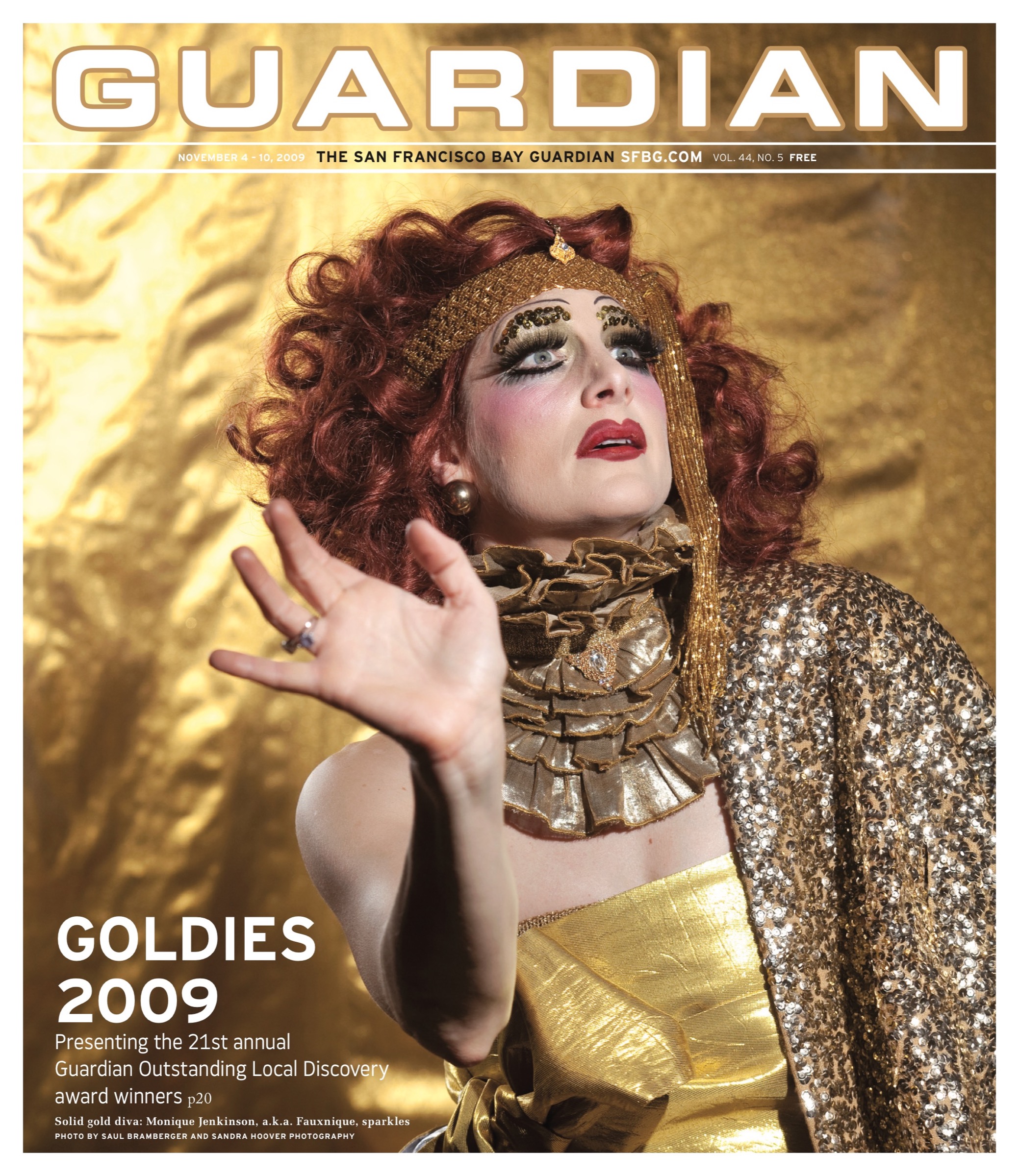
>>GOLDIES 2009: The 21st Guardian Outstanding Local Discovery awards, honoring the Bay’s best in arts

Veronica De Jesus

0

arts@sfbg.com

Veronica De Jesus’ art is centered on drawing — not limited to it — and is sewn to the practice of putting lines on a page in a passionate, automatic way. While the Oakland-based artist’s biography and work speak of displacement and nomadism, her art is unmistakably rooted in the urge to copy and recreate images by hand. She defines drawing as "a relationship between myself, my tools, my hand, what I am observing, and what I choose to define or be interested in."

These relations stretch across the surface of what may be her best-known work, the "Memorial Drawings" series displayed in the windows of Dog Eared Books. The imperfect lines De Jesus traces, poised between brittle and globular like Ben Shahn’s, communicate a middle-distance gaze that allows itself to go wide. The artist isn’t a perfectionist — she says she hasn’t erased a line in a dozen years — and in loosening her grasp on her intentions, she trains our attention on the physicality of drawing, how it deforms its subjects and breaks space. These unconscious flourishes may crystallize or chip away at figures like Golden Girls star Bea Arthur, basketball coach Chuck Daly, and J.G. Ballard, soliciting and troubling the thought that De Jesus’ choices represent straightforward endorsement. When she explains that she is interested "in things our culture takes for granted," one imagines she hasn’t entirely made up her mind about who she’s memorializing, either.

Though aspects of De Jesus’ art relate to biographical details — her drawings of intricately embellished, boxy cars derive from having spent much of her childhood on the road — she considers her art personal rather than confessional. The bulk of her contribution to a group show at Receiver Gallery in November 2006 consisted of car drawings done in white ink on birch. These drawings have the feel of ritual. "Once the basic car is drawn, I just go into a trance," she said. "The line gets built up and all these patterns and fantasies come out … I have a strong suspicion that my car drawings are in part a sort of photocopy of the spirit inside me."

One need only look at the sculptural forms in De Jesus’ 2007 Eleanor Harwood Gallery solo show and her sports-themed 2009 show at Michael Rosenthal Gallery to see what she means when she says she’s trying to create an "avalanche with materials, ideas, and space … an avalanche that is perfectly suspended."

www.veronicadejesus.com

>>GOLDIES 2009: The 21st Guardian Outstanding Local Discovery awards, honoring the Bay’s best in arts

Luke Butler

0

arts@sfbg.com

"It’s so hard for me to figure out where it begins and ends with Shatner," comments artist Luke Butler on the man who, arguably, could be called his muse. "He’s a genius," Butler continues, "not because he is a great actor, but because he has this unstoppable quality. His vulnerabilities are on the surface for all to see."

Butler has spent a lot of time thinking through what William Shatner reveals and withholds on his most expressive surface: his face. For his Enterprise series — hung as part of "Captain!," his recent solo show at Silverman Gallery — Butler meticulously painted and repainted the freeze-framed countenance of Shatner as Captain Kirk.

Roland Barthes famously rhapsodized over Greta Garbo’s face, noting that, at a time when onscreen representations of beauty were changing, her visage "assures the passage from awe to charm." Butler’s paintings propose an alternate shift in regard to the uses of pop culture in contemporary art: from something ironic or quotable to a strange, new affective model — especially where masculinity is concerned.

Isolated against their gray backgrounds, devoid of context, Butler’s faces invite projection on what’s causing the crew of the U.S.S. Enterprise to look so pained, or languorous, or nervous. In space, no one can hear you scream, but Butler is still trying to listen.

Which brings us back to vulnerability. Kirk is described in text on Silverman’s site as a "model of vulnerability" — one no doubt enabled by Shatner’s borderline-hammy yet entirely committed acting style. "I think vulnerability is a better way for people to be," Butler reflects. "I think that it’s the best, most productive form of strength."

It’s an observation carried out most fantastically in Butler’s collage series "Leaders of Men," also displayed in "Captain!," in which the heads of Cold War politicians appear seamlessly grafted onto the glistening, well-endowed bodies of contemporaneous gay beefcake. While humorously resonating with the recent eroticization of the body politic (think of those shirtless pics of Obama swimming or Putin fishing), Butler’s jarring juxtapositions are more than a one-trick sight gag. They offer that most sheltered, scripted, and paranoid of creatures — the politician — the chance to literally let it all hang out.

"It was no big deal to show Saddam Hussein being hung to death. But if his cock had popped out — that would have been a real crisis," Butler explains, expounding on our culture’s double standard toward depictions of violence versus male nudity. "It’s such an awful contradiction. My collages don’t solve this problem, but run into it head on."

www.silverman-gallery.com

Vicious skate

0

Like many artists, Henry Gunderson, a 19-year-old who attends the San Francisco Art Institute, focuses on "process, not product." But the similarity ends there. Gunderson’s paintings have a diaphanous, primordial sensibility; it’s a dog-eats-dog world, as depicted in his piece Everybody Eats Somebody, wherein fish begets vulture begets cat begets a winged bird with human molars lined up in the forefront for kicks.

Gunderson’s paintings have been showcased at Fecal Face Dot Gallery, 111 Minna Gallery, and White Walls in SF, and will be seen soon in San Diego at Subtext Gallery and Toronto at Show and Tell Gallery. His is no drip-drop kitsch art. His work brings vivifying eyeplay over landscapes of faces and bodies. It possesses the bright polychromy of baroque art, but with individual sketches of a skateboard or two thrown in for visual effect. Such juxtapositions and themes of overlapping parasitism are characteristic. At times stupefying, Gunderson’s figurative images are evidence of an enviable talent. The hard edges, flattened spaces, and sharp dissecting corners are not quite George Braque and not quite Henry Darger. This juggernaut of faces and beheaded bodies and faces is Gunderson’s world, or at least the one he retreats to on canvas. He’s running on a different engine, and his images hum and even hurt the teeth a little, but in a good way.

I recently met up with Gunderson — a lanky figure in turtle-green skinny jeans and a striped shirt — at his school studio at the San Francisco Art Institute.

SFBG At what age did you decide you liked to draw?

Henry Gunderson Since I was really young, I remember liking to draw just like any kid. I think I started out with crayons on walls.

SFBG What would you call the painting that you’re working on right now?

HG This one’s untitled at the moment, and it’s done with acrylic paint like many of my other paintings. I usually don’t title my work until I feel it’s done.

SFBG What would you say is the message behind some of your other paintings?

HG The piece Everybody Eats Somebody shows the hierarchy of animals in the food chain, but it also carries an underlying message about human beings.

SFBG And what would that be?

HG We’re vicious animals too. What exists in other animals also exists in human nature.

SFBG What are your goals? What would you like people to take away from your art?

HG Not a direct message, really, but just an emotion when they look at the painting — any emotion, even depression. Usually when I am drawing, I don’t really focus on how others will take in the finished product. I just kind of space out and really get into what I am doing.

SFBG Do you want to channel your talent into a future career, or will painting always be more of a side thing?

HG Hopefully it would be a career path I can make a living from, but I’d like to stick to my own vision and not do too much commercial stuff. I’ve always pretty much [maintained] my own way of doing things, and my art is no different. If people like what they see, then that’s great. I don’t have too many commercial goals, and I hope I never will have to use that medium for my art.

Untamed

0

johnny@sfbg.com

REVIEW Amanda Kirkhuff is drawn to wild women. In a 2007 show at [2nd Floor Projects], she used black and green ink to render some female icons whose strengths are laced with ambivalence. For example, in a portrait of Dr. Laura Schlessinger, the pissy, vindictive self-help guru is rendered-times-five in a manner that emphasizes the manic energy in her eyes. (Even Schlessinger’s hair, "painstakingly detailed" by Kirhuff, Ava Jancar noted in a Guardian review, seems slightly feral.) Likewise, in close-up looks at Mo’Nique from the same exhibition, the comedian and actress seems ready to burst out of her skin with ferocity and hunger — a craving for hilarity? No doubt about it: large and in charge in a manner akin to but also very different from Mo’Nique, Kirkhuff’s work has a tremendous, at times radical, sense of humor.

Two year later at the same space, Kirkhuff has turned her attention to another famous woman with a highly-charged image: Lorena Bobbitt. In "here comes every body," a group exhibition at Margaret Tedesco’s space, Kirkhuff looks at the woman known for cutting off her drunken louse of a husband’s penis after a rape. Her visions are funny in a shiver-inducing, exciting way. They’re also revelatory in terms of psychological twists, and in one case psychological depth.

Kirkhuff’s oil on canvas portrait Lorena Bobbitt pulls the viewer past its gaudy and ostentatious gold frame into an eye-to-eye encounter. To try to describe the wildness — the mix of woundedness, defiance, and spark of ideas and action — in her eyes is a doomed venture. (A self-portrait by Kirkhuff in a recent show at Ratio 3 S-M porn-themed "Safe Word" had a similar boldness.) Her hair is lush and dark, and the paintings’ colors are rich, an on-the-brink mix between old master classicism and lurid pulp. The overall piece is a great work, one of the best paintings to emerge from the Bay Area in years, and even more exciting when thought of amongst a new wave of California paintings by young artists such as Neil Ledoux and Conrad Ruiz.

One kicker of Kirkhuff’s latest [2nd Floor Projects] appearance comes in the form of another Bobbitt piece. Placed kiddie corner from the oil painting, a large diptych drawing depicts Bobbitt cradling something bloody in some cloths. Here, she seems to have regressed into a childish state, and her actions take on a quality of both obedient housework and rebellious secretiveness. There’s an electricity, a thrilling charge to the dynamic between the two works, and how they are arranged in relation to one another. Slightly less compelling, but arresting nonetheless, is Judy with the Head of Holofernes, a cranium-severer’s nod to classicism that’s a stark cousin of Bay Area creatorJamie Vasta’s glitter explorations of the same subject, and also bears a truly funny resemblance to the recent “Unborn” series by another local artist, Desiree Holman.

Kirkhuff is that rare young artist who combines technical facility with actual content that isn’t just art school wankery. More impressively, her still small (in terms of number) body of work to date has a definite arc. She is tapping into pop cultural femininity in a manner that has grown past the rigid binaries or blindness regarding self-critique that some might associate with pop culture feminism. She’s after something more truthful and primal, and her talent allows her to reach it and capture it and yet leave it enigmatic. There’s some untamed ambivalence at play in her imagery, except she and the women she sees aren’t playing, at all. The fact that a self-portrait is at the center of the second of the three main shows she’s taken part in hints that she’s only just begun, so to speak.

One last thing: I like it that Kirkhuff thanks "all the queers" in her notes for the show. Gotta keep the faith amid crossover and cultural vampirism. She makes it easy to do. *

HERE COMES EVERY BODY

Through Sun/13

[2nd Floor Projects]

www.projects2ndfloor.blogspot.com

Electric truth

0

johnny@sfbg.com

1. New wave of California painting My thoughts on the topic are still percoutf8g, but it will soon be time to take on the inspiring subject of new California painters. Amanda Kirkhuff’s superb oil portrait of Lorena Bobbitt, currently up at [2nd Floor Projects], is one touchstone. Neil Ledoux’s brown invocations at Silverman Gallery earlier this year is another. The next few months bring a blitz of lively, original paintings. Brendan Lott serves up ugly-beautiful America. (Oct.-17-Nov. 14, Baer Ridgway Exhibitions, www.baerridgway.com) Alika Cooper continues her film femme fatale fascination with some Farrah. (Sept. 3-Oct. 17, Mark Wolfe Contemporary Art, www.wolfecontemporary.com) Kim Cogan pictures San Francisco. (September, Hespe Gallery, www.hespe.com) Nancy Chan sets friends floating in space and Matt Momchilov confronts weird normality head on. (Sept. 11-Oct. 17, Eleanor Harwood, www.eleanorharwood.com) But most of all, I’m looking forward to Conrad Ruiz’s sure-to-be-orgasmic debut SF solo show. (Dec. 11-Jan. 23, 2010; Silverman Gallery, www.silverman-gallery.com)

2. "When Lives Become Form: Contemporary Brazilian Art, 1960s to the Present" Tropicália can’t be revived often enough, even if Os Mutantes have — shame, shame — soundtracked a McDonald’s commercial. This survey, which includes fashion and architecture in addition to visual art and music, has been traveling the globe. Finally, SF gets a chance to see the movement Hlio Oiticica built. Nov. 5-Jan. 31, 2010; Yerba Buena Center for the Arts, www.ybca.org

3. "Moby Dick" After last fall’s show devoted to L. Frank Baum’s The Wizard of Oz, CCA Wattis Institute’s trilogy of shows inspired by novels goes fishing for Herman Melville’s biggest catch. The range of artists taking part is impressive, with the likes of Tacita Dean placed next to local talents such as Colter Jacobsen. A number of works by filmmakers — including Buster Keaton, Jean Painlevé, Peter Hutton, and Kenneth Anger — are on deck. Sept. 22-Dec. 12, CCA Wattis Institute for Contemporary Arts, www.wattis.org

4. "On View: Candice Breitz" A working class hero is something to be. Breitz’s video portrait of 25 John Lennon fans singing along to John Lennon/Plastic Ono Band (Apple/EMI, 1970) sounds derivative of Phil Collins’ karaoke vids of Smiths fans, but in pop, no ideas are original, and all ideas are meant to be stolen and transformed. Plus the musical source is so damn good. A side video, 2005’s Mother — the title of one of John Lennon/Plastic Ono Band‘s best songs — mines cinema. Oct. 1-Dec. 20, San Francisco Museum of Modern Art, www.sfmoma.org

5. "Wonderland" Lance Fung’s curatorial idea to bring together 52 artists (43 from San Francisco and nine from other countries) for 10 site-specific projects in the Tenderloin has greater potential than any standard museum or gallery show. Oct. 17-Nov. 14, various sites, www.wonderlandshow.org

6. Photography Decades of work by an autodidact who learned from Warhol, studied under Irving Penn and at least briefly influenced Larry Clark comes together in "Ari Marcopoulos: Within Arm’s Reach," Marcopoulos’s first midcareer survey (Sept. 23-Feb. 7, 2010; Berkeley Art Museum, www.bampfa.org) Charles Gatewood’s raw and candid portraits of celebrities — no, he doesn’t only aim his camera at naked bodies with piercings — are gathered to form a countercultural scrapbook. (Sept. 3-Oct. 31, Robert Tat Gallery, www.roberttat.com) Johan Hagemeyer turns now-endangered California nature into a subject of eternal awe. (Sept. 9-Nov. 3, Scott Nichols Gallery, www.scottnicholsgallery.com) Hiroshi Sugimoto captures the surreal beauty of lightning in a manner Jean Painlevé might admire. (Sept. 10-Oct. 31, Fraenkel Gallery, www.fraenkelgallery.com) And San Francisco itself is the subject of the first entry in the vast retrospective "An Autobiography of the San Francisco Bay Area." Sept. 10-Oct. 31, SF Camerawork, www.sfcamerawork.org

7. "There’s a Mystery There: Sendak on Sendak" Where are the wild things this fall? On the movie screen — thanks to Spike Jonze’s adaptation of a children’s classic by Maurice Sendak — and in the museum, where this show presents watercolors, sketches, drawings and dummy books. Sept. 8-Jan. 19, 2010; Contemporary Jewish Museum, www.thecjm.org

8. "Bellwether" As New Langton Arts goes down amid dissent and criticism, the vibrant but at times diffuse Southern Exposure introduces a new Mission District home space with a 10-artist show that includes contributions by Renee Gertler and Lordy Rodriguez. Oct. 17-Dec. 12, Southern Exposure, www.soex.org

9. "The Art of Richard Mayhew" The Museum of the African Diaspora plays host to one-third of a three-part retrospective of the artist and activist’s career. The show includes work from the late 1950s through the 1970s, a time span that includes his beginnings as an artist and his work with Spiral, a group of black artists including Romare Bearden. Oct. 9-Jan. 10, 2010; Museum of the African Diaspora, www.moadsf.org.

10. Solo and duo shows a go go Ara Peterson proves once again that few people chart — and bring dimension to — color with such power. (Nov. 6-Dec. 18, Ratio 3, www.ratio3.org) David Hevel gathers hideously pretty sculptures of Bernie Madoff, Michael Jackson, Farrah Fawcett, and Brangelina. (Sept. 10-Oct. 17, Marx & Zavattero, ww.marxzav.com) The late illustrator Charley Harper — beloved by Todd Oldham — gets a tribute. (Sept. 24-Oct. 31, Altman Siegel Gallery, www.altmansiegel.com) Local minimalist Todd Bura presents another open puzzle. (Sept. 18-Oct. 25, Triple Base, www.basebasebase.com) Pop goes berserk in the works of John De Fazio, and Daniel Minnick reinvents the American photo booth (fall, [2nd floor projects], www.projects2ndfloor.blogspot.com) Katya Bonnenfont proves — with a light and lovely touch, and against most evidence in galleries — that design can be art. (Oct. 22-Dec. 24, Haines Gallery, www.hainesgallery.com) And last, Luke Butler brings hotness and comedy together through razor-sharp collage. Sept. 11-Oct. 17, Silverman Gallery, www.silverman-gallery.com.

“John Anderson: A Retrospective”

0

REVIEW John Anderson is among the great unknown painters of the 20th century. I say "20th" because, though living, he was forced to stop painting in 2003 due to Parkinson’s disease. He painted voluminously, beginning in the 1950s, but seldom exhibited, and he’s never had a show on the scale of his current retrospective. As Gordon Onslow Ford’s studio assistant, he learned about abstract automatism from a master, and was invited to live on Onslow Ford’s extensive Inverness estate in 1966, where he remains today. Thus he was able to pursue a pure artistic vision without needing to accommodate (or even notice) the fashions of the professional art world.

The results can be astonishing. If you’ve walked by the gallery in the past couple months, you may have seen in the window his painting Real Red (2000), which seemed to run an entire block down Powell Street (it’s since been taken inside for the show). Large-scale works were Anderson’s forte and Real Red amply illustrates both what he learned from his mentor and how he departed from Onslow Ford’s aesthetics. For even as he embraced the latter’s zen vision of circle, line, and dot as the basis of visual experience, Anderson ultimately rejected the equation of automatism with speed. For him, spontaneity wasn’t incompatible with a more deliberate architecture, within which the improvised elements could play. (The show does, however, include a pair of early exercises — paintings executed in 15 minutes — which are splendid though atypical.)

While some of his work displays Onslow Ford’s influence, Anderson clearly developed along his own lines over the years. A series of blue and white paintings from the 1970s are unlike anything I’ve ever seen, often composed in straight lines across the canvas which nonetheless yield various circular forms that appear to emerge from below the surface. There are fluid abstractions from the 1990s that at once give the impression of an impossible circuitry and the energy coursing through it. An electric blue often serves as the dominant tone, though his black and white work is equal to his use of color. This show is the first opportunity to see most of these works, but hopefully not the last for a painter who merits the designation of "master."

JOHN ANDERSON: A RETROSPECTIVE Through Sept. 23. Weinstein Gallery, 301 Geary, SF. (415) 362-8151, www.weinstein.com

Walk like an Egyptian

0

"Wonderful things." So said Howard Carter in 1922 when the archaeologist was asked what he saw upon peeking into the just-opened tomb of boy-king Tutankhamun. Almost a century and many world tours later, King Tut’s wonderful things — enough beautifully crafted, jewel-encrusted, and gilded loot to last a dynastic ruler through the afterlife and beyond — still hold their allure.

At least that is the belief underlying "Tutankhamun and the Golden Age of the Pharaohs," Tut’s latest greatest hits global tour (it started in Los Angeles in 2005), which has made a penultimate stop at the de Young Museum on its encore run of U.S. venues. Displaying 50 of Tutankhamun’s burial objects, along with artifacts from the tombs of his royal predecessors, family, and court officials, Golden Age aims to give a broader picture of the good life in the 18th Dynasty (1555–1305 BCE). But really, it’s all about the booty.

And while Tut’s famous golden funerary mask is not on display (it has been deemed too fragile to travel, and like the pharaoh’s mummy, coffins, and sarcophagus, it will never leave Egypt), there is still plenty to "ooh" and "ahh" over: The scarab shaped pectoral amulet inlaid with lapis lazuli and other precious stones, a jewel encrusted canopic coffinette for the king’s viscera that resembles his more famous gold sarcophagus in miniature, and two nested coffinettes that morbidly contain the remains of fetuses whose relation to Tut is still being determined.

Given our current depression, nothing seems simultaneously more fantastically alien, or more apropos a reminder of our last gilded age, than the glittering horde on display. Although, perhaps because of Tut’s enduring celebrity (there’s something endearing about watching groups of school kids press up against the display cases, having once been a self-appointed junior Egyptologist myself), Golden Age pleasantly lacks the undertones of clueless class condescension that hung about the Legion of Honor’s recent "Artistic Luxury: Fabergé, Tiffany, Lalique" exhibit like stale perfume. Or perhaps Dede Wilsey just doesn’t have a canopic jar to graciously loan, as she did with her own Fabergé egg for that exhibit. Then again, when admission for a family of four amounts to a week’s worth of groceries, something’s not right.

Lately I’ve been thinking of another deceased king, also remembered as forever young, in relation to Tut: the King of Pop. Michael Jackson once cast himself as a shape-shifting stranger who woos Iman’s Queen Nefertiti with his dancing prowess in the ancient Egyptian-themed video for 1992’s "Remember the Time." But I feel it would have been more fitting for him to play the Boy King. In many ways he already was the Tut of our time.

The comparison is underscored by the Julien’s Auctions exhibit of Jackson’s possessions, which retroactively seems an augury of Jackson’s untimely death. The rococo furniture, the self-aggrandizing effigies, the five-figure gewgaws: Jackson’s royal treasury held hideous things, but they are wondrous all the same. The universe is strange. NBC Chicago recently reported on how a 3,000 year-old bust of an Egyptian woman at the Field Museum has been receiving unusual amounts of attention because of its resemblance to the latter day visage of Jackson. Maybe one day, and perhaps only in a future envisioned by the likes of Bruce McCall, Neverland will come to the de Young.

Dead heat

0

a&eletters@sfbg.com

TREND Summer’s not over, but it might not be too soon to identify Michael Jackson’s passing as the touchstone cultural event of season. Icons and paradigms have been crumbling at a remarkable clip: California narrowly avoided a financial abyss, stalwart businesses folded, major pop and art figures died. New Langton Arts, a venerable San Francisco alternative gallery, may not survive the season.

Art museums are inherently rigid institutions. As much as they’ve been loosening up with livelier programs, they exist to present, collect, and protect the ever-fracturing canon. It’s difficult not to survey San Francisco’s big-ticket summer shows without considering recessionary measures. As endowments shrank, it was widely reported that museums would be tightening their belts by concentrating on their collections rather than on creating expensive new shows, and by presenting exhibitions for longer stretches of time. These shifts seem more like retrenchment than exciting revisions.

The de Young Museum’s current "Tutankhamun and the Golden Age of the Pharaohs" exhibition is perhaps more interesting as a barometer than as a well-designed (albeit to resemble a deluxe burial chamber) state-of-the-art showcase of ancient artifacts. It is, first and foremost, a return to proven formulas. Tut was the subject of the first museum blockbuster, and it worked like gangbusters for the de Young in 1979. Back then the boy king seemed to compete with a vibrant Farrah Fawcett for poster space on teen walls, but currently, evidence of him outside of banners on SF light poles seems scant. The pharaoh’s not the media darling he once was, but apparently the Fine Arts Museums, of which the de Young is a part, is banking on him. (Ironically, Tut is organized by a subsidiary of AEG Live, which also produced the ill-fated Michael Jackson tour.)

Tut is firmly placed as a multiseason blockbuster, a cash cow to be milked into spring. He’ll be followed by an Impressionism show, another safe bet the de Young has made before. The Legion of Honor’s print retrospective devoted to John Baldessari — an uncharacteristically contemporary artist for the space — will be followed in December by a Cartier jewelry show.

The Tut exhibition’s press preview was bolstered by official optimism and ample refreshments. There was a spread of Middle Eastern nibbles and pyramid-shaped servings of custard, and media reps left with gift bags containing a catalog and chocolates. It seemed like the old days, before endowments took their Madoff hits. There was a panel of speakers in the theater. Fundraiser socialite Dede Wilsey said she wished her sons were as successful as the king. Zahi Hawass, secretary general of Egypt’s Supreme Council of Antiquities, spoke of Tut discoveries with entertaining bluster. Gavin Newsom worked the civic booster angle, touting a power trio of summer museum shows: "Georgia O’Keefe and Ansel Adams: Natural Affinities" at SFMOMA ("Richard Avedon: Photographs 1946-2004" had yet to open), "Chagall and the Artists of the Russian Jewish Theater, 1919-1949" at the Contemporary Jewish Museum, and Tut at the de Young. Although each of these exhibitions puts forth a specific viewpoint on its subject — the Chagall show is driven by the fascinating sweep of political and theatrical history while "Natural Affinities" probes an artistic dialog — the list of names sounded emphatically conservative, even for summer blockbuster season. There’s not a living artist in the bunch.

This isn’t so strange — after all, big institutions follow Hollywood models by packing the houses with mainstream fare and saving the more thoughtful offerings for fall. Both SFMOMA and the de Young exceeded audience expectations last summer with their Frida Kahlo and Dale Chihuly shows, respectively. The de Young take was reportedly bumped up by brisk sales of pricey pint-size Chihuly sculptures. And due to the practice of sometimes booking shows years in advance, these offerings were in place before the downturn. How are they faring?

The de Young won’t release attendance figures until a show has closed — in the case of Tut, that means after March 28, 2010. A museum publicist could offer a cagey comment that "response from visitors has been phenomenal." (This despite the steep nonmember ticket price of $27.50.) SFMOMA is more forthcoming. It unofficially stated that Adams/O’Keefe held steady but admissions spiked when Avedon opened, almost recalling Kahlo crowds. (These exhibitions have a $5 surcharge.)

The Avedon show is handsome, with images of the famous in crisp black and white. So many of the subjects, though, are emphatically of another era — iconic celebrities and political figures who have passed. Janis Joplin, Marilyn Monroe, César Chávez, and various Kennedys, among others, are figures that continue to embody their cultural power in Avedon’s pictures. And Tut more than maintains his royal allure — gold holds its value. But finance gurus also tout making more unusual investments in times like these, and one hopes that our institutions will use this moment to engage in some portfolio diversification. *

CHAGALL AND THE ARTISTS OF THE RUSSIAN JEWISH THEATER, 1919-1949

Through Sept. 7

Contemporary jewish Museum

www.thecjm.org

GEORGIA O’KEEFE AND ANSEL ADAMS: NATURAL AFFINITIES

Through Sept. 7

San Francisco Museum of Modern Art

www.sfmoma.org

TUTANKHAMUN AND THE GOLDEN AGE OF THE PHAROAHS

Through March 28, 2010

De Young Museum

www.famsf.org

On location

0

a&eletters@sfbg.com

PHOTO ISSUE The ghost of Cindy Sherman is everywhere these days. In Untitled Film Stills (1977 onward), Sherman pictured archetypal B-movie versions of herself in emotionally-charged fake film stills. The project remains a salient commentary on self-imagining and imposed, gendered narratives. Yet Sherman’s influence can be seen most dramatically these days in photos where people are simply afterthoughts, either insulated or not present at all. Accessible digital video technologies have partially relieved photographs of the burden of "truth." Built and destructed environments are revealed as character actors and elegiac voyeurs.

This is felt even at current exhibitions of work from past decades, pictures that used to mean something quite different. Jerry Burchard’s nocturnal shots have long offered commentary on the medium’s innate capacity for revelation. But seeing them alongside Debbie Fleming Caffery’s knowing depictions of Mexican prostitutes and Linda Foard Roberts’s oval photos of almost-knowable materials at Robert Koch Gallery, they abandon a previous film-narrative sensibility (the blurry shots akin to 1970s horror film aesthetics, the celestial long exposures like being at the drive-in) and move closer to the subjects themselves: the game-like design of a park in Morocco, the cleavage of skeletal trees. What was caricatured emotionality for Sherman is silent theatricality for Burchard, the black-box-theatre intimacy of it all. His Casablanca, Morocco (1973-76) doesn’t demand that you want to know what it’s portraying. I initially saw the white streak as a mattress, something angelic and domestic that would be at home in a Tony Kushner play, but I was ultimately content with the mystery.

Nearby at Rena Bransten Gallery, photographs in the group show "Decline and Fall" move the empty stage further into ghostliness. Doug Hall’s Helena, Wife of Constantine, Museo Capitalino, Rome (1996/97) reads like Thomas Struth having an exorcism. Light speaks first, statues second. Light holds court. The oval molding appears flattened, invoking airport baggage carts. Next to Hall’s in-transit humans, Candida Höfer’s 2004 depiction of frozen palatial elegance and Martin Klimas’ 2003 picture of shattering ceramics against a white background appear increasingly compassionate.

For the San Francisco Arts Commission and PhotoAlliance’s "10 x 10 x 10" at City Hall, 10 local curators invited 10 photographers to submit 10 works each. Stacen Berg chose John Harding for his careful compositions of people who are "entirely distanced from their public environment." In one hallway, Harding’s analog captures of San Francisco street scenes face off with the late Ken Botto’s urban shots, constructed from miniatures and morphs. It’s as if the buildings and slabs, not the people, are shooting the movies of our lives. Heather Snider chose Solstice Fires, Lucy Goodhart’s "reverential but not sentimental" pictures of last summer’s Big Sur fires. In dialogue with Jesse Schlesinger’s varied but participatory outdoor exposures, picked by Joyce Grimm, and Chris McCaw’s stunning paper negatives, chosen by Linda Connor, Goodhart’s photographs speak to a world that is listening even when no one is there. *

10 X 10 X 10

Through Sept. 18

San Francisco Arts Commission Gallery at City Hall

1 Dr. Carlton B. Goodlett Place, SF

(415) 554-6080

www.sfacgallery.org

DECLINE AND FALL

Through Sat/8

Rena Bransten Gallery

77 Geary, SF

(415) 982-3292

www.renabranstengallery.com

JERRY BURCHARD, DEBBIE FLEMING CAFFERY, AND LINDA FOARD ROBERTS
Through Aug. 22

Robert Koch Gallery

49 Geary, fifth floor, SF

(415) 421-0122

www.kochgallery.com

Saved!

0

a&eletters@sfbg.com

PHOTO ISSUE Take Me to the Water (Dust-to-Digital, 96 pages, $32.50) is an eccentric archive, under the same bewildering sign as Harry Smith’s epochal Anthology of American Folk Music (1952). It comprises both a book (75 sepia plates of full immersion baptism scenes performed in nature) and accompanying CD in the same vein as Dust-to-Digital’s earlier ark of covenants, Goodbye, Babylon (2003). But the beautifully reproduced photographs are what make it worthwhile.

They were made at a time when photography was reserved for occasion (one shudders to think of the contemporaneous rage for photographs of lynching scenes). A photograph, like a baptism, was something you dressed up for. In many images here, figures stare down the camera, distracted from the spectacle at hand. One atypical shot looks as if it was snapped under cover of trees: we peer through shrubs at a minister and convert, rippling the water alone.

There is always a danger of mystifying the past with ephemeral evidence this gorgeous, but it would be foolhardy to think the invocatory power of these photographs is purely the invention of contemporary eyes — if anything, the images restore the spiritual sense in which photography is called a medium. The believers are transfigured by God’s light, the photograph by the world’s.

The cameraperson typically shoots from an opposite bank, offering a broad scene. Crowds are in the dozens, if not hundreds, draping bridges and packing every jut of land. The principle pictorial advantage of this framing is the emphasis it places on the water’s reflection. The reverse image coasting the water’s surface rhymes with the one produced by the camera’s lens. More immediately, this reflection gives the impression of ghosts. In his introduction, Luc Sante makes the point that many of these sites were so used for generations, and therefore "accrued layers of association and sentiment." Ghosts were to be expected.

Because the scope of the photographs frequently exceed the camera’s depth of field, surrounding space buckles to the distant baptism’s sharp focus. Time itself seems to bend around this point of clarity and calm. The person being baptized is most deeply submerged, making their reflections the clearest ones. Much of what the photographs communicate, then, is the way these baptisms were both public events and private passages. The individual is simultaneously a part of and apart from the community, in the same way death is to life.

Nearly all those pictured in Take Me to the Water have since crossed to the other side — the passage of time is there in the splotches and creases. The poignancy of these imperfections is that they remind us that the photographs belonged to people, as mementos. In one, a pen marking indicates one of many figures in the water — someone’s relation. Beauty balancing the ordinary and sublime is a strange gift indeed. The wonder isn’t that these photographs survived, but that they existed in the first place.

See here now

0

This is the third year of the Guardian’s photography issue, and fittingly, three themes or commonalities are at the forefront.

First, there is an emphasis on urban landscape or place — while we’ve always only showcased work by Bay Area artists, this year a number of photographs overtly consider specific settings in SF and surrounding areas as part of their subject matter. Or, in the case of John Chiara and Aaron Rosenstreich, their chief subject.

Second, this issue often — though not always — looks like trans or queer spirit. Molly Decoudreaux, Jack Fulton, Katy Grannan and Josh Kirschenbaum all capture moments in the neverending gender play that is San Francisco life. The vast breadth and wildly different shadings of their collective vision is itself quite different from the East Coast trans visions of Diane Arbus and, later, the "Boston School" (David Armstrong, Nan Goldin, and the under-known Mark Morrisroe).

Third, there is a tension between now and then, thanks to a 1968 photo by Fulton, a contribution from archivist Robert Flynn Johnson, and the issue’s more contemporary looks at local faces and places.

To borrow a phrase from SF Camerawork curator Chuck Mobley — who remodeled it from documentary filmmaker Thom Andersen, who in turn took it from porn director Fred Halsted — in the images that follow, San Francisco plays itself. It’s a great performance. (Johnny Ray Huston)

————

459-chiang.jpg

JAMES CHIANG

TITLE Untitled

BACKGROUND This image is from a recent collaboration with the kind folks of the San Francisco Food Bank.

SHOUT OUTS Josh Kirschenbaum’s work has always been my primary source of photographic inspiration. Special thanks to the Academy of Art Photo Department, and the wonderfully talented students there for allowing the exigency of my work to expand beyond just the printed medium.

WEB www.jameschiang.com

————

459-chiara.jpg

JOHN CHIARA

TITLE Bowdoin at Harkness, 2008

BACKGROUND I photograph cityscapes in a process that is part photography, part event, and part sculpture — an undertaking in apparatus and patience. Many times this process involves composing pictures from the inside of a large hand-built camera that is mounted on a flatbed trailer and produces large scale, one-of-a-kind, positive exposures.

SHOUT OUTS Artists I have worked with and those who have been inspirational are Jean Graf, P.K. Steffen, Michael Ninnan Hermann, Sue Ciriclio, Linda Flemming, Jim Goldberg, Stephen Goldstein, Larry Sultan, Richard Misrach, Marco Breuer, and Muriel Maffre .

SHOW "An Autobiography of the Bay Area, Parts 1 and 2," Sept. 1 through Oct. 31. SF Camerawork, 657 Mission, second floor, SF. (415) 512-2020. www.sfcamerawork.org.

WEB www.lightdark.com

————-

459-molly.jpg

MOLLY DECOUDREAUX

TITLE Go-Go Outfit, Lamp, and Heels (Mica Phelan), 2008

BACKGROUND This is from "The Creatives: Daytime Portraits From a Queer Nightlife," a series of portraits of San Francisco’s DJs and drag queens in their personal spaces. Mica Phelan, a.k.a. "VivvyAnne ForeverMore," is the creator of Tiara Sensation and Beast clubs and the designer behind House of Horseface, as well as a method go-go dance master.

SHOWS "The Creatives," Sept. 15 through Oct. 15. The Seventh Heart, 1592 Market, SF. (415) 431-1755, www.myspace.com/theseventhheart. Also: Nov. 10-Dec. 18 at the Lexington Club, 3464 19th St., SF. (415) 863-2052, www.lexingtonclub.com

WEB www.mollydecoudreaux.com

————–

459-torre.jpg

SERGIO DE LA TORRE

TITLE Waiting for Olafur Eliasson (from "Drivers"), 2009

BACKGROUND The idea is to photograph a series of limousine service drivers at different international airports. In front of the camera, a driver patiently waits with a sign in hand for an artist that will never arrive. The artists include Gabriel Orozco, Olafur Eliasson, and Francis Alÿs, among others. The artists’ names are selected based on their international presence within contemporary art spaces including museums, galleries, publications, and art events over the last nine years.

The process involves hiring a limousine driver to go to the airport and pick up a given artist. Drivers are expected to arrive five minutes before the arrival and wait for 10 minutes. These photos are not staged. The driver is real and he believes the artist he is waiting for will likely arrive, like in Waiting for Godot where two tramps wait by a sickly-looking tree for the arrival of M. Godot. The tramps quarrel, make up, contemplate suicide, try to sleep, eat a carrot, and gnaw on some chicken bones. Between the first and second day, the tree has sprouted a few leaves.

SHOW "An Autobiography of the Bay Area, Parts 1 and 2," Sept. 1 through Oct. 31. SF Camerawork, 657 Mission, second floor, SF. (415) 512-2020. www.sfcamerawork.org.

WEB www.maquilopolis.com

————-

459-fulton.jpg

JACK FULTON

TITLE Three on a Cadillac (from the portfolio "Nellie’s (K)night: Black and White Photographs From Halloween 1968, the Tenderloin, San Francisco, CA")

BACKGROUND The prelude to this is Martin Luther King’s death in April, and Mario Savio’s defiance at University of California Berkeley in 1964. It is ALL about freedom of being who you are and being appreciated for that. In 1968, when these photographers were made, the only night a man could "legally" dress as a woman in public places was on Halloween. In the then-Tenderloin, the baths were open and fun was everywhere with the police supporting the whole thing.

SHOUT OUTS Thank you to Brennan and Don Guynes

SHOW "New Works by Togonon Gallery Photographers," Nov. 5 through Dec. 5. Togonon Gallery, 77 Geary, second floor, SF. (415) 398-5572.

WEB www.jackfulton.net; www.togononongallery.com

————

459-johnson.jpg

ROBERT FLYNN JOHNSON

TITLE "Buddha Pests"

BACKGROUND In this anonymous photograph, Bohemian Club members somewhat irreverently sit in the hands of a 70-foot plaster replica of the Daibutsu of Kamakura, Japan that was made for the "Buddha Jinx" of 1892 in Muir Woods. The next year, the Bohemian Grove was permanently relocated north to Monte Rio.

MONOGRAPHS Anonymous: Enigmatic Images From Unknown Photographers (Thames and Hudson) and The Face in the Lens (University of California, 208 pages, $45).

SHOW "Hunters and Gatherers: Photographs from the Private Collection of Robert Flynn Johnson," through Aug. 29. Modernism Gallery, 685 Market, SF. (415) 541-0425,

www.modernisminc.com

WEB flynnjohnson@gmail.com

———–

459-rocky.jpg

ROCKY MCCORKLE

TITLE Wishing Well (from "You and Me On A Sunny Day," 2007)

BACKGROUND For the past few years, I have been constructing a silent film narrating the internal discourse of an elderly woman in today’s pervasively influential world. Through a sequence of stills, "You and Me On A Sunny Day" explores the impact that film and fictional media has on her way of life.

SHOUT OUTS Special thanks to Gilda Todar for her extraordinary acting and dedication. We’ve taken photographs for this project nearly every Sunday since 2007.

AWARD McCorkle is one of the winners of Flash Forward, the Magenta Foundation’s annual international competition for emerging photographers. A book launch will be held at Lenox Contemporary in Toronto, Canada, in October.

WEB www.rockymccorkle.com

————

459-rosenstreich.jpg

AARON ROSENSTREICH

TITLE Illinois Street, San Francisco (from Ocular Landscape), 2007

BACKGROUND This is an image taken from my studio window near the Mirant power plant. In that particular moment the sky was extraordinarily apocalyptic. This image is part of a series of constructed landscapes in the San Francisco Bay Area.

SHOUT OUTS Eugene Atget, William Christenberry, vernacular landscape photographs, neighborhood histories, urban planning

SHOW "PastForward: The 25th Anniversary Exhibition," through Aug. 29. The LAB, 2948 16th St., SF. (415) 864-8855, www.thelab.org www.thelab.org

WEB www.aaronrosenstreich.com

Not being boring

0

a&eletters@sfbg.com

There are reasons why John Baldessari has always seemed a little like god. For one, the L.A.-based artist resembles popular visions of the man upstairs. He’s a formidably tall fellow — 6 feet, 7 inches — with white hair and beard, and he exudes an unflappably calm, wise demeanor, characteristics that figure in his role as an influential professor for almost three decades at Calarts and UCLA. In Seven Days in the Art World, the dishy 2008 book-length look at the pre-downturn contemporary art scene, author Sarah Thornton describes Baldessari as "a hippie version of Michelangelo’s representation of the grand old man in the Sistine Chapel." It wouldn’t be hyperbolic to suggest that he makes art that you can faith in, if not always completely decipher.

At 78, Baldessari has amassed quite a body of work, even though he pared things down as one of his important early gestures, famously cremating his paintings to start afresh as a conceptualist. "I Will Not Make Any More Boring Art" was the ironic mantra that fueled a 1971 video and his first print, in which he wrote the phrase repeatedly as if a punishment. Since that time, he has well managed to steer clear of boredom, his own and that of his viewers, with works that playfully address mediated culture and the making of art.

Baldessari received a Golden Lion Lifetime Achievement award at the current Venice Biennale, and he’ll be honored with a retrospective at London’s Tate Modern this fall. In San Francisco, a thorough selection of his prints is on view at the Legion of Honor. While screenprints and lithographs aren’t usually considered primary works, Baldessari’s approach is so connected to mechanical reproduction — he relies on found images, text, and photography — that the exhibition’s 100-plus examples, all from the collection of Jordan Schnitzer, an Oregon-based Baldessari devotee, comprise a very satisfying survey.

Baldessari’s art is seductive, though surprisingly difficult to parse. His works can play like engaging rebuses that are thwarted by his frequent use of bold, primary-colored dots placed over faces and objects, seriously throwing their meaning into question. Just as often, however, a Baldessari can have a succinct visual/conceptual punch line, like his 1973 Throwing Three Balls in the Air to Get a Straight Line (Best of Thirty-Six Attempts), which in classic conceptual art fashion, is just what the title describes. That early work also exemplifies the sense of playfulness and pleasure often present in Baldessari’s art. It shouldn’t seem surprising that his prints can evoke Matisse’s buoyantly colorful Jazz cut-outs.

"I’m glad you saw that, he’s a huge influence on me," Baldessari says when I mention the Matisse connection during a recent interview. At the Venice Biennale award ceremony, he acknowledged his indebtedness to Giotto, Goya, Duchamp, and especially Sol LeWitt, the latter two being similarly playful conceptualists who played with systems to rejigger the way we think about life and art. Baldessari’s mode of operation involves breaking down mass-produced images until they take on new meanings. He has long collected 8 x 10 glossies from forgotten films, advertising campaigns, or various other commercial images that he reconfigures, crops, and/or paints over. Like Cindy Sherman’s Untitled Film Stills from the postmodern late 1970s, Baldessari’s sources are coded with meaning and narrative, but are emphatically anonymous. "If I know who it is, it’s ruined for me," he says.

Besides movie stills, Baldessari turns his attention to drab landscapes, mundane table lamps — resulting in a jaunty 1994 series of full-size reproductions with bold patches of color painted over the shades and shadows — and body parts, notably noses and ears (don’t miss the vacuum-formed piece mounted on the ceiling at the entrance of the Legion exhibition).

One room at the Legion is devoted to a 2004 series of prints of men playing guitars. The images are broken into layers, goosing the perspective by having some areas on thicker paper and turning the instruments into solid blocks of color. The story of their making offers a window into Baldessari’s process: "I’ve had these 8 by 10’s of rock and roll musicians for years," he begins. "I collect a lot of stuff because I’m repulsed by it, and that whole rock and roll musician thing does not interest me in the least. I just wonder, why are they popular? I had the photos for years and didn’t know what to do with them, and all of a sudden something clicked — the guitar is an element in art from Cubism, it’s always there with the bottle of wine and newspaper and a loaf of bread. So I thought, how does that work in a more contemporary context?"

He goes on to describe his interest in shapes in photographs, making perspective into a flat plane. "What if I just erase all the gradation and make shapes of color? When the guitars are tilted, they’re pretty interesting shapes, especially in context with gaudy costumes, glitter and bling. It’s an interesting collision."

Perhaps not a lightning bolt from above, but like most of Baldessari’s work, the clash creates subtle sparks. The kind you can believe in.

JOHN BALDESSARI: A PRINT RETROSPECTIVE FROM THE COLLECTIONS OF JORDAN D. SCHNITZER AND HIS FAMILY FOUNDATION

Through Nov. 8 (Tues.– Sun., 9:30 a.m.–5:15 p.m.)

free–$10

Legion of Honor

Lincoln Park, 34th Ave. and Clement, SF

(415) 750-3600
www.thinker.org

“Richard Avedon: Photographs 1946-2004”

0

REVIEW I saw my deceased grandfather before I saw Groucho Marx. In Richard Avedon’s 1972 photograph of the aging comedian, Marx’s push-broom mustache, here a baleen of gray bristles, is the only obvious identifying feature in what otherwise looks to be a portrait of an elderly Jewish man. Marx’s eyes — like Marilyn Monroe’s in Avedon’s famous 1957 portrait of the star seeming to want out of her skin — avoid the camera, looking off glassily toward something in the distance. Or perhaps they are trying to look at nothing.

Of all the faces in "Richard Avedon: Photographs 1946-2004," the first large-scale retrospective of the late photographer’s work that makes its only U.S. stopover at the San Francisco Museum of Modern Art, the ones crumpled with age, the ones closest to death, hold my attention most. The ubiquitous white backdrop and large format camera used in many shots allow the viewer an intimate look at the liver spots, wrinkles, fleshy furrows, stray hairs, scars, and other accumulated physical tallies that testify to what Susan Sontag called photography’s ability to depict "time’s relentless melt."

As in my encounter with the Marx portrait, you often notice the physical attributes of Avedon’s subjects before you register who they are. John Ford, replete with eye-patch, resembles a pumpkin caving in. Isak Dinesen (uncannily resembling Little Edie Beale in a brooch-adorned knit cap) is all hollowed cheekbones and cracked lips, and to quote Geoff Dyer’s wonderful catalog essay, "looks like she was once the most beautiful woman in the world — about 2,000 years ago." The exhibit contrasts Avedon’s portrait of Andy Warhol’s scarred torso, gnarled into a Weston-worthy bell pepper by Valerie Solanias’s gunshots, with the Apollonian perfection of the male superstars in the famous panorama of Warhol and his Factory Avedon shot prior to the artist’s near death experience.

Death has been a subject for photographers since photography’s invention, as much as it has developed as trope within writing on photography. Sontag certainly touched on photo-mortality, but it was taken up most melodramatically by Roland Barthes, who declared: "All young photographers who are at work in the world, determined upon the capture of actuality, do not know that they are agents of Death."

It would be foolish to brand Avedon with such a label, but there is something to be said for his willingness to allow his subjects’ place on this mortal coil to show through so clearly. Avedon was probably the most unsparing of 20th century photography’s great portraitists. But in their calculated presentation of their subject’s imperfections, his photographs manage at the very least to seem uncontrived — perhaps the best compliment a photograph can attract.

RICHARD AVEDON: PHOTOGRAPHS 1946–2004 Through Nov. 29, $9-$15 (free first Tues. and half-off Thurs. evenings). Mon–Tues. and Fri.–Sun., 10 a.m.–5:45 p.m.; Thurs., 10 a.m.–8:45 p.m. San Francisco Museum of Modern Art, 151 Third St., SF. (415) 357-4000. www.sfmoma.org

We walk with a zombie

0

PHENOM In our heads, in our heads: zombies, zombies, zombies.

Don’t blame me for taking a bite out of your brain and inserting an annoying tune in its place — once again, not long after the last onslaught of undead trends, our culture is totally zombie mad.

The phrase "zombie bank" is multiplying at a disturbing rate within economic circles. In music, the group Zombi — hailing from the zombie capitol Pittsburgh — is reviving the analogue electronics of George A. Romero’s Dawn of the Dead while the British act Zomby brings dubstep to postapocalyptic dance floors. A comedy of manners possessed by ultraviolent urges, Seth Grahame-Smith’s "unmentionable" Jane Austen update Pride and Prejudice and Zombies (Quirk Books, 320 pages, $12.95) has set up camp on the trade paperback New York Times best sellers list, with S.G. Browne’s Breathers: A Zombie’s Lament — currently being movie-ized by Diablo Cody — on its trail. On a smaller scale, Yusaka Hanakuma’s manga Tokyo Zombie (Last Gasp, 164 pages, $9.95) has caught a zombie plane over to the United States.

Most of all, posthumous Michael Jackson mania is bringing the corpse choreography of the 1983 video for "Thriller" to life, as the media and masses fluctuate between the worst facets of grave-robbing and best facets of revival and death celebration. A Friday, July 3 party in Seattle that aimed to top the 3,370-participant world record for largest "zombie walk" included a mass dance performance to the song.

When journalist Lev Grossman first noted the shift in bloodlust from vampirism to zombiedom in a Time trend piece this April, he ticked off some of these activities but steered clear of visual art. Zombies are around in galleries and museums, too. In Los Angeles last month, Peres Projects presented Bruce LaBruce’s "Untitled Hardcore Zombie Project" in which stills from a forthcoming movie by the director of last year’s Otto; or, Up with Dead People were blown up, framed, and hung on the space’s blood-spattered white cube walls. Here in San Francisco, Michael Rosenthal Gallery is hosting a variety of zombified works by another Canadian artist, Jillian Mcdonald.

Active revisions of cinema are central to Mcdonald, whose past projects find her staring down, mimicking and making out with male screen icons such as Billy Bob Thornton. "Monstrosities" makes room for vampires, but hunger for flesh is dominant over thirst for blood. The five-minute video Zombie Apocalypse brings the zombie back to the beach, its eerily effective primary haunting ground in Jacques Tourneur’s classic 1943 Val Lewton production I Walked with a Zombie — which, incidentally, is being remade, with Charlotte Bronte’s Jane Eyre now explicitly cited as its source material. In 2006’s Horror Make-up, Mcdonald plays with the image of a woman putting on makeup in public by using her compact to turn herself into a zombie while raiding the New York subway. "Monstrosities" also includes zombie wall portraits that aren’t exactly static. Through lenticular photography, Mcdonald taps into the zombie within an acquaintance, a creature that often appears more animated than its "living" counterpart.

"Monstrosities" and much of Mcdonald’s current work mines horror as a source of catharsis. The tactic is most overt in 2007’s The Scream, where her screams scare off a variety of slasher killers and monstrous adversaries. Art world attempts at tapping into filmic horror can be dreadful in the sterile and blah sense (see Cindy Sherman’s 1997’s Office Killer — or better, don’t see it). But when Mcdonald bites zombies, she gives them love bites, borne out of and energized by genuine appreciation. (Johnny Ray Huston)

JILLIAN MCDONALD: MONSTROSITIES

Through July 22

Michael Rosenthal Gallery

365 Valencia, SF

(415) 552-1010

www.jillianmcdonald.net

www.rostenthalgallery.com

———-

Brain appetit: Fine reading and viewing for the discriminating zombie lover

Twilight (haven’t read it) and True Blood (haven’t seen it) are grabbing all the headlines, including a fawning New York Times story entitled "A Trend with Teeth." But fuck this newfangled passion for vampires. (Apologies to Let the Right One In: you are awesome, despite the massive English subtitle fail on your DVD.) Go back to the graveyard, sexy supernatural critters. There’s a far more terrifying and fiendishly disgusting army of coffin-rockers afoot these days. And though they’ll happily drink your blood, they’ll also help themselves to the rest of your delicious mortal flesh.

Granted, zombie movies are almost as old as cinema itself. Glenn Kay’s recent Zombie Movies: The Ultimate Guide (Chicago Review Press, 352 pages, $25.95), which features a forward by Stuart Gordon, director of 1985’s Re-Animator, is a pretty good jumping-off point for the uninitiated — and a steal for anyone who’s shy about paying $280 on eBay for Beyond Terror: The Films of Lucio Fulci (FAB Press). Generously illustrated chapters — with a full-color photo section in the book’s center — cover the genre’s history, starting with 1932’s White Zombie (fun fact: star Bela Lugosi earned $500-ish dollars for playing the sinister plantation owner improbably named "Murder.") There are spotlights on the turbulent 1960s (the era that spawned 1968’s immortal Night of the Living Dead), the insane 1970s (with an index of "the weirdest/funniest/most disturbing things" seen in zombie films, including my own personal fave: the underwater shark vs. zombie battle in 1979’s Zombie), Italy’s reign of terror in the 1980s (the decade that also brought us, lest we forget, "Thriller"), and the rise of video game zombies in the 1990s. Sprinkled throughout are interviews with horror luminaries like makeup master Tom Savini.

Zombie Movies‘ biggest chapter is devoted to the new millennium, with shout-outs to Asian entries like Versus (2000), cult hits like 2004’s Shaun of the Dead, and mainstream moneymakers — 2004’s Dawn of the Dead remake brought in $59 million. Less successful (in my book, if not apparent George Romero fanatic Kay’s) was 2007’s Diary of the Dead, the least-enjoyable entry in Romero’s esteemed zombie series. Blame it on an annoying cast, and an even more annoying reliance on the hot-for-five-minutes "self-filming" technique. Aside from producing a Crazies remake (nooo!), Romero’s next project is titled simply … of the Dead, release date unknown, zombie subject matter an absolute certainty.

Still, ammo enough for walking-dead fans sick of all this fang-banging comes in two forms: the hilarious trailer for Zombieland (due in October), featuring Woody Harrelson and Jesse Eisenberg as slayers of the undead, and the eagerly-anticipated arrival of Dead Snow. Currently available as an On-Demand selection for Comcast customers (in crappy dubbed form), this Norwegian import — a comedy with plenty of satisfying gore — opens July 17 at the Roxie (in presumably superior, subtitled form). Nazi zombies, y’all. Get some! (Cheryl Eddy)

———-

Zombie playlist: Music to eat flesh by

For whatever reason, America is possessed by a another wave of fascination with the living dead. Is increased anxiety about a devastated economy manifesting as comic book fantasy? Or do we just think zombies are kinda neat? Either way, like so many (or few) survivors barricaded inside an abandoned country home, we’re captivated by the brainless hordes. In the mood for some mood music? Here’s a brief celebration of zombiedom in the world of rock. It ain’t authoritative — no self-respecting zombie respects authority.

MISFITS

"Braineaters"

(from Walk Among Us, Slash, 1982)

Yes, Walk Among Us also features "Night of the Living Dead" and "Astro Zombies," but neither of those tracks captures the profound ennui of existence as a walking corpse. Democratically sung from a zombie’s perspective, "Braineaters" laments a repetitive diet of brains. (Why can’t a zombie have some tasty guts instead?) The Misfits actually made a primitive music video for "Braineaters" that shows the band engaged in what has to be the most disgusting food fight ever filmed. If you’ve ever wanted to see a young Glenn Danzig covered in what appear to be cow brains, have I got a YouTube link for you!

ANNIHILATION TIME

"Fast Forward to the Gore"

(from II, Six Weeks, 2005)

One of the standout tracks from II, "Fast Forward to the Gore" makes excellent use of singer Jimmy Rose’s frantic vocal delivery. Rose’s raw lyrics, belted out over the hardcore guitar assault of Graham Clise and Jamie Sanitate, celebrate the subtle artistry at play when zombie meets chainsaw. In the event of an actual zombie apocalypse, this song should serve as nostalgic reminder of simpler times, when zombies were merely a source of entertainment that didn’t leave the TV screen.

THE ZOMBIES

Entire discography

Self-explanatory.

DEATH

"Zombie Ritual"

(from Scream Bloody Gore, Combat, 1987)

The second track on the seminal Scream Bloody Gore, "Zombie Ritual" helped establish the nascent death metal scene’s predictable love affair with the titular braindead hellspawn. Chuck Schuldiner’s lyrics — as awesomely repulsive as anything the genre has to offer — deal with some sort of zombie creation ceremony, though the only discernable part is the Dylanesque chorus ("Zombie ritual!" screamed four times in succession). While Death’s later albums saw Schuldiner grow by leaps and bounds as a songwriter, "Zombie Ritual" remained a live staple up until the band’s final days. (Tony Papanikolas)

Doug Biggert: “Hitchhikers and Other Work”

0

PREVIEW So. I find out about this show "Doug Biggert: Hitchhikers and Other Work," and it sounds and looks amazing. It’s all generated from a discovery that two friends of Biggert’s made in 2002: namely, that he’d taken a photograph of nearly every hitchhiker he’d ever given a ride to. The acquaintances, Xavier Carcelle and Chloe Colpe, organized the almost 400 images into an exhibition that began its own travels in Paris, as well as a monograph.

It turns out that a California show devoted to Biggert, like this one, is a special homecoming for a lifelong artist who was never a careerist. In the early 1970s, Biggert had a solo exhibition at the Newport Harbor Art Museum (now the Orange County Museum of Art) showcasing photos he’d taken at a sandal shop in Balboa Park. Liv Moe and the folks at Verge Gallery in Sacramento aren’t just presenting Biggert’s hitchhiker photos in their gallery space — they’ve also put together a "Sandalshop Wall" recreation of that 1,700-image early ’70s show, complete with rented furniture that matches the furniture of the original.

Another twist of the Biggert story is that the longtime Sacramento resident made a crucial contribution to the growth of the zine movement. He was responsible for getting "zine racks" into Tower Records shops throughout the world.

So. I want to see this show. And as I read about it, I found out that Verge Gallery just had an exhibition of work by Daniel Johnston. Damn. That one would have been worth hitching a ride to, too.

DOUG BIGGERT: HITCHHIKERS AND OTHER WORK Opens Thurs/9, 6–10 p.m., continues through Aug. 23. Wed.–Fri., 11 a.m.–6 p.m.; Sat., noon–5 p.m. Verge Gallery and Studio Project, 1900 V Street, Sacramento. (916) 448-2985. www.vergegallery.com

Kinda Kink.com

0

johnny@sfbg.com

It’s a beautiful day in the neighborhood — won’t you be my neighbor? That classic American question is all trussed up and ready to go thanks to "Safe Word," a new exhibition at Chris Perez’s gallery Ratio 3 that peeks inside a nearby Mission District space: San Francisco’s lively new gargantuan factory of BDSM imagery, Kink.com.

An all-too-rare site-specific appraisal of urban landscape and activity is intrinsic to this show. Even before Kink.com took over the 200,000-square-foot San Francisco Armory, the landmark’s fortress-like appearance and mammoth scale cried out for this kind of creative response. Back in 2003, reviewing a show of mixed media cubic works by Will Yackulic at the now-defunct gallery Pond, I used the block formations in Yackulic’s art and Pond’s across-the-street proximity to the Armory as an opportunity to take stock of the structure formerly known as San Francisco National Guard Armory and Arsenal, a neo-medieval brick goliath that was fully erected in 1914 and registered as a historical landmark in 1978.

At that time, the Armory was long dormant, but three years later, Kink.com purchased the site to use it as a production studio. While Kink.com’s location and activities have, unsurprisingly, generated a vast variety of local reportage, the five contributors to "Safe Word" don’t attack or celebrate the company — and its curious macrocosmic 21st-century update of old Hollywood’s studio system — so much as use its complex notions and representations of literal site and virtual space as trampolines for their own artistic imaginations.

In comparison to the clutter and overload characteristic of many group shows, "Safe Word" spreads nine works by a handful of artists across Ratio 3’s roomy confines in a manner that prevents any one piece from going neglected. To some degree, the standout works are those one first encounters upon entering the gallery. On the immediate right are four oil-on-panel paintings by Danny Keith that depict screen captures of grappling men from NakedKombat.com and UltimateSurrender.com. In Keith’s paintings, two torsos become one — not through the penetration shots one associates with hardcore porn, but through beast-with-two-backs-and-one-head physical images that momentarily occur during wrestling bouts. The compelling puzzle of these human pretzels is that Keith’s carefully selected and at times broodingly emotive visions bypass or subvert or transform the power games present in the titles of the source material. (In contrast, an orange-hued painting by Francine Spiegel remains elliptical as a visual response to Kink.com.)

Amanda Kirkhuff’s two graphite drawings (one on a large sheet of paper, another on a wall) are confrontational. On the far side of the room from Ratio 3’s front door, they greet viewers with (in one case) human-scale and (in another) larger-than-life full-frontal female nudity. Kirkhuff’s The Oldest Profession is like a 21st-century female answer to de Kooning. Thanks to a tit mountain and triangular patch of pubic forest, the piece’s faceless female torso flirts without sentiment with monumental abstraction — less obviously, and more wittily, Kirkhuff uses the magnified pixel or fractal block patterns of video in a manner that evokes Kink.com’s brick façade. Kirkhuff’s The Burden is the closest thing to a self-portrait in the show. Its subject meets the viewer’s gaze with a casual strength and defiance. Viewed within the context of Kirkhuff’s past hilarious renderings of pop culture icons and monsters such as Monique and Dr. Laura, these works prove she’ll likely excel in a solo show context.

Two pieces within "Safe Word" reconfigure material from Kink.com. Takeshi Murakata’s installation Because I Know How to Relax, I Can Work and Play Better matches woman-on-woman BDSM video with new age relaxation audio. There’s a comic frisson between the imagery and the verbal instructions: when the voice-over asks one to imagine a hand reaching inside one’s body, a semi-literal corollary takes place on screen. And connections between BDSM and meditative practice becomes quite clear. The idea is a bit glib and easy, though. More evocative is Anthony Viti’s looping five-minute video Mission & 14th, a card-shuffle barrage of fast-forward on-the-set screen captures of men and women at work and at play before and around the camera. At the same time that Viti’s piece demystifies or ignores the rigid barricades that characterize Kink.com activity, it also — like Keith’s paintings — defies the rules and perhaps rigidity associated with BDSM. Here, desire isn’t bound or laying down the law. Instead, it manifests as a polymorphously perverse blur.

SAFE WORD

Wed–Sat, 11 a.m.–6 p.m.; through Aug. 8

Ratio 3

1447 Stevenson, SF

(415) 821-3771

www.ratio3.org