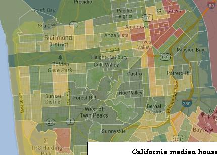
There’s a cool interactive map that gives you a visual picture of wealth and poverty in San Francisco. Check it out here. Just type in “San Francisco, CA” and click “income.”
What you see is a city full of green (wealth), with a few pockets of poverty. The data is at least two years old, so it’s almost certain that, say, the inner Mission no longer has a median income of $36,000 and the median in Noe Valley is above $108,000. The median in Vis Valley is (or was) $17,000. Nobody at that level could buy a house in VV now, not even close.
The fun thing is to imagine the income map overlaid with this map to see where housing costs — and thus median income — is rising fast. Check out, for example, the tiny Duboce Triangle area, with median income of $84, 000 (certainly no more than middle class by San Francisco standards). There were at least 17 buildings in that one census tract cleared of tenants by Ellis Act evictions; I wonder how much the median income has gone up.
It’s interesting to contrast SF to, say, Oakland and Berkeley, or to Los Angeles, where there are plenty of rich people (on the coast and in the hills) but also large swaths of more middle-income middle-class communities.
Just some thoughts for a Monday afternoon.

